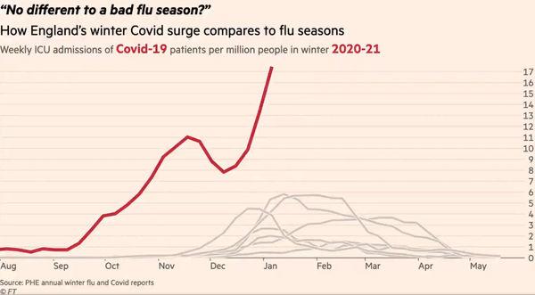
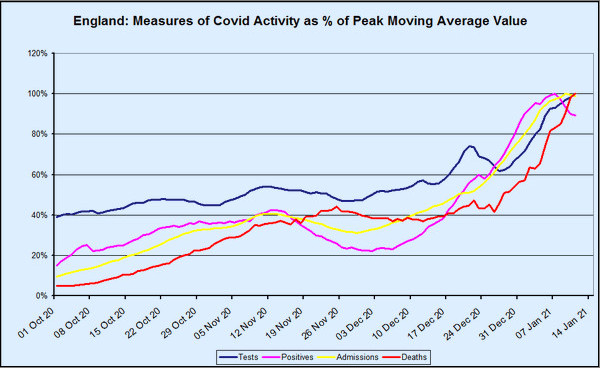
One of the features of this winter’s covid–19 wave that has perplexed Dr No, and indeed many others, is the lack of the normal lag between rises in positive tests, admissions and deaths. In the normal course of events — and as we are so often told by political and media experts — admissions lag behind cases, and deaths lag behind admissions. Yet when we look at the chart above, which presents various measures for England — the methodology will be explained shortly — the lags are rather conspicuous by their absence. From around about Christmas Day onwards, tests, positives and admissions have been in lockstep, while deaths have shown a lag, but only a short one, of about seven days. The peaks in both positives and admissions — both are currently in decline — are only two days apart. None of this makes any sense at all.