Lies Damned Lies and Denominators
There has been some conflation and confusion recently over ONS’s initially intriguing but ultimately infuriating deaths by vaccination status reports. They intrigue because they offer a possible route to the paired holy grails of vaccine effectiveness and vaccine safety. A number of bloggers, including Dr No, have gleefully thrown eye of newt and toe of frog into the bubbling cauldron, only to be rewarded with a poke in the eye from a howlet’s wing. A couple of tyros have even added time warps to try and make sense of the data, only to reach uncertain conclusions. Throughout the melee, the focus has at times shifted from numbers to rates and back to numbers again, at others, from covid deaths to non-covid deaths and even all deaths, but the data has work-hardened as it has been worked back and forth, and cracks have begun to appear. Perhaps the cracks were always there, we just couldn’t see them.
One of the more baffling mysteries which might now be solved is how can ramping up vaccinations in a particular age band trigger a sharp and striking rise in mortality in the unvaccinated in that age band, as seen in Figures 1–3 in Dr No’s last post. On the face of it, the unvaccinated just sit there, untouched, and yet their mortality soars as others get vaccinated. It makes no sense until you consider the possibility that, in each age band, the very frail with a short life expectancy may be excused the trauma of vaccination. This, Dr No should add, is not doctors playing God, it is doctors exercising compassion in the face of imminent death. Nature then takes its course, and as the others get vaccinated, the excused start falling off their perches. Over time, things level out, and mortality in the vaccinated and unvaccinated converge, exactly as seen in the charts.
The key thing going on here is the denominator is changing. We tend to focus on the number of events, in this case deaths, and so the numerator in any rates, but in this example, the numerator remains the same — the very frail with a short life expectancy do what they were always going to do — but the denominator gets rapidly smaller, as more and more people get vaccinated. The striking rise in mortality rate happens not because the number of deaths goes up, but because the denominator has plummeted, as can be seen in Figure 1. Note how the rate rises as the number falls, which can only happen because the population at risk, those remaining unvaccinated, falls even faster than the number of deaths.
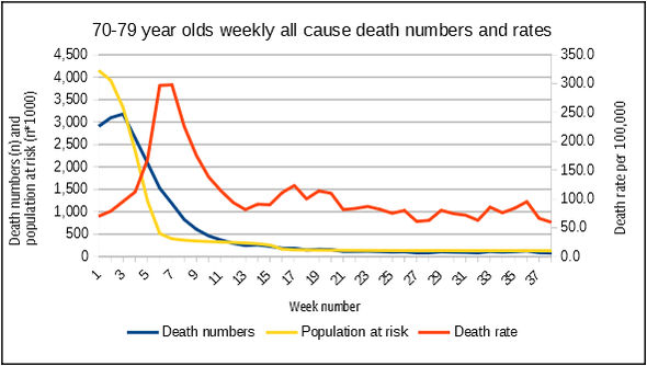
Figure 1: numbers vs rates as the denominator for rates falls even faster than the numbers. Note that to get all three lines on the same chart involved a bit of jiggery pokery with the axes. The actual population at risk falls from over 4 million in week 1 to less than 400,000 in week 8, a ten fold reduction, while the number fall from just under 3,200 to just over 800, a four fold reduction. Source: ONS
The lesson here is that denominators matter as well, but are all too often overlooked in the frenzy over numerators. We can just as easily double a rate by halving a denominator — 10/100 = 10%, 10/50 = 20% — as by doubling the numerator — 20/100 is also 20% — or indeed any combination of the two that gives the same result. This raises an intriguing question: if ONS’s death by vaccination status rates are being driven as much by denominator changes as numerator changes, could these changes make, for example, the vaccines appear more, or indeed less, effective than they really are? What if, for example, the vaccines have no effect on outcomes themselves, but the shifting sands of numerators and denominators caused by changing vaccination patterns over time make it appear that they do?
Regular readers will know that as a rule Dr No is not a great fan of whatiffery. There are times, however, when it has a place, and this one of them, given that ONS’s data aren’t sufficient to answer the question directly themselves. Instead, we can get a partial answer by approaching the problem from the other end, and say what if the vaccines are ineffective — there is no difference in mortality — can we still nonetheless see an apparent, but spurious, effect, driven by shifting numerators and denominators?
The answer is yes. Let us consider three age bands, the 60 year olds, the 70 year olds and the 80 year olds. Each age band has a fixed mortality, unaffected by vaccination, that rises with age band. At the same time, vaccination proceeds in stages, starting with the 80 year olds, and then progressing to the younger age bands. This means that in the early stages, there will be more people at risk of dying in the vaccinated group that the unvaccinated group. We can use a formula in a spreadsheet (cumulative normal distribution) with various inputs (mean, standard deviation) to generate vaccination curves. The table looks like Figure 2 (a screen grab, actual spreadsheet can be downloaded here). Vaccination starts in week 1, after a lead in period indicated by negative week numbers.
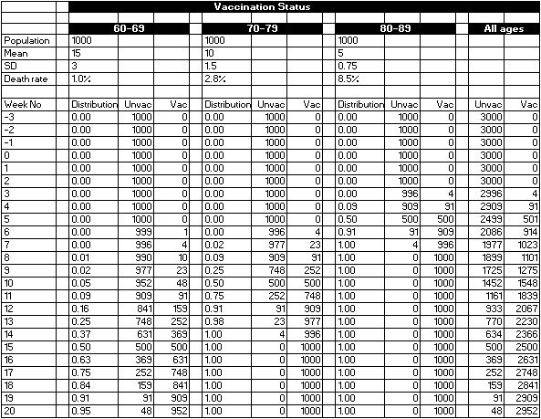
Figure 2: distributions of vaccinated and unvaccinated persons over time for three age bands. Source: whatiffery
Note how the denominators, the population at risk in the Unvac and Vac columns change over time. Charting cumulative curves for the vaccinated groups gives us Figure 3, which looks rather like UKHSA’s cumulative vaccine uptake charts, but with only three age bands shown. So far, so good.
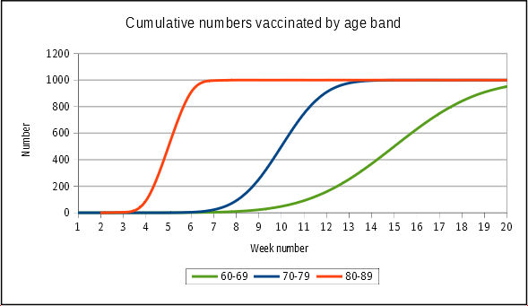
Figure 3: cumulative vaccine uptake curves for each age bands. 80 year olds get it first and fast, the younger age bands progressively less aggressively. Source: data from Figure 2
The risk (rate) of death, shown in row 7 of Figure 2 for each age band, does not change over time, or with vaccination status. It is fixed throughout at the rate shown for each age band. Using these fixed rates, which are not a million miles away from reality, we can calculate the number of deaths in each age band, by vaccination status, for each week. Using these numbers, we can then calculate the overall death rate for each group, vaccinated and unvaccinated, for each week. These calculations are shown in Figure 4. Note that rounding means that some nonsense numbers (0.0002 deaths etc) disappear in the number columns, but they still apply, and so appear, in the rate calculations.
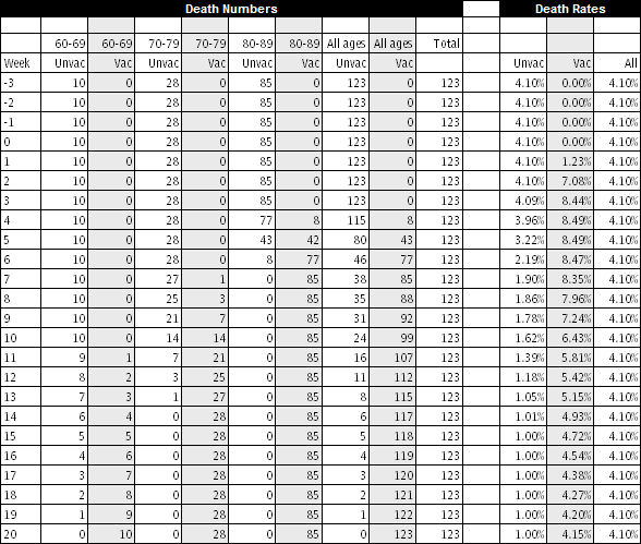
Figure 4: death numbers by age group by week and then overall rates by week. Source: data from Figure 2
Note first the Total column for death numbers, and the All column for death rates, which confirm that overall, each week had identical numbers and rates. Nothing happened: there was no epidemic, just a steady number and rate of deaths each week. Then look at the death numbers and rates for the all the unvaccinated and all the vaccinated. Note how, in the early stages of vaccination, around weeks 4 and 5, the deaths are dominated by the 80 and over group, with its relatively high death rate, but the total number vaccinated is still relatively small. The overall death rate soars. In the later stages, when almost all are vaccinated, the overall rate trends towards the overall rate. Figure 5 shows this ‘epidemic’ in chart form. The rates in the unvaccinated decline over time, as only the group moves towards small numbers of only 60 year olds.
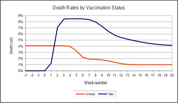
Figure 5: a pseudo-epidemic of deaths in the vaccinated caused by differential vaccination rates in different age bands. Source: more whatiffery
Now the curious thing is, we have seen something similar before. It follows the same pattern as the 10–59 year old curve from Dr No’s last post, the one that caused so much consternation. Here it is again, in Figure 6. Note the early peak, and then decline, in the vaccinated, and the overall decline in the unvaccinated rates. They are not identical, but they do follow the same pattern, which begs the question: is the ONS data also the product of shifting numerators and denominators?
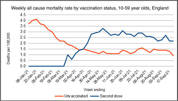
Figure 6: weekly 10–59 year old death rates by vaccine status. Source: ONS
What can we conclude from this whatiffery? Nothing about the actual data, because this whatiffery is an independent exercise carried out on hypothetical data. What we have learnt, though, is that when things are changing rapidly, for example during the early stages of a vaccine rollout, the shifting sands of numerators and denominators can cause apparent epidemics to appear, even when there is no underlying epidemic. The takeaway for Dr No is to be even more cautious in coming to any conclusions based on ONS’s deaths by vaccination status data; and, with that, to lament again the scandal that is the missed opportunity to collect substantive data on covid vaccine effectiveness and safety.
“One of the more baffling mysteries which might now be solved is how can ramping up vaccinations in a particular age band trigger a sharp and striking rise in mortality in the unvaccinated in that age band…”
At the risk of being thought cynical, may I observe that while such phenomena seem impossible in the world of mathematics and science, they are routine and indeed compulsory in the world of politics and PR?
If vaccinations have been “rolled out”, to the political mind the most important result MUST be much higher mortality among the unvaccinated.
It is also worth remembering that while, in a well-administered world, official statements and statistics are always as accurate and timely as possible, in a world run by politicians for politicians they are merely a means of deceiving the public.
Whether or not Mark Twain said it, we cannot dispute that “there are three kinds of lies: lies, damned lies, and statistics”. (I am more inclined to attribute it first to Disraeli who was, after all, a prime minister and an extremely devious one).
But I do believe that Mark Twain did say: “Get your facts first, and then you can distort them as much as you please”.
Excellent analysis, Dr No – if I may say so. In the best traditions of theoretical science! I almost felt the scales falling from my eyes.
Thank you, doc. I now raise a point that might be trivially small. Suppose someone is looking at death rates over the whole period say Feb 2020 – October 2021. During that spell people existing on 1st Feb 2020 have all aged 21 months by 31 October 2021. That’s pretty small beer for almost everyone except the old and frail in which case it might have carried them a good deal closer to, or past, their date of death. In other words the mere elapse of time will have killed some non-negligible number of codgers.
I can see that people such as actuaries would doubtless allow for such an effect in their calculations, but can we trust that government employees will have done so?
I can see that my point probably applies to calculations that try to follow the fate of particular cohorts of individuals – such as might be used to look at the “dry tinder” effect. Maybe it wouldn’t matter for the sort of calculations you report here.
Anyway, my ageing memory tells me that the two different sorts of calculations are pursued in Fluid Mechanics, being referred to as Lagrangian calculations (they study the path of individual little packets of fluid, as followed for example by a chap sitting in a coracle floating on the tide) and Eulerian (as seen by a chap sitting on an island watching the tide flow past).
After leaving your blog, doc, the next thing I clicked on was this:
https://www.hartgroup.org/full-article-one-in-20-people-vaccinated-since-april-had-to-be-added-to-the-nims-database/
Here NIMS = National Immunisation Management Service.
It shows how hard it is to be confident in the official numbers. Frinstance:
“Between April and the end of September, only 28,000 over 60 year olds were vaccinated for the first time. However, in October an astounding 270,000 over 60 year olds were apparently vaccinated for the first time.”
Obviously the over-60s are busy in the garden in the fair weather and then trot off to get vaccinated as the evenings shorten. Obviously.
Oh lord, and then I found this. To a medically ignorant soul like me it sounds ominous.
“We conclude that the mRNA vacs dramatically increase inflammation on the endothelium and T cell infiltration of cardiac muscle and may account for the observations of increased thrombosis, cardiomyopathy, and other vascular events following vaccination.”
I admit I don’t know the meaning of “42+/-12” so I’ve assumed it means ’42 plus or minus 12′. “35=/-20” is even more puzzling so I’ve assumed that the “=” is an error and that the author meant “+”
https://www.ahajournals.org/doi/10.1161/circ.144.suppl_1.10712
Great stuff Dr No.
I really appreciate this post. Frustrating about the ONS stats, but satisfying to finally understand why they made no intuitive sense.
I wonder what would the whatiffery graphs look like with, say, a ‘90% effective against death’ vaccine?
Thank you all for you kind comments.
dearieme – Some of the analyses (elsewhere, including possibly ONS) may have removed individuals who died during the period, and so adjusted the denominators downwards as time went by. Dr No didn’t. Another major problem is that this ONS deaths by vaccination status data (noted in posts passim) has a LOT of missing data, perhaps 10-20% of deaths. Furthermore, population data, which is used to calculate the number of unvaccinated (simple population minus vaxxed = unvaxxed calculation, they don’t actually count the unvaccinated) is far from perfect. The two main options are NIMS (which you picked up on), and ONS population estimates, and both are far from perfect. HART cover some of the NIMS problems, the ONS estimates in some age groups achieve what even HMG has yet failed to achieve, vaccination rates > 100%, which also has the unfortunate effect of introducing the intriguing concept of the negative unvaccinated person (happens because number vaccinated > population estimate, ergo unvaccinated number must be negative).
Helen – this hypothetical whatiffery example is for all cause mortality, as in the previous post, so we would need to know how many of the all cause deaths in each age band were ‘from covid’ deaths, and then remove 90% of them in the vaccinated group. The trouble is, we don’t know how how many people really die from covid – the ONS data is based on ‘with covid’ not ‘from covid’ – so we don’t know what to take the 90% from…
I had prepared a lengthy response to Dr No’s previous blog on this subject, but this latest analysis from Dr No, along with that from Bartram’s folly, led me to delay my reply until I had dug further into what might be at play here.
While I understand the above hypothesis, I still had that nagging feeling that Ockham’s razor should apply and there might be yet another explanation as to what’s going on. I have also spoken to a health worker close to the coal face who says this could be happening, but felt the numbers involved would be quite small and not really sufficient to significantly shift the dial.
So I looked at some of the data underpinning week ending 29th January, which according to the vaccination status graph published by UKHSA, coincides with the 2nd wave peak in the over 80’s, and by which time around 90% of the over 80s were vaccinated.
This data showed a total of 8,606 “all cause deaths” in the over 80s occuring in this particular week, of which it is claimed 5,207 were unvaccinated and 3,399 were vaccinated. ie 60% unvaccinated and 40% vaccinated.
In other words, 60% of all cause deaths must have occurred in only around 10% of the over 80s population.
Using ONS derived population figure as a reference, the over 80’s all cause death rate was a whopping 1,571 per 100,000 for the unvaccinated, but only 153 per 100,000 for the vaccinated. (Similar to the figures seen in Dr No’s graph). Yet the overall death rate for the over 80s as a whole was 387 per 100,000.
So I delved a bit deeper and looked at the weekly death registrations data for this particular week in the over 80s in 2021 (Admittedly this will be somewhat different to the date of occurrence data used in this latest report) and also for the same week 2019 (pre Covid) There were 10,680 deaths in 2021 and 7,967 in 2019 (75+)
If we then calculate the all cause death rate for week 4, using the NHS population estimate (2,855,599 and somewhat higher than the ONS figures), we see 278 per 100,000 in 2019 and 340 per 100,000 in 2021 (reflecting the 2021, 2nd wave excess deaths and closely matching the figure calculated above).
So it seems likely a significant number of deaths and a percentage of the present population is still unaccounted for, along with their relevant vaccine status
(I assume this is because the ONS are using figures based on Public Health Data Asset (PHDA), a linked dataset of people resident in England who could be linked to the 2011 Census and GP Patient Register as a reference.)
So a certain amount of data is still missing from this report and we clearly don’t yet have a full and accurate picture of the situation as a whole. However, the question is will this missing data account for the anomaly described above ? In my honest opinion I don’t think so. I estimate we might be missing around 300,000 from the current population and around 2,000 deaths for that particular week. If we added all the extra population to the unvaxxed total or the all the extra deaths to the vaxxed total (a very unlikely scenario) it wouldn’t significantly shift the needle.
So I was left wondering what would actually shift the needle, if indeed the needle should be shifted.
The one thing I believe would shift the needle is the definition of vaccine status. There still seems to be some confusion around this and while I understand how the ONS defines it, I am now wondering how and where this vaccine status is derived. Could it be via an algorithm that is buried deep in the system, that adds two weeks to the actual date of vaccination, with the “amended” vaccination status then fed through to the ONS who use it in good faith ?
So I carried out some further analysis to see if this might be a possibility. Using the populations in the data set associated with the ONS report it is possible to calculate the percentage of vaccinated against vaccinated for the reference population for each week. I would expect this to closely align with the vaccination roll out graph as published in the weekly Covid surveillance report. However, it doesn’t. There is a clear lag observed between the weekly percentages derived from the ONS report and the weekly percentages in the UKHSA surveillance report.
For example in week 1 the UKHSA weekly surveillance report shows approximately 40% of the over 80s vaccinated, while the ONS data shows only 17% vaccinated. Week 2 UKHSA shows around 60% vaccinated against ONS 48.6%. I also carried out a spot check on the 70-79 data for week 4 and this shows UKHSA 65% (This was calculated across two age bands and consisted of 78% of 75-79 and 35% 70-75, with NHS populations of 2,009,992 and 2,814,128 respectively)
(A further point of note is that the total ONS population figures for each age category do not appear to be very consistent throughout the weeks although it is appreciated that this figure will be somewhat “dynamic” based on the way it is derived)
If the vaccine status is deemed vaccinated two weeks after receiving the actual injection, how much this will affect the figures is unknown. As is the impact of the missing data and also the hypothesis as outlined by Dr No.
I feel this subject still requires further investigation / clarification, which I will seek to obtain from ONS.
Finally, as I am not a data analysis expert and this exercise required a significant amount of manual number crunching, I would appreciate if others could cross check what I have discovered and feedback their findings.
One final, final point a tweet from Dr Clare Craig http://twitter.com/ClareCraigPath/status/1461968762521980928?s=20
Not quite the same thing but rather close to the mark perhaps.
Should have included the 70-79 ONS figure was 38% !!!
Peter – an interesting thorough analysis. FTR, Dr No wasn’t proposing a hypothesis to explain anything. This post is more at the whatiffery hypothesis generating stage, specifically asking what happens if there is no underlying difference in mortality between the vaccinated and unvaccinated? The results show that you can get apparent varying mortality caused by different vaccination rates, but that doesn’t necessarily explain what is actually observed, it just raises a possible scenario that might apply.
The other important general point is that rates are sometimes very sensitive to changes in both numerators and denominators. The classic covid vaccination case is PCR positives in 70-79 year olds, using first NIMS and then ONS denominators: as the Office for Statistics Regulation (OSR) shows here, case rates in the unvaccinated increase more than fourfold, from 311.8 per 100,000 using NIMS, to 1443.7 per 100,000 using ONS data as denominator, a huge difference given the numerator is the same. What is the real figure? And why?
As an aside, this led to the glorious and ongoing bun fight between OSR and UKHSA, and the Witchfinder General for Regulation’s letter to Dr Jenny Harries, which concludes with this extraordinary sentence (emphasis added): ‘I recognise that you want to maintain transparency and consistency, but these qualities should not be at the expense of informing the public appropriately‘.
And then there are the missing deaths in the ONS deaths by vaccination reports. The second (week 1 to 38) report has a total of 322,692 all cause deaths for those aged 10 and over, while the weekly mortality reports have 424,295 deaths, albeit for England and Wales, and by date of registration rather than occurrence, but even so… There are around 100,000 missing deaths in the deaths by vaccination status data, or ~25% of the total. What happens to the rates if the missing deaths are added?
Finally Dr Craig is partly right. Sometimes it is outrageous to count vaccinated people as unvaccinated, but it all depends on what you are interested in. If it is side effects and all cause mortality, ie vaccine safety, then someone should count as vaccinated the moment the vaccine is administered, because you want to count events from the moment of administration. If, on the other hand, you are interested in vaccine effectiveness, then it is not unreasonable to wait 14 or even 21 days, until the person has developed immunity. Immediately after vaccination, being vaccinated is not the same as being immune, but all too often they are considered the same.
Many thanks for the reply Dr No. I note your FTR and appreciate you were not offering up a hypothesis and merely partaking in “whatiffery”. I believe the whatiffery charts admirably reflect what we might actually be seeing in the ONS 10-59 chart and the danger of making any judgement from data based on such a wide age cohort and with a constantly changing denominator. So I don’t believe we will have a clearer idea of what’s really happening in this age group until this data is broken down into more realistic age bands.
The link to the OSR “reprimand” to the UKHSA was enlightening. Smoke and mirrors and more obfuscation came immediately to mind and made me think of the copy of “How to Lie with Statistics” on top of a pile of books seen during a recent interview with the smiling Bill Gates. I just sense the introduction of the estimated ONS population data was somewhat of a red herring. Yes NIMS might be somewhat inaccurate but it represents real people with names and addresses rather than a just a nebulous “guestimate” of what the population should be based on the 2011 census and other data sources. Despite it’s limitations I would see the NIMS data as providing an extremely large sample of the UK population and capable of providing some useful and meaningful reports.
But I digress, Dr No makes an extremely interesting point regarding the definition of “vaccinated”. I believe to the common man, a person is considered “vaccinated” as soon as they have received the needle in the arm. That was certainly my view until Dr No raised this interesting point. I am very aware that those involved with this current vaccine program consider the vaccine does not become effective until two weeks after receiving the needle in the arm. However, it is during this very period that serious short term adverse effects are likely to occur and also immunity is actually lowered and could actually make people more susceptible to catching Covid. In fact there are many anecdotal stories of vaccinations taking place in elderly care homes with several residents dying soon afterwards and others becoming seriously ill. As this Mrna vaccine technology is so new and trials were so truncated, monitoring the safety of these products is absolutely paramount and in my opinion, it is only by monitoring vaccine status based on the date the needle goes into the arm that we would be able to see this.
The ONS response to an FOI request re vaccine status seems clear. They state:
In our analysis, an unvaccinated individual is someone who has received no vaccinations
So why the apparent lag between the NHS vaccine roll out percentages and the ONS derived percentages of those vaccinated (As referred to in my previous comment). There may be a good explanation but we need to find out.
We need to understand the process, methodolgy and system involved in transferring the data from NIMS to the ONS. ie going from entering the date of actual injection into the NIMS database and that data being subsequently turned into a vaccine status flag at the ONS.
I am aware that algorithms are used to determine the stated cause of death based on the ICD codes derived from a death certificate and that these are based on international standards defined by the WHO.
Is there some similar form of coding used to derive an agreed definition of vaccine status that might include a two week window from the actual date the injection went into the arm ?
There is only one way to find out so I will report my findings to the ONS team who produced the recent report (they have been quite helpful with previous enquiries) and see where we go from there.
Finally, by way of an update I received the following response to my FOI request to the UKHSA for a breakdown all cause mortality for vaccinated versus unvaccinated, broken down by age bands as per the UKHSA weekly surveillance report:-
Thank you for your email to the UK Health Security Agency (UKHSA).
In accordance with Section 1(1)(a) of the Freedom of Information Act 2000 (the Act), I can confirm that UKHSA does not hold the information you have specified.
Under Section 16 of the Act, a public authority has a duty to provide advice and assistance. Accordingly, for all cause death data this would fall under the Office for National Statistics (ONS) who are responsible for the registration of death certificates. They can be contacted at: foi.team@ons.gov.uk
Furthermore, the UK government dashboard to monitor the pandemic has detailed information that you may wish to view and can be accessed here: https://coronavirus.data.gov.uk/details/vaccinations
If you have any queries regarding the information that has been supplied to you, please refer your query to the Information Rights Team in writing in the first instance. If you remain dissatisfied and would like to request an internal review, then please contact us by emailing InformationRights@UKHSA.gov.uk
Were the UKHSA disingenuous with their response ? They obviously have access to the data although they are probably technically correct in that they don’t actually hold it. ONS may be able to say the same thing , however, I will forward the request onto them to see what they say. Interestingly enough some of this additional data was actually released in the latest ONS vaccine status report that we have been discussing. I’m sure that was just a coincidence but maybe we just need to keep asking for more !
.
Here’s another chap’s effort. He persuades himself that the vaccines do nothing for all-cause mortality. I’m not convinced: maybe the vaccines do just enough to reduce all-cause mortality to cancel the effects of lockdown on increasing all-cause mortality.
Not quite what Dr No’s article is about, except it comes under the heading ‘Strange to report’. This is from French website telling us unvaccinated are four times more likely to be infected than vaccinated.
https://covidtracker.fr/vaximpact/
What is interesting is that the curves for unvaccinated, partly vaccinated, fully vaccinated track quite close then suddenly there is an exponential rise in both vaccinated and unvaccinated with unvaxxed peaking higher. Partial vaccinated shows a bump. All three then come down and track parallel.
1. What caused that sudden rise in infections?
2. Why was fully vaccinated group much harder hit than, partially vaccinated?
3. Why are fully vaxxed/non-vaxxed identical shaped curves, when since vaccines are almost 100% effective (honest!), there should be virtually no infections in that group?
4. Since partially vaxxed group is least effected by infections, perhaps only one dose is best?
It just adds to the crazy world of nothing makes sense, and it isn’t ever going to be possible to find out what exactly has been going on as all data is distorted somehow or another. I suppose if I were cynical I would say that is by design.
Meanwhile some data is (relatively) straight forward.
France. There are currently 2 133 753 infected people ~ 32 500 per million. Of these, 1 049 are serious/critical, ~ 16 per million.
Ut only 0,05% of infections are serious/critical.
The question here is, what is all the fuss about?
After France’s second lockdown October 2020, restaurants and bars stayed closed until June, masks and the other nonsense has continued and since 01 September the only places you can go without a vax-pass or negative test, are shops, the street, local public transport. France is now doing third helpings of mRNA.
Sweden: has 23 253 infected people, (~ 1 162 per million), of whom 30 are serious/critical, that is 1,5 per million, and 0,1% of infected.
Vaccination rate France is 75%; Sweden 68%.
It seems that Sweden without all the hoopla, is doing rather better than France and elsewhere. There is a lesson there for any who want to learn.
“1. What caused that sudden rise in infections?”
We keep forgetting that there is no way (I repeat, no way) of identifying “Covid-19” infections. PCR was explicitly not intended for use as a diagnostic test. Yet governments and doctors the world over keep using it as a diagnostic test. What can it be that they do not understand?
It reminds me of the old chestnut about the policeman who finds a drunk searching for his car keys under a streetlight. “Is this where you dropped your keys, sir?” asks the helpful official. “No, it was over there by the car. But the light is better here”.
(Obviously that dates from the days when a policeman in such a situation would help the driver, rather than immediately arresting him for being drunk in charge).
Dearieme – that is another interesting analysis. It was only a matter of time before Simpson’s Paradox came up. It almost made it into this post, but didn’t because it added more length but not much in the way of breadth. Simpson’s Paradox is the counter-intuitive observation that aggregate effects (in this case, in the 10-59 year olds) can mask opposite effects in individual strata (10-19, 20-29 etc) within the aggregate because something else (some sort of confounder) acts to weight the aggregate effects (see why Dr No didn’t add it to the original post – explaining Simpson’s Paradox is never a matter of a few short words!).
The increasingly hot question is why did ONS lump 10 to 59 year olds into one category? Constructive use of Simpson’s Paradox?
The infuriating thing is only having this aggregate 10-59 year old group to work on. On one level, the final chart in the original post does make sense: if the average age is ~40 in the vaccinated group ~29 in the unvaccinated group, then we would expect, very roughly, twice the mortality in the vaccinated group, because the mortality rate very roughly doubles between 29 and 40 years old. One possible approach may be to do a simpler but very tedious version of Crawford’s analysis. But we are still stuck with the denominator problem. Here, for example, are NIMS and ONS population estimates by age band (taken from here). The differences are far from trivial, and we don’t really have any idea of what the real numbers are:
NIMS Pop
<18 12,581,219 (problem: includes 0-9 as well)
18-24 5,316,170
25-29 4,496,813
30-34 4,810,014
35-39 4,573,391
40-44 4,200,634
45-49 3,988,652
50-54 4,242,460
55-59 4,117,429
ONS Pop
12-17 3,918,423 (problem: misses out 10-11)
18-24 4,709,589
25-29 3,771,493
30-34 3,824,652
35-39 3,738,209
40-44 3,476,303
45-49 3,638,639
50-54 3,875,351
55-59 3,761,782
It seems unlikely ONS will release the 10-59 year old deaths by vaccination status data any time soon, so lets go back to basics.
1. A roughly two times higher mortality in the vaccinated vs the unvaccinated is plausible, given the different age structures and increasing mortality with increasing age (vaxxed avg age 40, unvaxxed avg age 29, mortality roughly doubles between 29 and 40). No need to invoke vaccines, covid, aliens, it’s already written into the mortality rates.
2. Does no excess morality in 2021 compared to pre-covid years prove anything? No. It could be nothing is going on, or it could be the vaccines have prevented excess deaths that would otherwise have occurred. Nonetheless, it is interesting, if true.
3. Is there any other way of looking at the data? Not directly. The 10-59 deaths by vaccine status cohort are in a black box on ONS’s devising, put there for reasons we can only speculate about. It seems inconceivable ONS don’t have the underlying data, so this must have been a policy decision.
4. We can look at weekly all cause mortality in the 10-59 years olds without a vaxxed/unvaxxed breakdown. We can also compare 2020 (covid presumed present, no vaccine) with 2021 (both covid and vaccine present) and ‘see what we see’. In some ways this is a more useful comparison than 2021 vs pre pandemic years, as it compares two covid years, one without a vaccine, and one with, but it is clearly not without problems eg there are significantly more PCR positives this year than last, but there are also more tests, so they may cancel out. So with these caveats, and an even bigger one about small numbers, what do weekly all cause deaths look like for 10-59 year olds by five year age band (available in the ONS weekly reports) for the period week 22 to 44 (to avoid confusing spikes) for 2020 and 2021?
Ho hum, not much difference. But once again, we cannot say whether that is because nothing is having much of an effect, or whether the vaccines are nuking the virus. So we’re really none the wiser. Ho hum indeed.
Interesting article on the same subject:-
https://www.hartgroup.org/full-article-one-in-20-people-vaccinated-since-april-had-to-be-added-to-the-nims-database/
Briggs has a go.
https://wmbriggs.com/post/38157/
…and every day it seems not to be noticed that the prick-thing doesn’t work. It clearly can’t work; you’ve already bought two identical maps which don’t take you anywhere near your destination, yet still go on to buy 3,4,5,6,7,8, (as are on most of the ‘vax loyalty card’ type forms) identical maps and, despite being more lost than before, expect a different result..? As we know, it’s the definition of insanity. But whether 1 or 8 ‘maps’ are bought, jail will beckon, because there’ll always be a point where you’re one jab short and thus seemed unvaxxed. More insanity. (Yet is the insanity in the evil planners? Or just on the part of those who go on buying and using the useless maps…? And does it really matter; insanity is insanity, and dangerous.)
Meanwhile Japan and Africa (and I think India?) have floored their ‘kovi’ numbers, because they’ve been using that top ‘get-yer self-blocked and banned for mentioning it’ good ol’ OTC remedy, iV*r M*cT1n – yet still it’s said that can’t possibly have anything to do with it. Whether it does or not, the rapidly increasing censorship is a filthy smelling rat that I’m getting tired of people not noticing.
We’re in very dangerous waters, and ‘it could never happen in good ol’ Blighty’ an assumption too far for me….
Great blog, Dr No, thank you. And thank you, all, for the great comments and links.
Copy of my rather lengthy FOI request to ONS https://bit.ly/3CVdQdi Will be interesting to see their response.
Peter – a very thorough FOI request. It will indeed be very interesting to see their response.
I’m sure this will be of interest to Dr No and his followers. Seems to echo the thrust of my latest FOI request. https://www.youtube.com/watch?v=Jxkb2yhdLiA&t=258s&ab_channel=NormanFenton