Ode to the Death Certificate

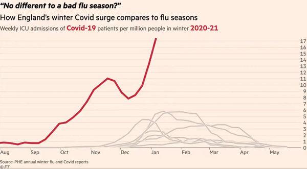
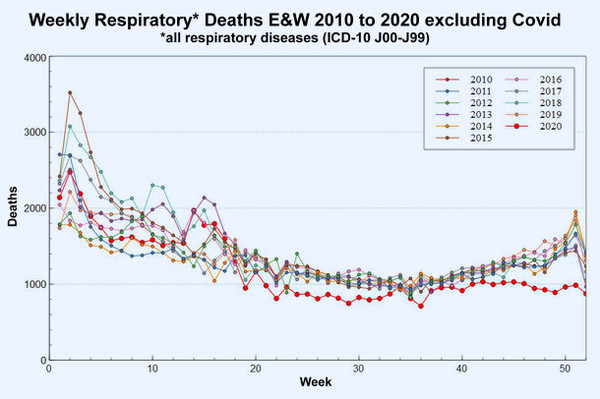
Covid! The very word is like a bell, to toll me back from my sole self to thee! Dr No continues to wonder about covid entries on death certificates, and how and why these entries do or don’t end up in ONS’s weekly counts of covid deaths. Unlike the pin-ball wizardry of counting every single death within twenty eight days of a positive covid PCR test as a covid death — an indiscriminate and robotic definition — one hopes, rather forlornly, that a modicum of medical effort on the part of the doctor completing the medical certificate of cause of death, or MCCD, followed by sensible coding of underlying cause of death by ONS, might give confidence that when we sidestep Donne and send to know for whom the bell tolls, then at least the count of tolls for covid are reasonably accurate. But are they?

Read more

On Having One’s Hat and Eating It

Dr No is surprised. Today’s ONS England and Wales weekly mortality report does not show the fall in deaths he confidently predicted in his last post. The rate of increase has certainly slowed, but there is no gainsaying the fact that the total number of deaths registered in England and Wales in week 2, 2021 has gone up compared to week 1, 2021. Wales did in fact show a slight fall of 28 deaths, but England’s 318 extra deaths meant an overall rise. This is against a backdrop of both Scotland and Northern Ireland reporting recent falls in the number of weekly deaths. Nonetheless, England and Wales, or rather England, deaths did rise, and a rise is not a fall. Is part or all of Dr No’s hat destined for the slow cooker?

Read more

Apples Cores and Z–Scores

Our government, and its PR machine, the mainstream media, have got the covid death caldron nicely on the boil. “Double, double toil and trouble; Fire, burn; and, caldron,  bubble… Eye of newt, and toe of frog, Wool of bat, and tongue of dog…Like a hell-broth boil and bubble.” At first glance, the recent daily covid death counts are alarming, but are the reported covid counts real? Is there a worrying excess in all deaths, or just a normal seasonal rise? The answers to these question are most readily found by looking at all cause mortality. Although all cause mortality is coarse grained — in truth it has no grain, it is just a single count of all deaths — it nonetheless has one cardinal virtue that comes about precisely because it doesn’t try to be too clever, it is robust. The diagnosis of death is rarely got wrong, and the UK has a reliable system of death registration. We know how many people have died overall, and when and where they died.

Read more

Medically Accelerated Epidemics

One of the features of this winter’s covid–19 wave that has perplexed Dr No, and indeed many others, is the lack of the normal lag between rises in positive tests, admissions and deaths. In the normal course of events — and as we are so often told by political and media experts — admissions lag behind cases, and deaths lag behind admissions. Yet when we look at the chart above, which presents various measures for England — the methodology will be explained shortly — the lags are rather conspicuous by their absence. From around about Christmas Day onwards, tests, positives and admissions have been in lockstep, while deaths have shown a lag, but only a short one, of about seven days. The peaks in both positives and admissions — both are currently in decline — are only two days apart. None of this makes any sense at all.

Read more

Through a Glass, Lightly

And though I have the gift of prophecy, and understand all mysteries, and all knowledge; and though I have all faith, so that I could remove mountains, and have not perspective, I am nothing… With all due apologies to one of the finest bits of English prose ever written, the major problem facing anyone foolish enough to attempt to put the 2020 covid epidemic in perspective is lack of perspective. Our dear ONS diligently collect more than enough data to fill the storehouse of the mind, but all too often it is ad hoc, or presented through shifting frames of reference. The result is that almost all attempts to put covid in perspective use a very short time frame, typically five of ten years. This is, Dr No suggests, short-sighted, rather like trying to assess the Victorian era by looking at the last few years of Queen Victoria’s reign. Given that the last decade or so have seen historically low crude and age standardised mortality, 2020, with its excess deaths caused by covid, tends to look pretty dreadful, because we are comparing 2020 with the best years on record.

Read more

Early Assessment of 2020 Mortality

If there is one thing guaranteed to make Dr No’s breakfast porridge go down the wrong way, it is the sound of Martha Kearney on the Today programme playing her voice as if it was an electric slide guitar. That, and the little pauses after the interviewee stops speaking, and Ms K asks her next question, as she waits for her controller to finish telling her what non-sequitur of a question to ask next. Mercifully, we were spared Ms K’s slide guitar treatment of the 2020 excess deaths data released yesterday, but elsewhere there was plenty of wailing to be had. “More deaths in England and Wales in 2020 ‘than any year since 1918’” wailed yahoo, while Sky News went with “an almost unparalleled loss of life” above some rather lurid blood red background charts of eye-popping variety. In a related twitter thread, Mr Conway sagely pronounced that “there is no definitive measure for the scale of this pandemic. There are other prisms beyond even these…”. Indeed there are. The prism glaringly obvious by its absence is age standardised mortality rates.

Read more

Email Subscriptions

A reader very kindly let Dr No know that the email subscription form (“Subscribe to Dr No” form on the right) was broken. There have also been some odd random ‘unsubscribe’ events for subscribers where Dr No knows the subscriber didn’t unsubscribe (because the subscriber was a test email address used by Dr No!). Dr No has therefore migrated all subscribers across to a new system which appears to be working (though you never can tell 100% with these things).

Read more

Lies Damned Lies and the FT

This image shows the climax of one of two animated charts produced by the FT’s data journalist. Currently doing the rounds on twitter, it purports to show the strain on, and so by implication the imminent collapse of, the NHS. It matters, not least because it has been viewed for getting on for 2 million times, and so is likely to have had something of an impact on the current political, media and public perception of where we are with covid. At first glance, it is alarming. But is it a fair representation of the facts? Dr No is pretty sure it is not, though proving that is easier said than done. Nonetheless, nothing ventured, nothing gained, so what can be found out about this chart? 

Read more

Hot Stuff Bias and Diagnostic Drift

One of the problems caused by a disease going hot is hot stuff bias. This is simply human nature at work. If everyone is talking about covid, then every respiratory patient starts to look like a covid patient. Add in a covid test that is so sensitive it can detect viral dandruff left behind from past infections, and the conditions are right for a form of diagnostic drift, which happens when a diagnosis accumulates patients that don’t properly belong to it. Is there any evidence this might be happening with covid?

Read more

Situation Still Mostly Normal — Week 5

NHS England released its weekly bed occupancy figures for week 5, 28th December 2020 to 3rd January 2021, this morning, and Dr No has given them the same treatment that he gave weeks 3 and 4. The headline is overall occupancy is still lower than it was in the corresponding week in either 2018/19 or 2019/20, but there are within the overall picture some clear hot spots, notably in London. The heat map colours are the same: red means occupancy is 95% or higher, amber means occupancy is between 90 and 95%, and green means occupancy is 90% or less. As in previous weeks, the images in the post are simple visual indicators — the more red, the hotter things are, the more green, the less hot things are, with links to larger pdf versions in the captions. Week 3, rather than week 4, which includes Christmas Day and Boxing Day when activity is lower, images are provided for comparison.

Read more