
Apples Cores and Z–Scores

Our government, and its PR machine, the mainstream media, have got the covid death caldron nicely on the boil. “Double, double toil and trouble; Fire, burn; and, caldron, bubble… Eye of newt, and toe of frog, Wool of bat, and tongue of dog…Like a hell-broth boil and bubble.” At first glance, the recent daily covid death counts are alarming, but are the reported covid counts real? Is there a worrying excess in all deaths, or just a normal seasonal rise? The answers to these question are most readily found by looking at all cause mortality. Although all cause mortality is coarse grained — in truth it has no grain, it is just a single count of all deaths — it nonetheless has one cardinal virtue that comes about precisely because it doesn’t try to be too clever, it is robust. The diagnosis of death is rarely got wrong, and the UK has a reliable system of death registration. We know how many people have died overall, and when and where they died.
Dr No has already shown in recent posts that overall 2020 mortality was bad, but only as bad as was normal a decade or two ago, depending on the detail of how the analysis is done. What this means is that someone from around 2005 using a time machine to look into the future over the intervening years at 2020 would see nothing exceptional. 2020 was just another normal year. But 2021 is a new year, and already the witches are at work, fire, burn; and, caldron, bubble, frothing about the ever rising covid deaths: another all-time high, record death tolls, a new daily high. Let us see if we can use the latest figures to get an idea whether the covid death caldron really is boiling over, or is instead just simmering, at high normal seasonal levels.
The first thing to get out of the way is Z-scores. Promoted by EuroMOMO, the pan-European organisation that aims to “to detect and measure excess deaths related to seasonal influenza, pandemics and other public health threats”, and favoured by PHE, who deploy them on the front page of its weekly excess deaths report, the Z-score is a classic example of statistical obfuscation. EuroMOMO claim that its modified Z-score allows direct apple to apple comparisons, both between countries and between years in one country by setting a benchmark and so thresholds based on the standard deviation (see footnote for a refresher on standard deviations) of the mean number of deaths, where the Z-score is the observed number of deaths minus the mean (and so expected) number, divided by the standard deviation. The Z-score tells us how many standard deviations the observed number is above (or below) the expected number. EoroMOMO defines a Z-score above four as a ‘substantial increase’ in the number of deaths.
In theory, this just might be plausible, were it not that EuroMOMO cook the books by using a baseline based on, in their own words, a “de-trended and de-seasonalized series, after a 2/3 powers transformation according to the method described in Farrington et al. 1996″. What this wonderful example of obfuscation means, once it has been de-jargoned and de-obfuscated after a 2/3 powers transformation according to the method described by Dr No in 2021, is that the baseline, and so all the thresholds above the baseline, are based only on spring and autumn data, the two typically unexceptional seasons of the year for mortality. This makes as much sense as calculating an average annual temperature based only on spring and autumn months, and then declaring ‘by gum, that summer was hot’.
Another perhaps more serious flaw in the EuroMOMO algorithm is that the variability (the dispersion or scatter) about the mean number of deaths will depend on the population size, with smaller populations, and so a smaller number of observations, or deaths, more prone to wider variability, which in turn will feed through into bigger standard deviations, and so smaller Z-scores (recall, the Z-score is the difference between the observed number of deaths and the mean, expected number of deaths, divided by the standard deviation). The four UK nations demonstrate this flaw very clearly (Figure 1). The smaller the population, the smaller the Z-scores. For Northern Ireland, (population ~1.8m vs England’s ~56m), EuroMOMO has achieved what months of epic masking up and locking down have failed to achieve: all but total ablation of the pandemic.
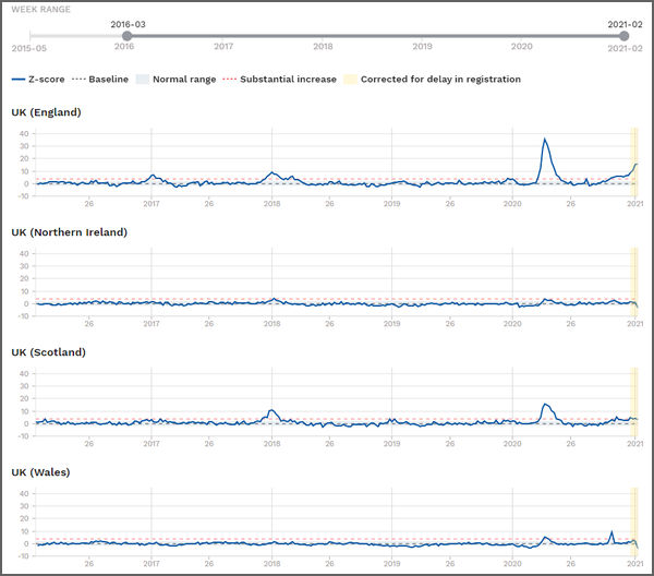
Figure 1: EuroMOMO charts for the four UK nations, with data from the last five years, up to week 2 2021
That’s what happens when you weaponise statistics, and the simple solution is don’t do it. So let us turn back to raw numbers of deaths, uncomplicated by numerology. Here are the latest ONS weekly all cause deaths for England and Wales**, and it looks like the covid death caldron is boiling nicely. Week 1 2021 sure looks bad (Figure 2).
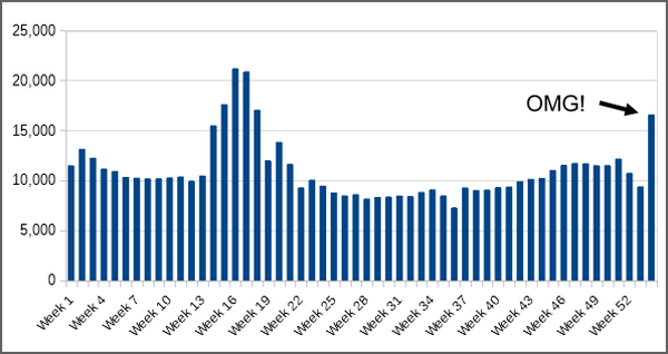
Figure 2: ONS weekly all cause deaths registered for England and Wales**, 2020 plus week 1 2021
Not quite as striking, perhaps, but nonetheless very visible, we can also see that the two weeks before the last week were also unusual, by having low counts, and there is a well known reason, the lag in registrations caused by Christmas and the New year. What happens if we apply a 2/3 weeks transformation, according to a method described by Dr No in a recent post, which takes 4,000 deaths from the final week on the chart, and puts then back in the penultimate week (+ 2,500 deaths) and the week before the penultimate week (+ 1,500 deaths). What we see is far less alarming, with deaths roughly in line with a year ago, in January 2020 (Figure 3).
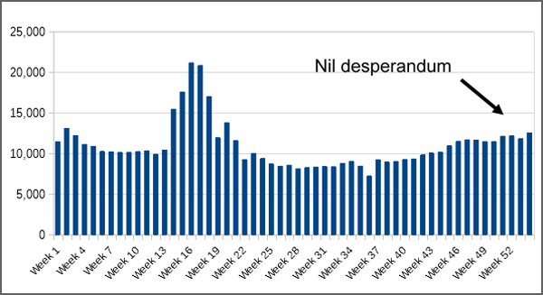
Figure 3: ONS weekly all cause deaths registered for England and Wales**, 2020 plus week 1 2021, adjusted for reporting delays over Christmas and the New Year
Viewed with this adjustment, it seems the caldron has rather gone off the boil, and is simmering at something approaching normal, with a moderate season increase in weekly deaths. There is no winter covid spike visible. If there is no spike in all cause deaths, then there is no spike in deaths cause by covid, because there is no spike.
This leaves just one other chart to consider, the weekly covid deaths chart on the coronavirus dashboard. This is based on ONS data, plus equivalent (but not identical) Scotland and Northern Ireland data, and for the UK as a whole it is very clearly another OMG chart. To make the data comparable to Figures 2 and 3, Dr No has downloaded the data for England and Wales and summed and plotted them (Figure 4).
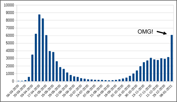
Figure 4: Weekly deaths attributed to covid–19, by date of registration, England and Wales (source: data downloaded from coronavirus dashboard for each country, then summed and plotted locally).
Surely this is proof that covid–19 is not just out of control, it is on the rampage. But is it? Consider that there have been no similarly striking rise in all cause mortality for in recent weeks, once the bank holidays lags have been corrected. How can this be? Covid deaths all but double, yet overall mortality remains pretty stable? The only sensible explanation is that, rightly or wrongly, the proportion of deaths attributed to covid–19 all but doubled over a week. And it just happens that this, and the period just before it, was the period in which testing rocketed up, all but doubling from around 300,000 tests a day to approaching 600,000 tests a day on some days.
Dr No has good confidence that when ONS reports its next set of weekly death registrations for England and Wales, the numbers will have moved back towards normal for this time of year. His grounds for this confidence are not based on models or numerology or even ouija boards, but on his favourite grounds for confidence, real observations in the real world. As it happens, Scotland has published more recent data, as has Northern Ireland, and both show the numbers of deaths registered returning to normal. There is no reason to suppose England and Wales will not do the same.
Footnote: Standard Deviations. Standard deviations are a measure of the scatter, or dispersion, of readings about the mean. Consider two groups of adults males: one made up of men all of similar heights, and another made up of men widely varying heights. The mean height will likely be similar, but in the first group, the standard deviation will be small, in the second it will be large, indicating wider scatter, or dispersion. Now suppose we want to identify some outliers in each group, the extremely tall men. No single measure of height will do. For instance, the outliers in the similar height group will very likely be within the normal range for the more varied height group. This is where the standard deviation can help. Given a Normal distribution (the bell shaped curve), it is a characteristic of standard deviations that fixed proportions of the population lie within so many standard deviations from the mean. The best known range is from minus to plus two standard deviations, which will include just over ninety five percent of the population. This means we can use a single measure, two standard deviations above the mean (though of course the actual number will be different, because the groups are different), to define the threshold above which a man is considered tall.
** Correction added 1145 26th Jan 2021: Dr No apologises, these references to England and Wales are incorrect, they (and Figures 2 and 3) refer to just England. Nonetheless, he believes the point made remains the same, and so will leave them as they are – and better an original post plus correction rather than the smoke and mirrors of original posts that mysteriously change.
‘This makes as much sense as calculating an average annual temperature based only on spring and autumn months, and then declaring ‘by gum, that summer was hot’.’ As with most of what’s being said, this beggar’s belief! Well, I expect the numbers will go all over the place now anyway, with the WHO wanting the PCR cycles reduced and two tests to also include symptoms (to no doubt suggest the vaccine is working) and by paying people £500 for a positive test… Anyone would think the government want as many ‘cases’ as possible in order to justify more lockdowns… Oh, hang on….
Brilliant blog, Dr, No, thank you. Your (in the end, for ‘a bear of very little brain’ like me!) explanation of the EuroMOMO clarifies much of what had me pondering slightly on a Fat Emperor broadcast last evening. But when we go back to the average of only spring and autumn…. I’ll continue to ponder on the madness of it all.
As Mark Twain is said to have attributed to Disraeli, “There are lies, dmaned lies and statistics”.
I prefer the observation of the Canadian humourist Stephen Leacock:
“In earlier times, they had no statistics, and so they had to fall back on lies”.
I saw in the paper that someone or other had estimated that 2020 saw UK population decline by 1.3 million as (mainly) EU nationals avoided UK lockdown by going home. I have no idea how good that number is – it sounds high to me.
Like everyone else I have no idea how many illegal immigrants we have living amongst us.
So I was just wondering how useful a death rate per 100,000 can be when the total population is unknown. Still, (i) those two groups might roughly cancel each other out in the denominator, and (ii) they are probably too young to have much effect on the numerator.
Annie – thank you. It does seem plausible that the government deliberately ramped up testing to sustain a testdemic. Though the number of tests has now somewhat levelled off, there was unprecedented (oh dear, that word again, but here it is the right word) increase in testing roughly from mid December to mid January, punctuated by a dip over Christmas and the New Year, which effectively doubled the number of daily tests over a four week period. We know that all other things being equal, the number of positives depends directly on the number of tests done: double the number of tests, and you get double the number of positives. The problem is teasing out the ‘all other things not being equal’ factors, like true prevalence, and whether the people being tested have changed in any relevant way. Positivity (an indicator of changes in true prevalence) did rise, peak and fall (from around 7% to 13% to 9%) over the relevant period, but that still means the majority of the increase in positives most likely came from increased testing, in other words a testdemic.
dearieme – it is remarkably difficult to find current population estimates for the four UK nations. Partly this is because of the way estimates are done – in essence, take the last census, add subsequent births, subtract subsequent deaths and add/subtract net migration – and so they are always in arrears (you have to wait to get the data). Furthermore, as the last census (2011, next one due this year and still set to go ahead) is now as distant as it gets, the estimates are going to be as wobbly as they get. But ‘we are where we are’, and Dr No used the 2019 estimates from Figure 3 on this page, with a ~ prefix, as being ‘good enough’ to make the point needed for this post, Northern Ireland has a much smaller population than England. Many of the rate (per 100.000) calculations used in other posts also need a breakdown by age and this is another nightmare of differences, for example one set of figures perhaps from the past may add all 85 and over year olds into one band, another might divide them into 85-89, 90-94 and 95 and over, and this tends to matter, given that covid mortality overwhelmingly affects older people.
“The problem is teasing out the ‘all other things not being equal’ factors…”
Is it too cynical of me to reflect that (with obvious exceptions) anyone who is well enough to go out and get tested probably doesn’t have a severe respiratory illness?
Of course many are tested (with or without their explicit consent) while helpless – as when being admitted to hospital or treated there (for whatever).
“Covid deaths all but double, yet overall mortality remains pretty stable?”
It’s obvious, isn’t it? Covid deaths have soared, while deaths from all other causes (starting with flu) have all but disappeared.
They used to call cancer “the emperor of maladies”, but apparently it has been dethroned by the new Khan: Covid has terrified all other diseases into quiescence, leaving the stage to it alone.
Emperor of Maladies indeed.
https://www.worldlifeexpectancy.com/selected-deaths-vs-covid-19-united-kingdom
CoVid deaths have outstripped deaths from the top six maladies, which coincidentally are the underlying conditions that 95% of those who succumb to CoVid have.
I wonder.
There seems to be something odd recently about the number of ‘Covid deaths’ in the UK as reported in Worldometers compared to those in the USA. With about 6 times our population, US deaths have been reported as anything between a fifth and a half of ours on a day-to-day basis. Shome mistake, shurely?
Strangely, Portugal, with between a sixth and a seventh of Britain’s population has produced figures almost matching ours proportionally. Perhaps this means their method of ascribing deaths to causes is the same as ours?
Glyn – Dr No couldn’t replicate your results on https://www.worldometers.info, but having said that, he tends to take all the covid data aggregation sites with a bit of a pinch of salt, and if he does have to chose one, he usually goes for https://ourworldindata.org, which has many more chart options, and also allows easy download of their data for local charting.
Thanks too to others for their comments. Sticking with emperors, it does increasingly look like covid is the emperor’s new diagnosis. The writing has been on the wall (and of the death certificates) for some time, particularly since the recent doubling in the daily number of covid tests. with the number of daily tests currently running at over half a million tests every day. That’s right, over half a million every day. Even with a low (by which Dr No means between say 0.5 and 2%) true prevalence of covid, that is going to detect a lot of positives, and with the ‘deaths withing 28 days of a positive test’ count as covid criteria, a lot of deaths are going to get counted as covid deaths. We could do the same sort of thing with anaemia, or hypertension, or fever. Check half a million people a day, especially the elderly and those admitted to hospital, and if the latter had a normal result, check again in seven days time just in case, and then set up an government anaemia (or hypertension or fever) dashboard, and do daily reports of how many people had died having had a positive test/check for anaemia (or hypertension or fever) in the 28 days before their death. Yes, we could certainly do that, but Dr No is not really sure how much wiser we would be.
Afterthought: we might not be any the wiser, but we could certainly use that dashboard to justify issuing the Spinach Regulations 2021, requiring everyone to stay at home and eat spinach all day, and then do hard hitting TV ads that invite viewers to look into the eyes of an NHS dietitian, and answer the probing question, have you had your daily spinach?
Thanks again Doc. One factor that seems to get very little air time even with those on the more sceptical side of the argument is that when we compare 2020/2021 (with the past 5 years for example) we are comparing ripe and sweet eating apples with small hard crab apples. The impact of the Corona doom and continual propaganda must translate into poorer outcomes in health both generally and specifically. Not sure how one would quantify this in any formal analysis? Is there any research on the link between a positive patient outlook compared to those who are scared out of their minds. In any case a 5 year average is less reliable because 2020 was anything but average interns the a response.
Rich – yes, there is research on mindset and outcomes, mostly if memory serves right on patients with cancer. There was also one on angina which Dr No came across years ago, that used perceived family (wife’s, all the subjects were males) support which concluded in the abstract “The wife’s love and support is an important balancing factor, which apparently reduces the risk of angina pectoris even in the presence of high risk factors.” You are right though, traditional epidemiologists have tended, at least in the past, to frown on such studies, because you can’t put ‘wife’s love and support’ in a test-tube and measure it. Dr No on the other hand, as regular readers will know, prefers to have a good enough answer to the right question, rather than an exact answer to the wrong question, which is probably why he noticed that angina paper all those years ago.
Dr No also takes the view that the adjacent five years is a very short time frame to use to establish a ‘normal’ or benchmark value. It’s the temporal equivalent of the spatial process of taking five adjacent trees in a wood and using their height to determine a ‘normal’ height of trees in all the wood. It’s basically a sampling problem, as in too small a sample.