
Medically Accelerated Epidemics
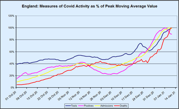
One of the features of this winter’s covid–19 wave that has perplexed Dr No, and indeed many others, is the lack of the normal lag between rises in positive tests, admissions and deaths. In the normal course of events — and as we are so often told by political and media experts — admissions lag behind cases, and deaths lag behind admissions. Yet when we look at the chart above, which presents various measures for England — the methodology will be explained shortly — the lags are rather conspicuous by their absence. From around about Christmas Day onwards, tests, positives and admissions have been in lockstep, while deaths have shown a lag, but only a short one, of about seven days. The peaks in both positives and admissions — both are currently in decline — are only two days apart. None of this makes any sense at all.
Or can we make some sense of it? Dr No started by over-laying the coronavirus dashboard charts, one on top the other, and scaling each layer to match the others. The result was an unholy mess, not fit for publication. So Dr No did the mathematical equivalent, and converted the data so that each point became a point expressed as a percentage of the measure peak values, with the later smoothed by using a seven day centred moving average, with dates based on reported date. The result is the chart you see at the top of this post, with reporting delays, and the use of a moving average resulting in the last date on the chart being the 11th January.
Biologically, this chart makes little sense, unless we factor in something else, and that something else is medical activity, specifically testing activity. Notice the dark blue line, the number of tests done, which has gone from around 60% of current peak activity to 100% of peak activity in just two weeks. In absolute terms, that is from around 350,000 tests every day, to what is currently just shy of 600,000 tests per day. Dr No suggests you might take a moment to let the scale of that increase, both in relative and absolute terms sinks in.
The scale of testing has now reached the point where just about anything that moves gets tested. They probably even test things that aren’t moving from time to time, by mistake. People with pets tests their pets, just to be on the safe side, after reading about domestic animals contracting covid. More importantly, anyone who gets with 100 yards of a hospital gets tested, and re-tested if the first test is negative, with the vast majority of these tests being the ultra-sensitive PCR tests.
Now, the crucial thing to look at in the chart is the gradient of the lines, particularly during the rise since Christmas. What we see is they are all the same, each one rising in lockstep with the others. What does this mean? Consider a situation in which the actual epidemic is in a steady state — cases are not really going anywhere — and yet you double the number of tests. What happens is you will get twice as many cases, but it isn’t because cases have themselves increased, it is because testing has increased. What you have is a testdemic, and apparent epidemic caused not by rising case numbers, but by rising test numbers. The key point is the gradients being all but identical, which explains the lockstep. If true cases had been growing faster than the growth in tests, the lines would diverge, but they don’t. The increased testing drives the increase in cases and admissions in real time, and that is what accounts for the loss of the normal lags between successive events.
What happens next is far from clear. Cases, or rather positives, and admissions have both started to decline in recent days, despite ever more frantic testing. This is an indication, and only an indication at this stage, that this recent winter wave is in decline. Nonetheless, this wave, which has caused so much anxiety and alarm, was largely fuelled by testing, and testing is a medical activity. It appears that covid–19 has given us yet another new entity, to sit alongside support bubbles, national lockdowns and covid secure workplaces, the medically accelerated epidemic. Let us all hope it disappears as quickly as it arrived.
This is an excellent piece of work, I’m trying to get my head around it: Could it be that the majority of positives are currently being picked-up at admission? That would certainly explain the lack of lag there. If that’s the case then does that suggest that community testing is picking up proportionally very little?
With regard the lag to deaths, that does seem short for Covid. I wonder what the average length of stay is for someone who dies in hospital from all causes? If, as we suspect, large numbers are dying with Covid rather than from it then if it’s about a week then this would add weight to that hypothesis.
(As an aside I can attest to the fact that they do indeed test things that aren’t moving, as in the case of a patient of mine this week who had the misfortune of dying in his sleep and shortly after had two Covid swabs taken – they were of course positive and therefore it was assumed that he had succumbed and no further investigation were necessary, this despite the fact that he had none of the typical symptoms and had been well the previous evening)
“no further investigation were necessary, this despite the fact that he had none of the typical symptoms and had been well the previous evening”
Call for Miss Marple or Hercule Poirot.
Shawn and dearieme, my jaw is on the floor re your last paragraph/quote of same… Just HOW can this be, what might be termed, ‘allowed to be got away with’?? (Yes, I cannot even find words!)
Thank you, Dr No; ever moving towards surely helping the world see that not only does nothing make sense, but why.
Dearieme and Annie – I should have finished my little story – luckily nor the family or me were happy with this course of action and a PM is being undertaken. Sadly this clearly isn’t the norm
Dr No, if your time permits I’d enjoy reading your views of this review of protection and treatment from Oz.
https://quadrant.org.au/opinion/qed/2021/01/covid-19-a-realistic-approach-to-community-management/
Shawn – thanks for your ‘little story’. With all the usual n=1 caveats, it is ‘little stories’ like this one that give an insight into the prevailing mindset. It reminds Dr No of the Berkshire coroner who back in the spring, hearing that a young woman who had died might have had a cough, promptly rubber stamped the death as a covid death. The mindset is in reality an absence of mindset, an absence of a willingness to question. It is a variation on the hammer/nail thing, that when all you have is a covid test then everything starts to look like covid. So all credit to you and the family for asking the right questions!
dearieme – Dr No suggests Mr Holmes of Baker Street is the man you are looking for. The article you link to is well worth a read. Dr No found much he agrees with, particularly on scaling down expectations for vaccines (RNA virus variability, trickiness of the borderline (neither inside not outside the body) nature of the respiratory mucosa, relative newness of mRNA vaccines and associated uncertainties, the ongoing lessons from decades of flu vaccines, and the filtered release of scant very short term trial data predominantly through manufacturers PR departments). The discussion on the impracticability of herd immunity is interesting, and has important implications. As with just about everything else it has touched throughout the pandemic, it seems all but certain our government has over-promised but will be seen to have under-delivered on the miracle of the vaccine cavalry.
The discussion of drug treatment is slightly less convincing. The pros cons and most notably knowledge gaps (trials just not done) of RCTs vs observational studies is OK but the ‘case for HCQ’ relies on relative risk reduction (dressed up an as OR), with no mention of NNTs (this risks the age old trick of presenting a benefit as a dramatic relative risk reduction, which hides an all but trivial absolute risk reduction, and so very high NNTs). Dr No has a vague sense of perhaps reading an argument predicated on its conclusion.
If all admissions are being tested, is it not possible that the number of positive tests are not driving number of admissions, but number of admissions driving number of tests positive? And if number of admissions are increasing and all tested, won’t that be driving up the number of tests? And we know anyone with a positive test within the previous 28 days is a CoVid death irrespective of actual cause, it means any death after admission, or already in hospital being recorded as CoVid could explain why there is little or no lag between infection and deaths.
A little story of my own. My brother, two months off 80, in care home having had a stroke 4 years ago, progressive dementia, unable to speak, becoming frail. He tested negative after a test on Monday, week before Christmas, then was tested again on the Friday, the results back on Monday of Christmas week being positive. No further test was done to confirm.
The Sunday evening after Christmas the home informed us he had CoVid. Symptoms confirming this diagnosis being diarrhoea, tiredness, loss of appetite. On Tuesday evening we were informed he was out of bed, eating normally and in good spirits. I think too much Christmas goodies, but now he is a CoVid statistic, probably x 2, the test and then the disease. Also perhaps first case of ‘Short CoVid’.
We were told he had the same symptoms as the other residents who had had CoVid, all now statistics.
Dr No, I wonder what you make of this – which I saw today through Slashdot, the techy social media site.
“Almost a third of recovered Covid patients return to hospital in five months and one in eight die”
https://www.yahoo.com/news/almost-third-recovered-covid-patients-180255388.html
At first I thought that might be real news, and worrying. Then I applied the stuff that sits above my throat and between my ears, and bagen to get some glimmerings.
Namely, if almost all the people who suffer severely from Covid – and in particular, those who die – are already old and ill, Covid might be slightly accelerating their demise. Or it might have been scheduled for six months or whatever after they were admitted for Covid.
On the face of it, the article should mean that people are dying in thousands. But, as we know, they aren’t.
John B – short covid, cured by Christmas goodies! And yes, plenty of scope for double counting.
“If all admissions are being tested, is it not possible that the number of positive tests are not driving number of admissions, but number of admissions driving number of tests positive? And if number of admissions are increasing and all tested, won’t that be driving up the number of tests?” Good questions. All emergency admissions, including it appears already known positives, are certainly tested (and re-tested if first test is negative), and that could certainly drive up the number of positives, a sort of over-zealous screening bias, but it is not entirely clear how and when these positives are counted. Furthermore, overall emergency admissions in December were in fact down – more on both these points later in this comment.
Dr No has gone back to his original unholy mess not fit for publication overlay chart based on screen grabs from the coronavirus dashboard and made a few improvement and here it is, over a slightly longer time frame so we can see the October rise more clearly. The same principles apply (plots scaled to same time frame 1 Sep to 1 Jan, and peaks at same amplitude) and this version shows only positives (‘cases’) and admissions because adding more starts turning it into an unholy mess:
There are two things of interest going on when we compare the October rise and the December rise. The October rise shows what we would expect: admissions lagging behind positives by getting on for two weeks, and the gradient of the admissions curve is a little slacker. The trough in late November/early December is also as expected, with the fall in admissions lagging behind the fall in positives.
Then we come to mid/late December through to January, the period when testing went through the roof, and we see the two interesting oddities. First, the positives and admissions go into lockstep (compare the two gradients between the two periods of increase), and secondly the lag shortens greatly, from around fourteen days in the first rise to around four days in the second rise.
Biologically, this short lag is implausible, if not impossible. The clinical course of covid is such that it takes time to become ill enough to need admission. But this only applies if we assume the events are coupled, by which Dr No means that the patient who tests positive on one day is the same patient who gets admitted around fourteen days later. What if instead we are looking at uncoupled events? What it today’s covid admissions aren’t test positives from two weeks ago, but are instead additions, created by over-zealous testing, with covid diagnoses being handed out willy nilly, in the manner seen in our ‘little stories’?
This, it seems to Dr No is the least bad, or least implausible, explanation for the shortened lag. New covid cases are being recruited among admissions, over and above the coupled cases, and so the covid admissions go up faster, and with less lag, than if there were only coupled positive then admission cases working there way through the system.
That said, apart from the steep rise in overall testing, Dr No cannot find any easy ready evidence to support this. Pillar 1 testing rates, on the other hand, which is supposed to be for patients with ‘clinical need’ (so sort of implied hospital in-patients) and NHS staff, has flat lined for months. Almost all of the rise in testing is in Pillar 2, and much of that in recent weeks has been fuelled by increased lateral flow tests.
Two other possible lines of enquiry have appeared during Dr No’s research into this anomaly. The first is the question of the role of hospital acquired covid infection, but the data on this is somewhat blurry to say the least. The second is the role of overall emergency admissions. These were in fact down in December 2020 (latest month of available data) by 17.9% compared to December 2019, which NHS England drily notes are ‘likely to be a result of the COVID-19 response’. Could part of that ‘COVID-19 response’ be an undue likelihood that those who do get admitted are increasingly likely to be touched with covid’s cold finger? If either of these lines of enquiry bear fruit, Dr No will post the results.
Tom – your interpretation (already old and frail, already have one foot in God’s departure lounge) is likely to be on the right track. While doing the research mentioned in the previous comment, Dr No came across some re-admissions data, and it may be there are some answers there.
Dr No, thank you for your comments on the Oz work.
Now then: “certainly tested (and re-tested if first test is negative)”. Are they retested if first test is positive?
I remember the Elon Musk wheeze: four tests in succession, with the results two positive, two negative. OK, he’s a Barnum and Bailey type, but I’ve no reason to suppose he lied or exaggerated about his tests.
dearieme – see this comment on a previous post about likely current practice (likely, but it was issued in June last year). Short answer seems to be they should get at least one more test before discharge, regardless of previous test results.
ONS have released their routine weekly deaths report (to the week ending 8th Jan and these are deaths by week of registration, not week of death) this morning, and on first impressions it is a OMG report, with weekly deaths apparently going through the roof:
But as all acknowledge, Christmas and the New Year delay registrations. What happens if we put the deaths back where they belong (take 4000 deaths from final week on chart and add them back, 1500 and 2500 to the penultimate and last week of last year)? Things look far less OMG, rather more nil desperandum:
Positives and admissions were well on the rise by mid December (see original chart and overlay chart above), and so some of those should already be showing up as deaths – but they aren’t. There are two possible explanations: the deaths have yet to filter through the system, or the ‘cases’ and ‘covid’ admissions are in part a testdemic, and so do not represent a cohort at risk of death. Both explanations are probably true, and only time will tell what their respective impacts were.
Similar goings-on in France. Alpes-Maritimes: the number of patients hospitalised with CoVid and under intensive care as reported by Public Health France, is 564 and 69 respectively. But according to Nice-Matin (local press) their enquiries direct with the hospitals, show the actual number to be 233 and 55 respectively.
The newspaper plotted PH France data v data from the hospitals in the region, from 01 October to 11 January. Two differences: the PH France numbers are 2,5 higher; from 01 October until 01 November (second lockdown in France, the curves mirror, but after that the curve of data direct from the hospitals shows relative stability, whereas the PF France curve shows a constant increase. Quite a rise during the second lockdown which ended 15 December but bars restaurants stayed closed and a curfew introduced 8pm to 7am, replaced by a new curfew 02 January 6pm to 7am, then a steady rise thereafter to date.
So why the difference?
The correspondent reports: Trying to get answers to the questions raised by the data, plunged us into a totally Kafkaesque universe, at the end of which we could only offer hypotheses, each party having given us complex explanations.
It seems the usual problems emerges. What exactly is being counted? Patients admitted for other things but tested positive, previous CoVid patients readmitted for other reasons, tested and classified as CoVid…. same really as in the UK. And they make the point, the more tests, the more positives.
They also conclude it is certain to be a national problem, not just localised to one region. To which we might also conclude not just National, but multi-national.
And of course, the Government’s policy is based on ‘the numbers’ and the ‘experts’.
Article here with graph in French:
https://covidinfos.net/covid19/les-hopitaux-seraient-deux-fois-moins-occupes-que-ne-laffirme-sante-publique-france-selon-nice-matin/2943/
“The clinical course of covid is such that it takes time to become ill enough to need admission”.
That is logical, Dr No; but of course we must take into account that, according to the government, a positive test alone constitutes “illness”. Anyone at all might test positive at any time; just now I was listening to Dr Sucharit Bhakti’s video interview https://vimeo.com/498561475 in the course of which he mentions that 60 people were recently ordered to quarantine in Germany because they tested positive. They requested a second test, and 58 tested negative with two marginal positives (almost certainly due to too many cycles).
If someone is admitted for a genuine illness, automatically tested on admission, and found positive, this is a “case” but very likely not an illness. So calculations of elapsed time are inapplicable.
My 91 year old mum is in a nursing home and has just tested positive. If she’s lucky she’ll be isolated for 14 days and then released from isolation. However the care home say she won’t be tested again for 90 days as tests can still come back positive up to that time even though she’ll no longer be infectious.
If the care home know this, and they’re monitored by the CQC, local authority, CCG, PHE and uncle Tom Cobley and all then why isn’t this more widely known?
Tom – this is the problem of blurring the traditional concept of so-called ‘caseness’, whether a person is a case or not. If we use the word disease rather than illness, then dis-ease reminds us that one if the things a dis-ease/illness has to do is dis-ease you. In other words you have to have symptoms. The blurring started big time when risk factors (uncomplicated high BP, uncomplicated raised cholesterol) became diseases (and it may be no coincidence that diseases provide fertile ground for Big Pharma) and one fears will only end when old age itself becomes not a stage in life but a disease to be treated. Indeed the architects of this ghastly dystopia are already waiting in the wings, with their poly-pharmaceutical pills that all must take…
Good point about calculations of elapsed time being inapplicable.
Terry – very likely your 91 yr old mum also knows! Dr No is demonstrably not a conspiracy theorist, but there are times when he has an uncomfortable feeling that someone, somewhere, is desperate to keep this pandemic hot and high for as long as possible.
Another can of petrol for the bonfire, the emergency admissions Dr No mentioned earlier:
You can just about make out past ‘winter pressures’ seasons as periods of reduced variation. But the stand out thing from this chart is 2020, including the finding that even in December, emergency admissions are still strikingly below normal for the time of year.
Are reduced admissions in 2020 due to the ‘nothing but CoVid’ can be treated/save the NHS policy?
John B – yes, a combination of NHS clearing the decks and the public staying away, both to ‘protect the NHS’ (truly bizarre, as many have noted: you are sick, you need the NHS, so you stay away to ‘protect the NHS’) and because of good old fashioned avoiding hospitals because they are full of pestilence.
Dr No managed to re-find a website he came across a while back that shows HES (Hospital Episode Statistics). These are generally not the best quality data, and the jargon needs translating eg an hospital admission episode is the entire admission, FCEs (Finished Consultant Episodes) are spells under one consultant, so you might have more than one FCE in a single admission, which is why there are more FCEs than admission episodes. Recent data (since April 2020) is also provisional. The painfully long url is hidden in this link, use the < and > buttons at the bottom to navigate round the site. You will see that all hospital activity took a big hit during 2020. The Emergency Admissions data is pretty much the same as that on the chart two comments above, but because of the different timescale and inclusion of larger measures the charts in the link make the emergency admissions drop appear smaller, despite showing pretty much the same data.