Lies Damned Lies and the FT
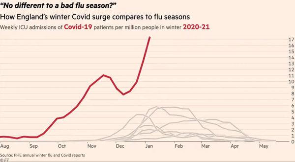
This image shows the climax of one of two animated charts produced by the FT’s data journalist. Currently doing the rounds on twitter, it purports to show the strain on, and so by implication the imminent collapse of, the NHS. It matters, not least because it has been viewed for getting on for 2 million times, and so is likely to have had something of an impact on the current political, media and public perception of where we are with covid. At first glance, it is alarming. But is it a fair representation of the facts? Dr No is pretty sure it is not, though proving that is easier said than done. Nonetheless, nothing ventured, nothing gained, so what can be found out about this chart?
The chart is a plot of selected weekly ICU admissions for recent winters. The red line is this winter’s covid admissions, and the other beige lines each represents a recent past winter’s flu admissions. On the face of it, this winter is exceptional. Although the period from August to the start of November is unremarkable, being just a normal flu curve happening earlier in the year, once we get to early November, the curve takes off, quite literally dwarfing the curves from previous years. To get the full effect, you need to see the animated version.
The animation, and even the still image above, work so well because of the visual difference between the beige flu lines and the red covid line. After some fairly deep digging, Dr No has confirmed the lines do indeed represent the data held by PHE, though some minor details have been changed, for instance the plot is per million rather than per 100,000. The denominator, the per million/per 100,000 are per trust catchment population of the trusts reporting the data, so the denominators are comparable. Can the same be said for the numerator, the number of cases, per denominator?
Dr No dropped a big hint a couple of paragraphs ago, by italicising covid and flu. This is a red flag, because the data represent two different conditions. For the rates to be comparable, the reliability of case counting, or case ascertainment, has to be the same for each condition. If, for example, you were to count all covid cases, and then some, but were for whatever reason less rigorous in counting flu cases, then you cannot reliably compare covid cases with flu cases. The chart then becomes at best meaningless, at worst, a damned lie likely to instil fear and despondency in a demoralised population.
Given the crux of the matter is how cases were counted, what do we know about this? For both flu and covid, the case definition is effectively the same, an ICU admission with a laboratory confirmed diagnosis of the relevant condition. But that is where any semblance of comparability ends. For covid, we know there has been testing on a reckless and colossal scale, and furthermore that testing, particularly in hospital, is done using a remarkably sensitive test, the PCR test, that is more than capable of detecting past, now no longer relevant infection. Almost all, if not all patients admitted to hospital will get a covid test, and if positive, will become a covid patient, even if their primary diagnosis is something unrelated. Any of these patients then admitted to ICU will be counted in PHE’s data as covid ICU admissions, and so will contribute to the red line on the chart.
For flu, the situation is entirely different. Most patients don’t get tested for flu, because flu isn’t part of their diagnosis. Even in patients admitted with an influenza like illness (ILI), there is no obligation to test for flu. Despite his best efforts, through both formal and informal enquiries*, Dr No has not been able to get an estimate of how many patients admitted with ILI would routinely have been tested for flu over the last decade, the period covering the beige lines on the chart. Nor has he been able to discover much , apart from a distant hint that early data might not be that complete, on the quality of data collected by the UK Severe Influenza Surveillance System (USISS), the routine surveillance system used over the last decade to collect the data that directly gives rise to the beige lines on the chart.
What we do know, however, is that routine data surveillance, not exactly the most glamorous corner of the medical world, tends to under-perform. Under-reporting is rife. A 2015 study looking at a similar flu surveillance system used in America, which is the closest we are going to get to an indirect feel for the quality of USISS data, found that less than half of patients aged 18-64, falling to less than a third of patients aged 65 and over, admitted with a respiratory infection to the study hospitals in the surveillance network were tested for influenza. The study concluded that, overall, surveillance detected laboratory confirmed cases of influenza under-reported true 18-65 year old cases by a factor of three, and rising to a factor of five in those aged 65 and over.
There is a world of difference between sleepily recorded routine data, and that collected in the urgency of a full blown pandemic. There is no reason not to suppose that the recent historical routine data from England, the beige lines, have not suffered a throttling similar to that seen in the American flu surveillance system data. Recall, no test means no lab confirmed case means no show in the PHE surveillance data, and so no show in the beige lines in the chart. If — Dr No accepts it is if — similar throttling of flu testing happened here over the last decade, causing significant under-reporting, then we need to give those beige lines a big kick up the backside, a kick almost certainly large enough to put them on a par with, if not above, perhaps significantly above, current covid levels.
*Edit 08:40 11th Jan 2021: Dr No has now had an answer to an informal enquiry, and turns out that, at least in one trust, all admissions with suspected flu are tested. This clearly weakens his argument, but does not rule it out, since it doesn’t rule out the hot stuff bias/diagnostic drift elements of the argument, ie everyone gets tested for covid in a climate of heightened covid awareness vs sleepy normal routine surveillance. Those who know how medicine works on the ground will Dr No is sure concur — as Shawn does in the comments — that idealised policy on paperwork and reporting rarely translates into actual practice. And then there is that American paper, and that distant hint in a British paper: “[USISS] data are available by age group and influenza type/subtype. However, when stratified by both, as well as week, many zero counts are observed.”
Thank you.
I have lost all faith in just about everything from the integrity of our masters, the police, the MSM etc. & now adopt the late George Carlin’s stance. I don’t believe a single ****ing word from the government or any of its minions.
When I saw this chart, my reaction was to ask myself questions around “apples:apples”, “pears:pears”, “how is a ‘case’ defined” etc.. But I have long since lost the will to follow through. Your stamina & persistence is much appreciated.
How long before your platform shuts you down?
Devonshire Dozer
I wonder how that last Asian Flu epidemic would look on such a plot? (Was it also known as Hong Kong flu?)
https://bjgp.org/content/59/565/622
I would echo Devonshire Dozer’s sentiments: I saw this doing the rounds, it didn’t pass the smell test, I moved on. I’m grateful for you pointing out why it’s so patently misleading (I once tried to do a flu swab but didn’t have the correct swab, or form, or know which orifice should be probed). Keep up the good work!
Devonshire Dozer: apples and pears all but appeared in the post, and case definition, or more specifically, case ascertainment, ie how the definition gets ‘operationalised’ and cases actually get counted, and beads on the abacus get moved, is crucial. Shawn’s candid insight is telling, and will be familiar to many doctors both in hospitals and general practice. Dr No supposes that another way of looking at this might be to say that wholesale covid testing of all patients and hot stuff bias etc tips the scales in favour of a covid diagnosis, while in normal flu years the workup and paperwork need to get a flu diagnosis recorded tips the scales in favour of a case not being recorded.
For the avoidance of doubt, Dr No has no intention of being shut down! He has long suspected the difficult to prove shadow banning of his tweets on twitter, which is one of the reasons he strongly favours this blog. Another reason for favouring a blog is there is no social media platform involved, no equivalent to twitter/facebook. It’s just Dr No, as writer and publisher, and you, dear reader. The platform acts only as the pipework and conduits through which words and pictures flow, and unless Dr No starts spouting incendiary nonsense, as opposed to voicing legitimate concerns, he does not expect the platform he uses to find reason to interfere.
dearieme – a very interesting paper, well worth a read. Rather too much of it sounds all too familiar.
Dr No came across this “Healthcare associated COVID-19 infections* – further action” directive issued by NHS England to all trusts in June last year (with no indication that it has been withdrawn or modified), with details for impatient testing:
A. Inpatient testing
The current inpatient testing programme remains:
(i) all patients at emergency admission, whether or not they have symptoms;
(ii) those with symptoms of COVID-19 after admission;
(iii) for those who test negative upon admission, a further single re-test should be conducted between 5-7 days after admission;
(iv) test all patients on discharge to other care settings, including to care homes or hospices;
(v) elective patient testing prior to admission.
This is extremely thorough, and is unlikely to miss any positives (be they cases or not cases). If flu testing in past years was not carried out (and reported) with the same rigour, then the red and beige lines on the chart are not directly comparable.
* These hospital acquired infections are something Dr No is looking into: how many inpatients with covid caught the infection whilst in hospital? Two CEBM reports (here and here) from October last year suggest the number may be around one in five.
Excellent post, thank-you. You added:
“all admissions with suspected flu are tested. This clearly weakens his argument but does not rule it out, since it doesn’t rule out the hot stuff bias/diagnostic drift elements of the argument, ie everyone gets tested for covid in a climate of heightened covid awareness vs sleepy normal routine surveillance.”
Exactly. Elderly patients with serious underlying health conditions are less likely to be tested for suspected flu when these other conditions are presenting the major symptoms. And yet these are precisely the category of people where flu death is likely to be highest. And it is certainly the category of people where covid death is highest. An article about flu in 2018 in California throws away this comment:
“State officials collect flu death data only among people under 65; the actual death toll from the flu is much higher.”
https://www.latimes.com/local/lanow/la-me-ln-flu-demand-20180116-htmlstory.html
If we adopted the same approach to covid death data, the overall picture would be completely different (and if we didn’t lockdown, there would be significantly less excess death – possibly a lot less).
I have contacted several NHS trusts via FOI to request ‘Do Not Attempt CPR’ order statistics on their reported (in October) covid deaths and to date I’ve had the following details:
1. Out of 515 patients who died in Kings College Hospital, 440 had a DNACPR order (85%).
2. Out of 623 patients who died in London North West University Healthcare, 555 had a DNACPR order (89%).
3. Out of 353 patients who died in Royal & Broadgreen Hospital, 337 had a DNACPR order (95%).
Whatever the explanation is for such a high proportion of covid deaths in patients with DNACPR orders, it is yet another example of how the data is being manipulated to make us worry about deaths that are entirely non-representative of the public the overwhelming vast majority of whom do not have DNACPR orders on their medical records.
A picture paints a thousand distractions.
According to the FT graph at the start of December there were 8 per million = 530 approx, rising to 17 per million = 1 125 approx. CoVids in ITU.
From the French Govt website today, there are 2 629 patients with CoVid en réanimation… that is ITU plus high surveillance beds. There are currently 24 559 CoVid cases in hospital according to the same site.
The French healthcare system is not on the brink of implosion like the NHS is said to be.
Years ago the NHS operated a number of Fever Hospitals it had inherited in 1948, these continued in use for gereatric and respiratory diseases, as well as other infectious diseases. All of these closed by 2 000, or had their use changed, I believe.
I worked in the NHS between 1971 and 1975 in two large city hospitals. I do not recall a Winter ‘flu crisis with the hospitals overwhelmed, exhausted heroic staff slumped on the floor, etc. I also was associated with healthcare on the supply side until the late 90s but don’t recall an annual Winter calamity. Maybe I just didn’t notice.
I wonder if taking those former Fever Hospitals out of service has anything to do with it? Putting infectious patients in a general hospital with non-infectious patients is just the thing to do isn’t it? We used to know how to deal with infectious diseases until this knowledge and practice was replaced by ‘The Science’.
FT graphic. The shape of this year’s curve is different from all the others in that its sharp rise starts much earlier, during September, peaks in November, then declines sharply in early December, does an about turn upward throughout December.
Is this significant? What might an explanation be? Why would CoVid have such a different trajectory from influenza in previous years when it has behaved much the same up until now: the famous ‘new strain’ came too late, so cannot explain it?
Great blog Dr No.
Mr Doyle – interesting data in those DNR FOI replies, and chimes with an anonymous personal view by a respiratory consultant that Dr No read recently that had him wondering whether part of the 2020/covid madness is a blind admit everyone approach that ends up with far too many people being admitted, and, as a result, far too many people dying in hospital with a covid tag on their big toe.
This dying at home/in hospital thing is always tricky. Dr No’s mother, who died in February 2013, was absolutely determined she would die at home, and in the end she did, but not without an awkward twist caused by overzealous paramedics. What would we have done if covid had arrived in 2012, and she got it in February 2013, and been very ill (diagnosis not entirely clear, but ‘something respiratory’) at home? Ignored her wishes, and admitted her anyway, with a DNR order stapled to her night dress? Dr No doesn’t think so, but what if she was still alive today, and were to get ill in Feb 2021, again diagnosis unclear, but ‘something respiratory’? Would covysteria ‘mandate’ she be admitted, only to get a DNR order once she was on the ward?
John B – France probably has rather more beds, see here (sort by continent), although some of the data may be out of date by now (if SAGE can use wikipedia, so can we). Here, the Tories have been hacking away at beds over the last decade, like secret loggers in the rain forest, not knowing or caring about the unique resource they are destroying. As came up not so long ago, a health service works more efficiently, and humanely, both for patients and staff, when it is not at full throttle. It needs a bit of slack to accommodate surges.
Another Tory habit was (and still is) selling off the family silver ie getting rid of parts of the NHS estate. Fever hospitals, cottage hospitals etc were (and are) being liquidated. Fever hospital were a bit before Dr No’s time, though he has worked on sites that used to be fever hospitals, but he has done visits/ward rounds on cottage hospitals where tea and biscuits in sister’s office was part of the ritual, and the smell of beeswax polish from the oak stairs was stronger than that of disinfectant on the wards. We also washed our hands before examining patients, in winter as much to warm our hands before touching the patient, as much as for infection control. These reminisces are to say that there is a place for these half way houses, between hospital and care home, and their loss is our loss.
The November peak, early December trough, and then (steep) rise again path of the FT curve is mysterious, in particular the trough. It is also seen on the corona dashboard, for test positives, all admissions and deaths, with positives and admissions moving averages bottoming out on pretty much the same day, 28th or 29th Nov, and deaths a few days later on 3rd or 4th December. Both the lack of lag, and the fact there is an apparent trough at all are mysterious. Some will suggest the November lockdown, but this seems unlikely, given test positives and admissions peaked on 10/11th Nov, only five days after the lockdown started.
If you move the red line 3 months to the right, the first part of the curve does indeed match the flu curves:
This too is curious: why the flu gradient, rather than the covid gradient seen in the spring?
“The November peak, early December trough, and then (steep) rise again path of the FT curve is mysterious, in particular the trough”.
I assume that the trough denotes a period when the laughably crude logistics system collapsed, and it was not possible to conduct thousands of tests every day.
Thanks for the response.
I went to nursery school in an old sanitarium. It was a mile or two outside the town, surrounded by agriculture, with a good southerly aspect, with a view over the sea, and – being on higher ground – exposed to healthy breezes. As a sanitarium it must have been closed under a Labour government.
As far as I can see the dreadfully dim decision to treat infectious diseases in general hospitals is just part of the NHS. No doubt doctors will try to evade responsibility by blaming politicians but many of the thoughtless decisions must surely be made at a level below government ministers?
The other day I read a doctor explaining that patients wearing CPAP masks found it dreadfully uncomfortable to lie prone because the ward didn’t have beds with a face hole, of the sort physiotherapists use. Why the bugger not? The dimwits have had almost nine months of notice to buy some. Or, could they not mimic the effect by adroit positioning of pillows? Just how unenterprising are these people?
Tom – logistics will no doubt have had a hand in things but that chart is ICU admissions, who will almost certainly have got their covid diagnosis earlier in their ‘patient journey’.
dearieme – you are right, some doctors are part of the problem. Some are brilliant, but in many ways medicine is like the other two great professions, the military and the priesthood. For every Wellington, there are many donkeys. For every Martin Luther King, there are many others covering up the sins of their brothers. Groupthink is rife, and a innovation is actively discouraged. Dr No remembers once trying to set up a computer based system to manage rewriting very overloaded drug charts for long stay patients, because the routine and regular rewriting these charts is one of the most tedious and boring jobs known to a doctor, and so is error prone. The consultant Dr No was working for didn’t actively get in the way, but the hospital’s pharmacy department started hissing like a snake, and all but reported Dr No to the GMC, and before long the consultant shifted towards supporting the pharmacists, no doubt mindful of the fact he would have to carry on working with them long after Dr No had moved on. Such are the ways that innovation gets stifled.
But there are innovators. Dr No’s mother had polio quite badly in her teens, and was all set up for months in an iron lung, but a medical uncle wasn’t going have any of that sort of nonsense, and set her up for active management, against the then conventional medical wisdom, and the outcome was almost certainly far better than it otherwise would have been.
Today’s ‘news’ that large numbers of front line NHS staff are or soon will be suffering from PTSD worries Dr No somewhat, not least because it smells of diagnostic drift. Medicine is a beguiling mistress, but often a very cruel one, and part of learning how to be a doctor is learning how to get past the cruelty. Again, an anecdote from Dr No’s career: as a casualty (as it was then) SHO, Dr No was part of the flying squad that went out to major accidents. Those of us who chose (as we could in those days) that hospital for our casualty job did so precisely because it was notorious for having more than its fair share of major accidents, being situated near some dangerous roads, and we were keen to learn. On the August bank holiday, Dr No went out with the flying squad to an accident. All four of the young occupants of the car were already dead, and instead of learning how to save lives, Dr No learned how to confirm death in the mangled remains of what had once been a car. It was, literally, both shocking and sickening, the terrible end and waste of young lives. Once Dr No got back to the casualty department, there was nothing: no debrief, no so sorry, just the next patient to be seen. Unlike the young people in the car, the young Dr No survived, and perhaps he had learned something else as well, that medicine is cruel but the doctor can still carry on.
Dr No is very aware of how harsh what he has just written is, and it stinks of we old timers just got on with it, so you juniors should just pull your socks up and do the same. If he were boss, he would certainly do more for his juniors than happened that August bank holiday long ago, but how much is delicate. He is mindful of studies that suggest individual post-trauma debriefing and counselling, particularly if single session, may not be of any help, and may counter-intuitively actually worsen outcomes. Post trauma group therapy may do better, but perhaps what we really need is preparedness before the event. But how, especially when there will always be times when we don’t know what the event will be?
Dr No: did those medics who run the place decide that after the first pressure period of March-May some effort should be made to give the hardest pressed staff a break – maybe a week or two of extra holiday come the summer? If not why not?
dearieme – not as far as Dr No knows, and the managers would have said oh no, we can’t do that, we’ve got such a large non-covid backlog to catch up on, but you are right, it is things like this, something special, that make all the difference. Not to mention, a refreshed doctor is almost certainly going to work harder and better on his or her return, and more than make up for the extra week off, so in fact its win win.