
Through a Glass, Lightly
And though I have the gift of prophecy, and understand all mysteries, and all knowledge; and though I have all faith, so that I could remove mountains, and have not perspective, I am nothing… With all due apologies to one of the finest bits of English prose ever written, the major problem facing anyone foolish enough to attempt to put the 2020 covid epidemic in perspective is lack of perspective. Our dear ONS diligently collect more than enough data to fill the storehouse of the mind, but all too often it is ad hoc, or presented through shifting frames of reference. The result is that almost all attempts to put covid in perspective use a very short time frame, typically five of ten years. This is, Dr No suggests, short-sighted, rather like trying to assess the Victorian era by looking at the last few years of Queen Victoria’s reign. Given that the last decade or so have seen historically low crude and age standardised mortality, 2020, with its excess deaths caused by covid, tends to look pretty dreadful, because we are comparing 2020 with the best years on record.
To get a meaningful sense of perspective, we need a longer time frame, and that’s where we hit the shifting frames of reference problem. Sometimes we end up comparing apples and pears, at others it’s even worse: comparison, and so perspective, is impossible, because there are only apples, or pears, or even no fruit in the bowl at all. When we do find a longer time series with apples and only apples, we tend to find the time interval available in the data is wide, often a year, and this has a profound dampening effect on seasonal variations, so much so that whole epidemics can disappear. We can see this in action in this chart, from Dr No’s last post. This is annual crude (blue line) and age standardised mortality (green line) data published by ONS. Where is the 1968 Hong Kong flu? Where are the other bad flu years since? By using the annual mortality prism, we have effectively written them out of history.
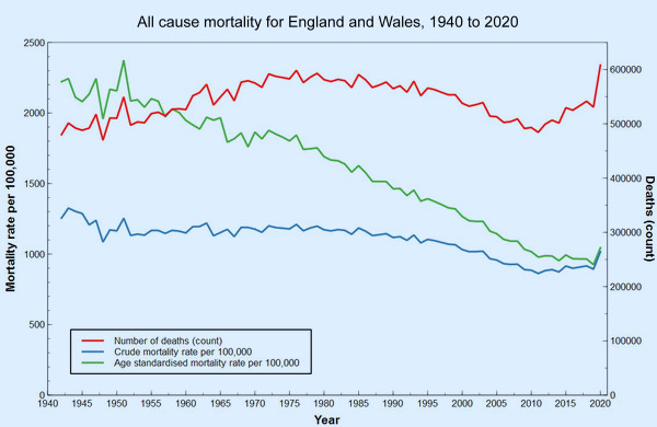
Figure 1: medium term time series of all cause mortality data from ONS.
This ironing out happens because looking at a whole year at a time means we are in effect looking at an average for the whole year. If, for instance, high spring mortality is followed by low summer mortality, the two can cancel each out, and nothing exceptional remains to be seen. To fix this we need shorter time intervals, either monthly or quarterly will do, so we can see the seasonal variations. We then need to apply standardisation, the technical term for taking account of changes in the size and age distribution of populations, so that we compare like with like, apple with apple and pear with pear.
ONS and other official statistical bodies tend to favour a method called direct standardisation. This tends to be seen as the purer method, but it has one major drawback. Direct standardisation requires age band specific mortality throughout all the data to be standardised, and this level of detail is simply not available even over the medium term, let alone the long term, at anything less than annual intervals. There is insufficient information in the data, and we just see annual averages, as we saw in Figure 1, where past epidemics have disappeared.
An alternative method, called indirect standardisation, solves this problem. Indirect standardisation requires only one reference set of age band specific mortality rates, which are then applied to the populations — be they from individual years, quarters, countries or whatever — of interest. We can then compare the expected number of deaths, determined by applying each age band specific rate to each age band in each population of interest, be it from a year, a quarter, or whatever, with the observed number. If there are less observed deaths than expected, things are good, if there are more observed deaths than expected, then things are less good. Conventionally this is expressed as the Standardised Mortality Ratio, or SMR with 100 as the neutral point (observed and expected deaths are the same – there is no difference), with SMRs over 100 meaning more deaths than expected, and SMRs under 100 meaning less deaths than expected.
Although we don’t have quarterly age band specific mortality rates going back over the medium term, we do have quarterly population numbers — that is, how many people there were in each age band of the population — going back to the mid sixties, and so we can do indirect age standardisation, and so calculate SMRs for each quarter over that time frame of over half a century, and so a far better perspective than that gained using the narrow five or ten years time frames. All that remains is to decide what reference population to use, to supply the age band specific mortality rates.
At first glance in might appear that the choice of this reference population is critical, since it is a major input to determining the expected number of deaths. If we accidentally ‘cook’ the expected numbers, then we might find ourselves comparing apples not just with pears, but with prickly pears. But in reality, within sensible limits, these prickly effects are not enormous. Of far greater importance is the fact we are using quarterly data, and so not ironing out seasonal variation by using annual data.
Dr No has run the calculations using no less than four different reference sets of age band specific mortality rate data. The first set, Figure 2, is the original calculation from November last year, that uses Q2-2020 mortality as the reference, now updated to include Q4-2020. The second set, in Figure 3, is Dr No trying to be clever, and uses the matching 2020 quarter mortality for each quarter, so all the Q1 points in previous years have Q1-2020 as the reference mortality, all Q2 points in previous years uses Q2-2020 as the reference, the idea being that we can now compare like quarter with like quarter, because each quarter uses the matching 2020 quarter as its reference. You might be inclined to think, along with Dr No, that this isn’t so much Dr No being clever, as being too clever by half.
The last two sets use a single whole year mortality divided by four (because a quarter is a quarter of a year…) as the source of the reference age band specific mortality data. The third set, Figure 4, uses all 2020 mortality, in an attempt to ‘capture’ the information in all four quarters, including Q4, while the forth and final set, presented in Figure 5, uses all 2000 mortality, partly because 2000 is a pretty average sort of year, with no wild swings, and partly because the necessary data, age band specific mortality in the right age bands is available.
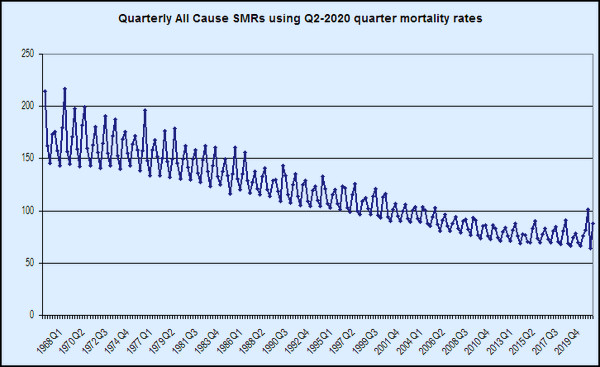
Figure 2: Dr No’s original SMR chart, updated to include Q4-2020. The reference age band specific mortality rates are from Q2-2020. The 1968 Hong Kong flu spike is clearly visible, as are other later bad flu years, including notably 1976.
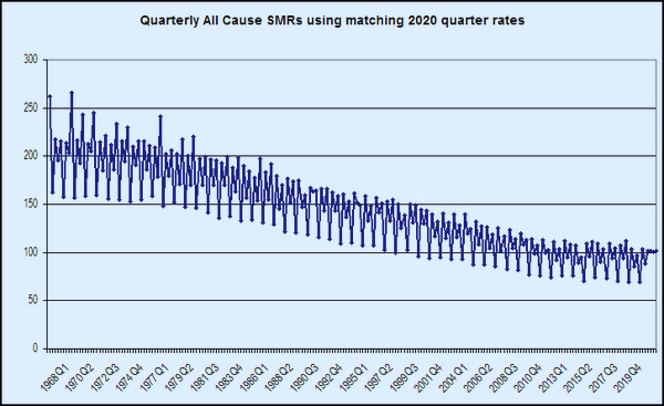
Figure 3: Interesting, but probably too clever by half. This uses the matching 2020 quarter to provide the reference age band specific mortality rates. Each historical Q1 uses Q1-2020, each historical Q2 uses Q2-2020 etc. All 2020 appears as 100, because it is ‘referencing itself’. The past bad flu years nonetheless are still visible.
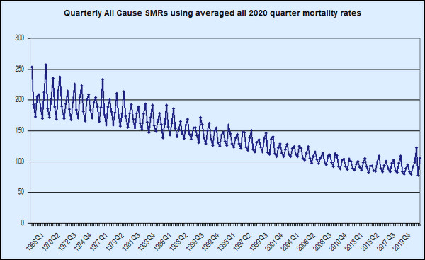
Figure 4: This uses an average of 2020 data divided by four as the reference age band specific mortality rates. 2020 now has a bad Q2, a good Q3, and Q4 going bad again. Because all 2020 is not the reference, 2020 hovers around 100.
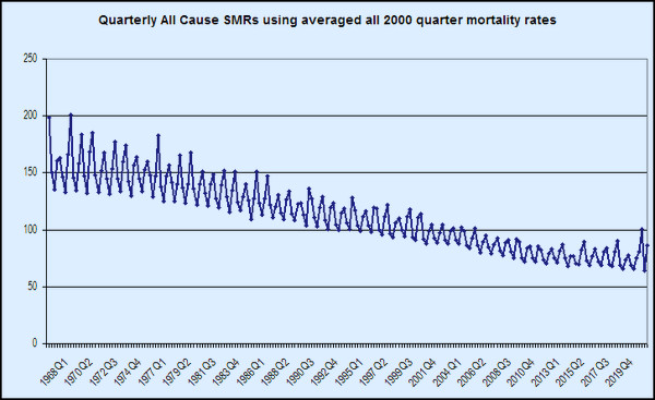
Figure 5: Much the same as Figure 4, but using an average from 2000, a relatively neutral year, as the reference age band specific mortality rates. This is very similar to Figure 2.
The first thing to note is that we have lost the ironing out effect caused by using annual data. Seasonal variation, and exceptional seasons — for instance, the 1968 Hong Kong flu, and the 1976 bad flu year — are now visible, now that we have seasonal data. Apart from perhaps Figure 3, you can choose whichever version of the chart takes your fancy, because interestingly, they all tell pretty much the same story in slightly different ways. The essence of that story, told from a historical perspective, is that presenting covid–19 and 2020 against a short five or ten year recent background is frankly misleading, because, when seen from that longer historical perspective, 2020, though exceptional compared to recent years, is not exceptional seen over the longer term. It is, to put it bluntly, about where we were 20 years ago, in 2000. And yet, for some bizarre reason, we didn’t lockdown then, or indeed in any of the many many earlier years when things were so much worse than in 2020.
Dr No is not saying nothing terrible happened in 2020. It did, but we need a proper sense of historical perspective if we are ever to get out of this mess. And though I have the gift of prophecy, and understand all mysteries, and all knowledge; and though I have all faith, so that I could remove mountains, and have not perspective, I am nothing…
“It is, to put it bluntly, about where we were 20 years ago”
Oh God no, not Toni bloody Blair again.
Bravo! Any way you cut it the same trend can be seen: an improvement from mid-70s that starts to level off in the last 10 years. There also seems to be a reduction in the variance season to season. 2020 is not very special, not only have we lived through worse in the long view it is not even that bad as an exception relative to ‘normal’ in adjacent years.
For now we see through a glass, darkly;
I thought fig 5 so good that I called my wife to look at it. Bravo indeed.
A question for Dr No, not statistical. A French Govt website advises that those individuals who have had CoVid should wait three months after a positive test before having vaccination.
It is my understanding that contact with a virus gives life immunity, rarely not in all individuals, or even contact with similar virus can do this… Cow Pox and Small Pox, the evidence that many have immunity to the SARS CoV 2 because of contact with other coronavirus.
I don’t then understand why anyone having had CoVid would benefit from vaccination, which apparently doesn’t guarantee immunity, but may prevent or reduce severity of symptoms. Won’t a previous CoVid do no less? Isn’t it why so many of us don’t get ‘flu or not get it seriously unless it’s a new strain?
And in any case why the three month wait? What happens if you had it but didn’t realise, as seems to be largely the case, and get jabbed within three months?
What are your thoughts Dr No?
“If, for instance, high spring mortality is followed by low summer mortality, the two can cancel each out, and nothing exceptional remains to be seen. To fix this we need shorter time intervals…”
But why would you want to “fix” it? I assume that the implied “problem” is the noticeable absence of any peak in deaths. But if a peak in spring was followed by a valley in summer, so that total deaths for the year come out about average – isn’t that supremely normal?
Surely the moral is that “to everything there is a season” – whether excess deaths or excess (temporary) survivals.
John B – the variability in advice reflects Dr No suspects the fact we don’t really know much about SARS-CoV-2 immunity, be it naturally acquired or from a vaccine, in particular how effective it is, and how long lasting. The first SARS appears to have long lasting immunity, but that hasn’t been put to the test, common cold coronaviruses have short lived immunity. Our government may have taken a decision to vaccinate everyone for logistical reasons, easier than trying to tease out those who might (but then again might not) have immunity from a previous infection.
Tom – a good point. Maybe both have their uses, and it’s a bit like woods and trees. Sometimes you want the overall picture, sometimes you need to see the detail. Dr No wanted a chart that did show past epidemics, so that we can compare the past peaks with the covid peaks. The explanation of how annual ASMRs smooth out the peaks, and confirmation of peaks cancelling out troughs and vice versa most of the time can be seen in the red and blue lines in Figure 1. Once you have stood back enough to look at only whole year data, the line largely loses its peaks and troughs, so unsurprisingly they do not reappear in the annual ASMRs.
Both the annual ASMR chart and the quaterly SMR charts show 2020 was a bad year. The annual ASMR chart (Figure 1) shows that it has put us back a decade of so, to around 2010, but not much else. The SMR charts show it has set us back a bit further, to around 2003, but they also allow us to compare the individual 2020 peaks with other past peaks, so we get a more detailed picture.
In passing, excess deaths is perhaps an unfortunate term because it implies extra deaths overall, yet we all only ever die once, and so they might more accurately be called shifted or displaced deaths (backwards or forwards in time). But somehow Dr No doesn’t see the MSM adopting such terms anytime soon. Excess deaths just soooo much bettter…
It certainly is interesting and useful to have both views – it’s almost always better to have more information, as long as you know how to interpret it.
What I was thinking was that in the case of the Black Death, for example, you would not have to do a lot of statistical analysis to notice that about half the people in Europe had died.
If Covid-19 is the kind of disease that kills off some people in Spring without showing up as a huge excess for the year as a whole, it’s nothing to get desperate about.
Tom – Dr No agrees, a rare case where more is better. Quarterly charts tell us about individual outbreaks, and annual charts tell us that most of the time, things even out over time.
Another ‘interesting’ facet of these charts is the total time period used. For long time series, the gradient of year on year or quarter on quarter change is much steeper (because each quarter/year is a much shorter distance in the X axis), for shorter time series it is much gentler. This is the ONS year on year ASMR for the last 20 years updated to the end of 2020 and with England and Wales added together (and so is also the last 20 years in Dr No’s latest long series ASMR charts).
Here is ONS’s latest version, England and Wales separated out, to the end of November:
ONS tell us that the 2020 uptick is statistically significant (at least it was in their December version of this chart, covering up to the end of November), but visually it is far less striking in this version of the chart than in the longer time series version (Figure 1 in original post).
Saw this headline on BBC this week, ‘Covid in Scotland: Peacetime excess deaths highest since 1891’ and thought of your post.
https://www.bbc.co.uk/news/uk-scotland-52214177
Over the next few years the impact of the collateral damage of pandemic mitigation strategies on the health of the nation will undoubtedly manifest in national statistics. I guess we need these apocalyptic statements to become embedded in the national consciousness now, so that when impacts of Covid versus Lockdowns are compared, the govt can defend their actions.
Helen – that is diabolical reporting, even by current BBC standards. It contains the absurd statement “The NRS defines every Covid-19 death in 2020 as an excess death”, though it does mitigate the nonsense in the following paragraphs, conceding that some covid deaths are likely to be displaced deaths: “It is possible that many of those who would have died from respiratory disease, died with Covid-19 instead.”
But perhaps the absurd statement isn’t so absurd after all, if it is seen instead as a sort of Freudian slip, that reveals the mindset of the anonymous writer. Another example, perhaps, of the hammer/nail effect, that when covid is the only thing on your mind, then everything starts to look like covid.
It does seem highly likely that the nudge units and PsyOps groupies are “managing expectations” and “establishing narratives”, set on a Wagnerian stage, with smoke and mirrors in the wings, and mood music to match. There was also a ‘minor’ example in yesterday’s Downing Street press conference, the ‘we don’t really know, but we’re going to tell you anyway’ point that the new variant might be a bit more lethal. Very commendably they used absolute risk increase (3 in 1000) which the media swallowed hook line and sinker and later regurgitated, as they knew it would, as a 30% relative risk increase. Job done.