Early Assessment of 2020 Mortality
If there is one thing guaranteed to make Dr No’s breakfast porridge go down the wrong way, it is the sound of Martha Kearney on the Today programme playing her voice as if it was an electric slide guitar. That, and the little pauses after the interviewee stops speaking, and Ms K asks her next question, as she waits for her controller to finish telling her what non-sequitur of a question to ask next. Mercifully, we were spared Ms K’s slide guitar treatment of the 2020 excess deaths data released yesterday, but elsewhere there was plenty of wailing to be had. “More deaths in England and Wales in 2020 ‘than any year since 1918’” wailed yahoo, while Sky News went with “an almost unparalleled loss of life” above some rather lurid blood red background charts of eye-popping variety. In a related twitter thread, Mr Conway sagely pronounced that “there is no definitive measure for the scale of this pandemic. There are other prisms beyond even these…”. Indeed there are. The prism glaringly obvious by its absence is age standardised mortality rates.
Dr No thought he was going to have to updated his quarterly SMR chart, and he may yet still do so, because it uses quarterly intervals which provide a finer grained picture, but for now it turns out that ONS have very helpfully, and curiously discretely, published a long series of annual age standardised mortality rates going back to 1942, provisionally updated to include 2020. Before we consider the chart and what it tells us, a little background on age standardisation might go a long way towards explaining what age standardised mortality rates, or ASMRs, do, and so why they matter. Throughout, we will be considering all deaths, so there are no ‘was it/wasn’t it’ covid conundrums to manage.
If we consider just total number of deaths, we ignore the size of the population. Today, the population of England and Wales is getting on for twice what it was in 1918, and so we would, all things being equal, expect getting on for twice as many deaths. We can fix this by working out the crude death rate, the number of deaths per 100,000 people, but that still leaves another problem, that of a changing age structure in the population. The higher the proportion of older people, the more deaths we would expect. Imagine two islands each with a population of 100,000. The first island has recently been colonised by young people in their twenties, while the other is exclusively a retirement island for people aged 70 and over. Barring the unforeseen, the second island will have many more deaths, even if the actual age band specific mortality rates are identical.
Age standardisation fixes this, and enable us to compare like with like. You can skip this and the next paragraph without coming to any harm, but it is as well to understand methodology. There are two ways of doing age standardisation, and both have their merits and pitfalls. The first, which ONS used, is called direct age standardisation. This uses a fixed standard population, and applies the age specific rates from previous years (or different countries, or whatever is being compared) to this standard population. It is many different rates applied to one fixed standard population, and it allows us to compare the different year (or countries or whatever) as if they all had the same population age structure. The actual rates derived are, it must be appreciated, entirely fictional, but they are nonetheless directly comparable, because the age structure that the rates are based on are identical for each year, country or whatever.
The other method of standardisation, indirect standardisation, does a sort of opposite. Instead of applying many age specific mortality rates to one standard population, it applies one set of age specific mortality rates to all of the many different populations, be they from different years, or countries, or whatever, and determines how many deaths would be expected if the year, or country, or whatever, had the same age specific mortality rates as the reference population. So we end up with a number, of expected deaths, and conventionally we compare this to the observed number, and end up with not a rate, but a ratio, the standardised mortality ratio, or observed divided by expected number of deaths. This SMR is conventionally multiplied by 100, so an SMR of 100 means no difference, while an SMR of say 200 would mean twice as many deaths observed than were expected, signalling a significantly worse mortality.
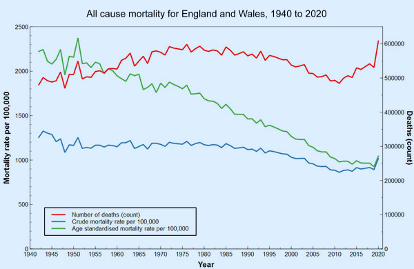
Dr No used indirect standardisation, and SMRs, in his quarterly interval charts, because we don’t have a long time series of quarterly age-specific mortality rates, which are needed for direct standardisation. ONS on the other hand has used an annual interval, and has found annual age band specific mortality rates going back to 1942, and the chart at the top of this post charts numbers of deaths, crude mortality rates and age standardised mortality rates for the period from 1942 to 2020. What do the lines on the chart tell us? Here’s the chart again, for ease of reference.
The number (count, red line) of deaths clearly shows a striking up-tick for 2020, the 75,000 or so excess deaths, compared to recent years, seen in 2020, and attributed either directly or indirectly to covid. It looks pretty grim. Small wonder Mr Conway used blood red on his charts. But if we look at the rates, things appear very different. An up-tick for 2020 is still there, but it is much less striking. For the blue line, crude mortality per 100,000, we see that we have gone back to where we were something just under about twenty years ago. If we then add in age standardisation, as in the green line, we are only back where we were only ten years ago. Covid has had a clear effect, but in the longer term view, it has only moved us backwards a decade or so. Dr No doesn’t remember us getting all worked up about mortality back in 2010; in fact he recalls rather the opposite, as we were on a long trajectory of declining mortality and at the time didn’t know the last ten years, from 2010 onwards, would see a slackening in the rate of that decline.
Put in that long term historical perspective, covid has very visibly reversed recent improvements in mortality, but it isn’t a huge reversal. The steepness and size of the 2020 up-tick is exaggerated by 2019, the previous year, having an exceptionally low ASMR; if we draw a mental trend line through the last ten years’ ASMRs, the up-tick seems smaller. Covid in 2020 was exceptional, but how exceptional is a matter for individual judgement; and in Dr No’s judgment — and you are entitled to your judgement — it is not wildly exceptional. This long time series shows the fallacy of using only short — typically five or ten year — time frames. If the chart, as so many do, only ran from 2010 to or 2015 to 2020, a very different, and misleading, picture emerges.
What about the often considered bad flu year benchmarks? Interestingly, unlike the quarter based indirect standardisation used by Dr No in past charts, direct age standardisation has all but flattened most of them out of existence. Small up-ticks can be seen for 1957-8 (Asian flu), 1968-9 (Hong Kong flu) and 1976 (another bad flu year), but it is only 1951 — not widely recognised as a bad flu year, despite the fact in parts of the country it was worse than the 1957, 1968 and 1918 pandemics — that stands out as a definite spike. Indeed, this apparent flattening out of known epidemics has Dr No intrigued. WWII has also been ‘disappeared’, and there is no mention Dr No can see that the data is limited to civilian deaths. Might there be something about annual direct standardisation that irons the wrinkles that other methods leave behind? At some point, Dr No hopes to update his quarterly SMR chart, but there are some methodological questions that need to be resolved before he does so, so it will have to wait for another day.
Not sure if it is helpful but there is a series of Quarterly updates at CMI Mortality Monitor
One of the best decisions of my life was to stop listening to the Today programme. I have since extended it to not watching TV news nor listening to radio news.
“ONS have very helpfully, and curiously discretely …”: my money is on your meaning ‘discreetly’.
It’s striking how much bigger the 1951 flu spike is than the Covid spike.
“from 2010 onwards, would see a slackening in the rate of that decline.” The immediate cause of death may be distinct from the long term effects that contribute to death, So, given the inevitable time lags that occur in health, what differences in the preceding thirty (say) years caused that flattening off? I’ve seen someone write that it is a consequence of making it easier to buy booze from supermarkets. Any views, doc?
Yet again, a big ‘thank you’ to Dr No. Those charts are much more in line with what I see & hear for myself.
Like dearieme, I abandoned the entire MSM a long time ago. It’s only sources like this one & a few others that keep me even close to sane.
We are being conned, manipulated & played – yet nobody in the mainstream of politics or the media i s prepared to say what should be plain to see. Why?
When in doubt, my inclination is to follow the money. If you do that, you’ll trip over one Tony Blair at some point. I don’t need to know any more! It’s about money, power & control. No other explanation.
As we lurch closer to compulsory ‘vaccination’ and associated passports, I need to find a medical man of principle who is prepared to administer the appropriate substance into ones shoe leather & then issue the right piece of paper/chip/tag . . . or whatever device it turns out to be (excluding an implant). Alternatively, connect with a (likely East European) forger & fixer. Any suggestions?
djc – a useful and well presented extra source of data but it only goes back a couple of years. For the quarterly interval age adjusted rates, you either need age band specific quarterly rates going back in time for decades (which is what we don’t have) to do direct standardisation, or current (or another) single reference set of age band specific rates, and quarterly populations by age band, both of which we have, and so indirect standardisation, and SMRs, are possible.
dearieme – nobody has really come up with an answer to the recent slackening in decline of mortality clearly visible in both the crude and age adjusted rates. Easier access to booze via supermarkets (and so presumably increased consumption, which did happen from around 1960 to around 2000) might have something to do with it, but such things are very tricky to tease out, for example UK per capita consumption doesn’t tell you anything about individuals, particularly as the distribution of consumption is very skewed (there’s a lot of historical stuff on this), and so most ‘normal’ people with ‘normal’ consumption aren’t going to be drinking anywhere near enough to set up their eventual demise decades later.
Dr No is inclined to look elsewhere. One possibility (this is only conjecture) is that once we made dramatic inroads into cardiovascular deaths, the next major group of killers, the cancers, kicked in. Even more broadly, the human body has a natural lifespan, which is something more that the biblical three score years and ten, but it certainly isn’t infinite, and at some stage people are going to start falling off their perches in large numbers.
Quite. I remember hearing it said that medical advances had given us extended dying rather than long life.
“what differences in the preceding thirty (say) years caused that flattening off?”
Maybe there is a limit to how much improvement can be made to life expectancy. Good sanitation, nobody need starve nor freeze, antibiotics, a bit of exercise; most will manage three-score-and-ten. Adding ten years without some loss of function is harder, a score without some comorbidity unlikely.
DrNo the spreadsheet of results (updated to Q4 2020) (at bottom of the page linked above appears to show weekly back to June 1999
Is everyone familiar with the story of the old woman who lived in a vinegar bottle? I shan’t take up Dr No’s valuable Web space, but here is a rather expansive version of it: https://www.bedtimeshortstories.com/the-old-woman-who-lived-in-a-vinegar-bottle
It occurs to me that this is a very appropriate fable for our times. There is so much entitlement almost everywhere, and I suspect that the NHS is no exception.
All the good people who work for the NHS managed to drive up our life expectancy, but every new peak is immediately “discounted” and becomes the new minimum.
Government (more entitled than the rest) assumes that the current reasonably low rates of disease and death are here to stay, and starts chiselling away at the NHS’s funding, staff, equipment, etc. Worse still, it has actively encouraged the organisation to silt up with useless parasitic administrators and managers. I looked up Sir Simon Stevens, apparently in charge of the whole kit and caboodle, and as far as I can see he has no qualifications or experience in medicine or science. Yet he has a long track record of highly-paid jobs advising on healthcare.
Tom De Marco explained this syndrome in his superb book “Slack”. (If I have plugged it before, I make no apology. Every citizen should read it. Twice). De Marco’s point is that managers shoot themselves in the foot when they survey the costs of operation of their organisation during a quiet period and decide to cut costs to the corresponding level. As soon as demand goes up – as in an epidemic – the organisation finds itself “overwhelmed”.
That is not the fault of the organisation, nor even of the epidemic. It is the fault of the stupid cheese-paring managers.
To function well all the time, even under conditions of unusual demand and stress, every organisation needs to have some “slack”. A hospital whose peak demand in the past 10 years has been for 400 beds should have 500 – or at least be able to find an extra 100 immediately. If you continually work all your doctors and nurses flat out, soon some of them will give up and retire or move away, and now you won’t be able to keep up even if everyone works flat out. The stress goes up, more leave… instant catastrophe.
The cheese-paring in the NHS saved only a tiny fraction of what last year’s bungling has cost us all. The wiser policy would be to allow a proportion of slack or reserve against contingencies. No general would go into battle without a strategic reserve.
Now all we need are some competent managers and politicians with IQs higher than their shoe size.
Or maybe we could find some doctors and nurses willing to run the show in their spare time – as they could if allowed. The full-time administrators could be rehired, if absolutely necessary – but only at the lowest grade and pay, and only to work under the professionals and at their direction.
I won’t start on the politicians. There are some problems even the greatest of brains cannot face, but turn away with a shudder.
Devonshire Dozer – “As we lurch closer to compulsory ‘vaccination’ and associated passports” should perhaps be “As we lurch closer to ‘compulsory’ vaccination and associated passports”. The vaccination will be real, but the compulsion will be applied indirectly. No vaccination (and so passport), no trips to the movies, then no trips to the supermarket etc; though of course no one will be forced to get vaccinated. We’ve talked about this menace before.
Tom – a succinct analysis. Don’t forget some of the managers are turncoat doctors, and much the same applies to nursing – ‘modern’ matrons’ etc. This is part of the problem. The doctors and nurses who would make the best managers have a natural aversion to management culture, and those who make the worst managers just love being managers, not to mention being passionate the brain curdling plain thinking destroying management speak that comes with management.
djc – thanks for the link, Dr No missed that first time round. The linked spreadsheet is terrifyingly complex but the linked report has this interesting chart which starts to give an answer to whether annual standardisation irons out important variations which are visible when you do quarterly interval based standardisation. Note these are SMRs, so indirect standardisation [edit 09:55: reading the Actuaries methodology paper, it appears they may be using SMRs, but based on direct standardisation; nonetheless, the fact their curve and Dr No’s are still the same provides reassurance, see below], just as Dr No used back in November:
If we overlay the Actuaries chart over Dr No’s November chart, we can see they both follow the same curve, which gives reassurance because two independent sources got the same results:
This needs further work. The Actuaries data only goes back 20 years, and so, although it gives a fuller picture than the usual five or ten year window, it misses out on the pre-2000 ‘bad flu years’. Dr No’s data goes back to 1966, and so just includes the Hong Kong flu, and other bad flu years since then.
The unresolved question now that we have provisionally complete data for 2020 is what to use for the reference age specific rates. Dr No’s November version of the chart, with data up to Q3-2020, used Q2-2020, as the second seasonal winter wave had yet to happen. Dr No is inclined – and this is not the usual method, but it makes sense to him, at least for now – to use quarter specific rates. Each historical quarter in the past will use the same numbered quarter from 2020 as its reference range, ie all past Q1 SMRs will use Q1-2020 rates, all past Q2 SMRs will use Q2-2020 etc. This may or may not blow up the chart, and won’t be easy to do given Dr No’s rudimentary mathematical skills, but it should be possible. Watch this space, but don’t hold your breath…
“The doctors and nurses who would make the best managers have a natural aversion to management culture, and those who make the worst managers just love being managers, not to mention being passionate the brain curdling plain thinking destroying management speak that comes with management”.
Thanks for your thoughtful response, Dr No. It seems to me that this problem in the NHS is simply a microcosm of the more general problem of human governance. We evolved to live in small mobile groups of fewer than 200 or so (mostly a lot fewer, as in one extended family); no one has ever, to my knowledge, found an ideal way of governing people in communities of over 10,000 or so. That may be because there isn’t one.
Plato, who laid a lot of the foundations of Western political thought, began by pointing out the obvious fact that, to be governed well and fairly, we cannot allow those who wish to rule to do so. Instead, we ought to find the most suitable people – who will be extremely unwilling to give up their serious work in order to become glorified nannies to adults.
The same is presumably true of the NHS. A qualified doctor or nurse who has “gone rogue” and been infected with the deadly virus of ambition or acquisitiveness should be blacklisted permanently. They are as dangerous – and maybe even more so – than through and through ignoramuses such as Sir Simon Stevens. (Ferguson, Witless and Unbalanced are perfect examples of rogue experts whom we desperately need to exclude from all decision-making).
Oh, and the more real medical professionals get into management, the less of the filthy “management culture” will survive. It is essentially a culture of survival of the fittest, I’ve got mine, and devil take the hindmost – the exact antithesis of the proper professional attitudes.
There might be a battle between the professionals (once they get control) and the politicians. But the professionals would have a decisive advantage – they are the only ones who can actually cure and heal people. Without them, the politicians could accomplish nothing.
I am having a little trouble understanding what this all means, I feel a bit baffled! I’m trying to dig and find out the truth, as I know msm are not reporting it right. Could you maybe dumb it down a bit for me? Thankyou it is very interesting!
Katie – Dr No will do his best. We suspect 2020 is an exceptional year for mortality, because of covid, and want to answer the question: how exceptional? Only a bit worse than other years, pretty bad really or, as many in the MSM like to portray it, the worst year since 1918?
We can’t just count the total numbers of deaths, because the population changes (grows, shrinks) over time, and the number of deaths is directly related to the number of people. Very roughly, the population today is twice what it was in 1918, so we would expect twice as many deaths today compared to 1918, assuming everything else remained the same.
As well as the number of people in the population, the age structure (how many people in each age band) will affect the number of deaths. A population with lots of old people will have more deaths than a young population, all other things being equal, simply because there are more older people.
Age standardisation fixes both of these things. With some minor caveats, it allows us to compare two different populations – in our case, the population from one period with the population from another (or, and this is one of the caveats for indirect standardisation, the reference) period – with reasonable confidence that, at least from a population structure point of view, we are comparing like with like.
The results from age standardisation are expressed in one of two ways: as age standardised mortality rates, or ASMRs, which are a sort of summary rate for each period, or as Standardised mortality Ratios, or SMRs, which is the ratio of observed (actual) deaths to the expected number, assuming everything was the same. In both cases, the bigger the number, the worse the mortality, with the caveat that SMRs are set such that the neutral point (no difference) is 100, so anything over 100 = worse than expected, anything less = better than expected.
The last thing to mention is interval, or period used when doing the calculations, quarterly or annual. Annually based calculations give the broader picture (the shape of the woods), quarterly based calculations give us finer detail (what is happening to some of the trees).
Once you have got these ideas under your belt, you can then look at the various charts and images, and they, Dr No hopes, will make more sense. Pay attention to the interval, or period, and which measure, ASMR or SMR, is being used, and read the charts bearing in mind bigger is worse. So for the chart at the top of this post and the green line, the ASMR line, we can see that over time mortality has improved, before levelling off a bit in recent years, and then a small uptick for 2020. So yes, 2020 is unusual, indeed exceptional, but it is a small exception, that has only put us back to where we were around 15 years ago. For the whole of the rest of history, overall mortality was worse than it was in 2020.
The quarterly based charts show significant individual outbreaks (eg those happening in ‘bad flu years’) which get lost in the smoothed out annual series. In the charts in the next post (Through a Glass, Lightly), which use quarterly SMRs, you can clearly see the 1968 peak (Hong Kong Flu) and 1976 peak (a ‘bad flu year’). These were significantly worse than 2020, all other things being equal (ie after adjust for populations size and structure). The main reason 2020 appears bad is because (a) fatal covid affects mostly old people and (b) there are more old people around today than ever before.
Hope that helps!