
Situation Still Mostly Normal — Week 5
NHS England released its weekly bed occupancy figures for week 5, 28th December 2020 to 3rd January 2021, this morning, and Dr No has given them the same treatment that he gave weeks 3 and 4. The headline is overall occupancy is still lower than it was in the corresponding week in either 2018/19 or 2019/20, but there are within the overall picture some clear hot spots, notably in London. The heat map colours are the same: red means occupancy is 95% or higher, amber means occupancy is between 90 and 95%, and green means occupancy is 90% or less. As in previous weeks, the images in the post are simple visual indicators — the more red, the hotter things are, the more green, the less hot things are, with links to larger pdf versions in the captions. Week 3, rather than week 4, which includes Christmas Day and Boxing Day when activity is lower, images are provided for comparison.
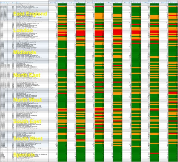
Figure 1: General and Acute Bed Occupancy heat map by day and trust for week 5, 28th December 2020 to 3rd January 2021. A much larger pdf version is available here. Overall, occupancy was 86.7%, which is lower than the same week in either 2019/20 (94.2%) or 2018/19 (93.2%).
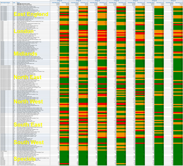
Figure 2: General and Acute Bed Occupancy heat map by day and trust for week 3, 14th December to 20th December 2020, for comparison.
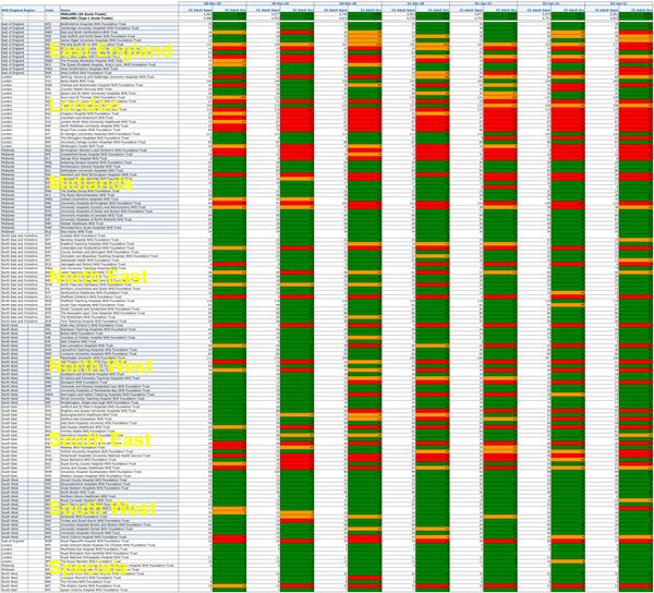
Figure 3: Adult Critical Care Bed Occupancy heat map by day and trust for week 5, 28th December 2020 to 3rd January 2021. A much larger pdf version is available here. Overall, occupancy was 79.5%, which is lower than the same week in either 2019/20 (82.4%) or 2018/19 (83.3%), but London, and the East and South East to a lesser extent, are visibly much hotter than in week 3 2020/21 (Figure 4 below).
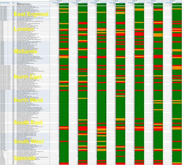
Figure 4: Adult Critical Care Bed Occupancy heat map by day and trust for week 3, 14th December to 20th December 2020, for comparison.
Sources: week 5 data from here (xlsx file near bottom of page), 2018/19 and 2019/20 data available here (click on Weekly dashboard to get the xlsx file).
Following on from Dr Tomlison’s comments in the previous post, Dr No will see if he can add the daily covid data to the occupancy data to determine how many beds are ‘covid’ beds, and if he is successful, he will publish the results in a new post.
Edit 17:30 7th Jan 2021: Dr No has managed to add the covid data to the last week’s data to determine crude percentages of beds occupied by covid patients for general and critical care beds. The data are far from perfect, for example the sit-reps used for the above charts count total and occupied (a) general and acute and (b) adult critical care beds, whereas the daily covid file, available here, counts “Total beds – occupied by confirmed COVID-19 patients” and “Mechanical Ventilation beds – occupied by confirmed COVID-19 patients”. Nonetheless, if we assume the former are all beds occupied by covid patients, then the general and acute beds occupied will be total beds occupied less MV (mechanical ventilation) beds occupied, and MV beds occupied will be, one hopes, close to adult critical care beds occupied.
Running these plots produces nothing very remarkable. There is certainly ‘a lot of it about’, but that’s what we expect in winter. Occupancy by covid patients has increased slightly in some regions, but not explosively, over the last week, and furthermore, a number of these ‘covid’ patients will have ‘coincidental covid’, and will be in hospital for other reasons, and so are unlikely to represent ‘excess’ covid patients, as they would have been in hospital anyway, for the ‘other reason’. As the plots aren’t very striking, rather than do a new post, Dr No will add them here.
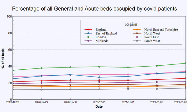
Figure 5: percentage of all general and acute beds occupied by covid patients for the week 28th December 2020 to 3rd January 2021. See text above for necessary caveats.
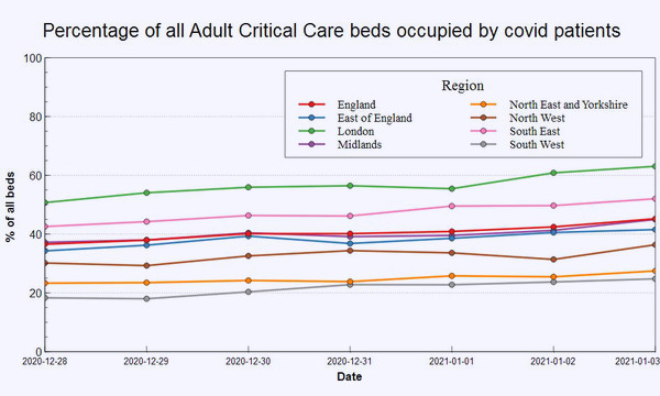
Figure 6: percentage of all adult critical care (MV) beds occupied by covid patients for the week 28th December 2020 to 3rd January 2021. See text above for necessary caveats.
Excellent work for us all, Dr No, thank you. And making it so visual is very helpful, too.
Good luck with finding out how many are ‘fully symptomatic covid beds’ and how many are ’+ve test covid beds’, with patients only attached to a heart monitor, a new baby, or with an elevated broken leg. I await with full confidence!
We’re in the flu season. We use a PCR test that is suspected of returning lots of false positives.
How many of those Covid patients in fact have the flu? Is there a test for flu viruses that could be used to check?
Annie and dearieme – see latest addition to the post starting at Edit 17:30. These are less than satisfactory data, for the reasons you give: it is not clear how these ‘covid’ patients were defined, how many would have been in hospital anyway, and just happened to test positive. Another difference in the data sets is the full occupancy data is broken down to trust level, but the covid occupancy is only down to regional level (so it is still possible Dr Tomlinson’s local hospital is overwhelmed, while others in London are not. Still, the plots are a starting point, of sorts…
Our local hospital in Carlisle has been in the news recently with record levels of covid patients, but it doesn’t appear in the records. Any idea why?
NCUTH CUMBERLAND INFIRMARY CARLISLE (CIC)
John
John – it appears under ‘North East and Yorkshire’ which does seem odd, Carlisle being in the west, but checking the current NHS regions map, it does seem the North East region includes Carlisle.
Thanks, yes that is very odd!
John
So the thing I can’t get my head around: people are admitted to hospital with all sorts of injuries and illnesses. If everyone is tested for Covid on admission then those unfortunate enough to die within 28 days will all be Covid deaths – all of them.
If they are tested regularly in hospital then the situation surely gets worse as the 28 day clock restarts with each test? Sooner or later everyone who dies in hospital will be counted as a Covid death.
Am I missing something?
Terry – no, you are not missing anything (except from one point, see below), this is almost certainly what is happening, and in the process causing covid death inflation.
The only question is the rolling covid test effect (and so perpetual epidemic effect). The wording on the covid-19 dashboard is a little less than immediately clear: “Number of deaths of people who had had a positive test result for COVID-19 and died within 28 days of the first positive test.” and “Number of deaths of people who had had a positive test result for COVID-19 and died within 28 days of the first positive test.” This says twice “within 28 days of the first positive test” but there is scope for (a) resetting the first test and (b) diagnostic blur ie not being too fussy about when/where the patient had a positive test, if the patient had a positive test, the patient is a covid patient/death.
dearieme – forgot to answer the questions in your second paragraph (“How many of those Covid patients in fact have the flu? Is there a test for flu viruses that could be used to check?”): the answer to the second one is yes, PCR tests including a ‘multiplex’ one that tests for SARS-CoV-2 and various flu and other viruses, and of course viral cultures, but they aren’t used routinely, flu being usually a clinical diagnosis, and so the answer to your first question is we don’t know. We can however look at mortality and cause of death, and Dr No is putting together a short post on this, and all being well will publish it shortly.