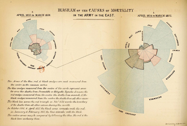
Florence Nightingale diagrams continue to do the rounds, both literally and figuratively. Variously also known as wedge diagrams (correct), coxcombs (misnomer, Nightingale’s coxcomb was the whole package), rose charts (by any other name, would still go round in circles), polar area charts (sometimes correct), and, in this parish, ring piece charts (for reasons that will become apparent), the general view seems to be that they are pretty and informative, and come with the added kudos of a shine from the Nightingale lamp. If they were good enough for dear Flo, then they are more than good enough for us. Dr No happens to think rather the opposite. They are always messy, often confusing, and, worst of all, frequently misleading.
Articles Written By: dr-no
I Tried It My Way
Pay Checking the Fact Checkers
Who pay checks the fact checkers? A intriguing post by a Bad Medicine reader led to information on facebot, of all places, suggesting that a vaccine manufacturer funds factcheck.org, facebot’s fact checker, so Dr No decided to follow the money, and dig deeper. What he found is interesting, in the faux-Chinese way. In the three months ending on 31st March 2021, factcheck.org received $53,501 from a health foundation that has over $2 billion invested in Johnson & Johnson, the pharmaceutical giant and leading covid–19 vaccine manufacturer. Specifically, the $53k grant funds factcheck.org’s SciCheck’s COVID-19/Vaccination Project, which aims to “to increase exposure to accurate information about COVID-19 and vaccines, while decreasing the impact of misinformation.” An independent fact checking organisation with a mission to debunk vaccine misinformation, funded indirectly by a vaccine manufacturer. What could possibly go wrong?
Covid Apartheid
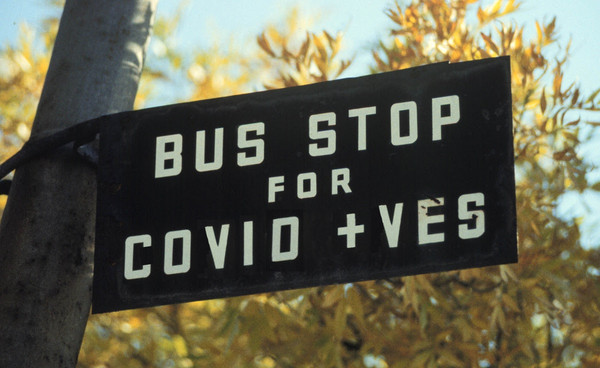
Let’s get the definitions out of the way. Unqualified, apartheid means the repugnant South African system of segregation by race. It comes “from Afrikaans, literally ‘separateness’, from Dutch apart ‘separate’ + -heid (equivalent of -hood)”: apart-hood. The word itself doesn’t make any reference to race, it just happened it arose in South Africa, and by its use there, unqualified, it came to mean racial apartheid. But the word — apartheid/apart-hood, or apartness, or separateness — can apply to any form of segregation. The phrase sexual apartheid makes perfect sense, segregation of the basis of sex. So to does the phrase religious apartheid, segregation on the basis of religion. And so too does the phrase covid apartheid, segregation on the basis of covid status. The repugnant state of racial apartheid can very meaningfully be found mirrored in the repugnant state of covid apartheid. Once you have separateness, or segregation, on the basis of this or that, you have apartheid; all that is necessary is to specify the basis of segregation, and then you have a fully formed phrase of clear meaning.
The Coronavirus and the Crocodile
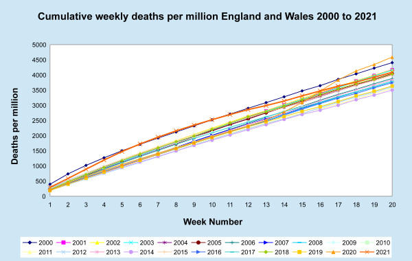
An article published yesterday on off-Guardian, which coincidently makes welcome use of an earlier Dr No post on covid death certification, points out the menace of politicians and the MSM using cumulative covid deaths as a sort of fat crocodile, that only ever gets bigger, leaving so many to wonder who the crocodile will eat next. Like the gift that keeps on giving, it is the crocodile that keeps on growing. As the article says, cumulative covid deaths are about as useful as a cumulative unemployment counts, because neither tell you what is happening now. Yet there is another cumulative death count that paints a rather different picture, and does have some merit in putting the pandemic in perspective. It is the cumulative all cause death count.
Going With the Flow Tests
The way the government’s coronavirus dashboard tells it, we can hardly move for covid lateral flow tests. Back of the envelope sums suggest there are now ‘only’ 600,000 plus daily LF tests, down from a peak of around a million daily tests in mid March. It’s a wonder we aren’t awash with grimy discarded test kits, jetsam from the ghost ship the New Normal. In Australia, where they take these things very seriously, the jetsam could have been far worse. A few months back, a zeroid (an endemic-covid denialist who believes instead in zero-covid, whatever it takes, and whatever it means) suggested that adding anal swabs for kids — zeroids believe kids and schools are hotbeds of infection and transmission — might pick up the covid that other tests can’t reach. What could possibly go wrong?
The Runaway Train of Project Fear
Forget Brexit, the real Project Fear kicked off in March last year, with SPI-B’s infamous “The perceived level of personal threat [from covid–19] needs to be increased among those who are complacent, using hard-hitting emotional messaging”. Printed in bold in the original report, the directive launched a thousand messages that sailed freely past their intended target, the complacent, and went on to cause immense collateral damage among the timorous. Rained on day after day by this lurid torrent of “hard-hitting emotional messaging”, these nervous souls quickly became punch drunk, and lost the capacity for rational thought. Whole swathes of the population started to believe that covid–19 was a threat out of all proportion to any real risk. The extraordinary thing is they still believe covid–19 is a threat out of all proportion to any real risk. Let’s take a look at what happened.
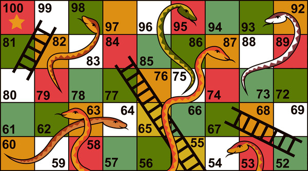
The Snakes and Ladders of Vaccine Numbers
It is a truth universally acknowledged that a pharmaceutical company in want of a profit will use relative risk. It will do this because presenting the results of clinical trials as relative risk reductions tends to make their new wonder drug appear dramatically effective. But relative risk reduction is only one way of presenting the data. We can also look at the absolute risk reduction, and a useful number derived from the absolute risk reduction, the number needed to treat. This tells us the number of people we need to treat to prevent one adverse outcome. As we shall see, absolute risk reductions and numbers needed to treat tend to dramatically lower the apparent, and so perceived, benefits of treatment. These observations, we shall further see, can be applied to all treatments, including covid vaccines.
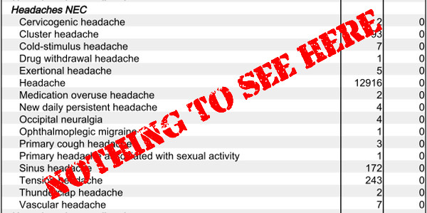
Nothing to See Here
Has the novel vaccine for a novel coronavirus led to a novel case of hiding something bad in plain sight? We are constantly told by the authorities and mainstream media that the novel coronavirus vaccines are exceptionally effective and safe. Yet at the same time there is a constant drip feed, now running more like a torrent, of reports of numerous and sometimes serious side effects from the vaccines. Dan Astin-Gregory of the Pandemic Podcast recently received, but failed to publish, a “113 page report documenting the tragic accounts of people who had sadly died following the COVID-19 vaccination”. Mr Astin-Gregory’s heart is clearly in the right place, but the mind needs data. An anecdote of anecdotes? Without seeing the report, it is impossible to make any assessment of it.
The Flea Is Airborne
The Covid Inquisition has had a rather hard time of it lately. As UK test positives, hospitalisations and deaths have plummeted, they have had in recent weeks to rely on scariants and foreign outbreaks in Brazil and India to maintain fear levels, but over the last few days a game changer has emerged: the virus is airborne. WHO have marginally up-rated their assessment of risk from aerosol transmission, triggering a raft of tweets from the Inquisition saying we told you so, but the real bombshell is a pre-print that puts some E notation numbers and extra computer generated colours on the Milk Curdler’s earlier three colour crayon box model #CovidRiskChart. The Inquisition now know that H, or your airborne infection risk parameter, for a brief, silent masked outdoor encounter is 2.33E-05. Prolonged shouting without masks in a poorly ventilated crowded room, on the other hand, pushes your H up to 1.00E+02. If shout turns to shove, your H jumps even higher, to 2.33E+02. Cripes.