
The Coronavirus and the Crocodile
An article published yesterday on off-Guardian, which coincidently makes welcome use of an earlier Dr No post on covid death certification, points out the menace of politicians and the MSM using cumulative covid deaths as a sort of fat crocodile, that only ever gets bigger, leaving so many to wonder who the crocodile will eat next. Like the gift that keeps on giving, it is the crocodile that keeps on growing. As the article says, cumulative covid deaths are about as useful as a cumulative unemployment counts, because neither tell you what is happening now. Yet there is another cumulative death count that paints a rather different picture, and does have some merit in putting the pandemic in perspective. It is the cumulative all cause death count.
Official statisticians, governments and the MSM (the latter is a hideous BBC attempt to keep the crocodile alive: “just because no deaths were announced on 1 June does not mean for certain that no deaths actually occurred” hisses the anonymous author) all make heavy use of daily and weekly counts of deaths, with their Wonderbra twin peaks of covid waves. When a comparator, or baseline, is provided, it is typically based on a brief and short recent time period, which guarantees 2020 and 2021 look bad, because mortality in recent years has been unusually low. Charts without an explicit comparator use an implicit one, for example the visible low levels seen for example during last summer. All these charts rely on the fact that short term day by day or week by week variations and comparisons highlight the variability in the data, and so emphasise the peaks. But what happens if instead of using daily or weekly data, we use cumulative data, over longer time frame?
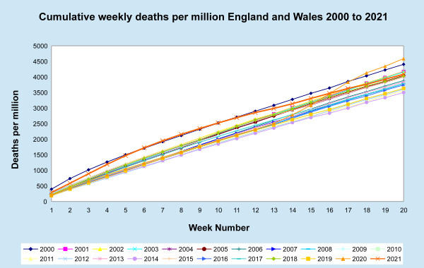
The chart at the top of this post shows the cumulative all cause mortality, for weeks one to twenty (the latest week available for this year) for England and Wales, for every year since 2000 to date. The raw data comes from ONS, here (2000 to 2009) and here (2010 to date). The plot uses deaths per million, rather than raw counts, to adjust for the growth in population over the last two decades, but hasn’t been adjusted for demographic changes (the ageing of the population), as the sums needed are long tedious and boring to do, and crude death per million adjustment is sufficient for today’s purposes. The idea is not to be able to follow each and every individual year, but to get an overview of the cumulative mortality for each year since 2000 to week 20 in much the same way a scatter plot gives an overview. Are the data clumped together, or spread out? Are there any outliers, and if so, how exceptional are they?
The first thing to note is the peaks have all but disappeared. This is largely because the Y-axis range is greater, because it is scaled to cumulative mortality, rather than individual daily or weekly mortality. We see from a perspective of year to date, rather than daily or weekly perspective. The second thing to note is that overall, most of the lines are pretty close together, and there are no stand out by a mile outliers. Only three years break free of, and lie above, the general pack.
The first is 2000 (blue line with diamond markers), a bad flu year with exceptionally high numbers of deaths in the eraly weeks. The second is 2021 (orange line with X markers), and although somewhat exceptional at the start of the year, it is still only on a par with 2000, until around week 12, when it starts to return to the pack. This is almost certainly a simple left shift effect: more deaths in early weeks means less deaths in later weeks, with overall cumulative numbers coming out about normal in recent weeks. The third break free year is of course 2020 (orange line with triangle markers), which for weeks 18 to 20 has the highest cumulative mortality of any year in the last two decades, but by not much more than a crocodile’s whisker.
What is the take home message? It is that the covid pandemic did affect mortality last year and this, but so far — Dr No has no crystal balls, just as he has no glass eyes —the effect, as seen from a perspective of cumulative mortality, is not that striking. That’s the message from the chart, that nothing really really stands out. Yes, pandemic effects are visible, but there is no crocodile.
From all recent accounts (esp. through social media) it could be that the crocodile’s name is ‘Dr Fauci’?
What are Dr No’s views on the recent revelations of this dodgy Doctor, with at least one American mainstream news anchor calling him ‘Lord Fauci of Wuhan!’
Fauci’s done much to encourage the medical theatre of mask wearing etc but his flip / flop record, and recent email leaks, raise serious concerns about his impartiality. Also see patents owned by him.
That with Gove today singing the globalist’s chorus of ‘build back better’ — who is leading this shower of sh@t we’re living in? A global cabal of sorts?
It’s irrelevant and inconsequential – but I can’t resist posting this from Dr Kendrick’s blog.
“An anagram for Dr Anthony Fauci is China Fraud Tony…”
James – with a name that doesn’t take much to change it into Faust, Dr No dare not guess who Dr Fauci sups with, long spoon or short.
Perhaps Annie might have something to say about what may be behind all this?
The Faust analogy is surprisingly close and fruitful. Faust sold his soul for power – the power to do anything he wanted. Yet, as soon as he was given that power, he found that nothing satisfied him. He called up Helen of Troy, only to find that she was really just another pretty woman. (What did he expect?)
Dr Fauci seems to me to have sold his soul for money, power and prestige. I don’t know whether he will come to regret the transaction – I would guess probably not.
Because the huge, fundamental difference between Dr Faust and Dr Fauci is that, when the former sold his soul for worldly success, everyone could immediately see that it was a rotten, foolish, self-destructive deal. Dr Faustus was one in a million, and not in a good way. Seeking to be more than his fellow-men, he became less.
But Dr Fauci is one of the majority. Almost everyone wants money, influence, power and prestige. In that he has obtained those things, he must be accounted a success by the standards of our (or, at least, the USA’s) culture.
“Achievement is irrelevant if you’re not famous; if you are famous, no additional achievement is required.” Certainly having an ordinary job and supporting a wife and child is not an outcome to be desired”.
– Philip Greenspun, commenting on the movie “Hugo” (blog, 7 December 2011)
That makes Xi (or ‘President’ Xiden) into Mephistopheles – it will not end well.
I am not of the party, but Desmond Swayne’s blog post is worth quoting from: https://www.desmondswaynemp.com/blogs/ These are questions put to the Sec State for Health
“So, given my opposition to lockdown and the threat posed by the Indian variant to the lifting of all restrictions on 21 June, I put down the following question on 14 May:
“To ask the Secretary of State for Health and Social Care, if he will publish statistics on the (a) number of infections, (b) deaths and (c) hospital admissions by each covid-19 variant of concern”
On 25th May I got the following quite astounding answer
“Data for hospitalisations and deaths is not currently available in the format requested.”
I would have thought that this data is essential for any informed decision about removing the final stage of lockdown.
On 24th May My Colleague Dr Julian Lewis MP tried with
“To ask the Secretary of State for Health and Social Care, if he will make it his policy to release to the media, on a daily basis, the numbers of people hospitalised with covid-19 who are (a) vaccinated and (b) unvaccinated against the virus.”
on 28th May he got no further with the following answer
“The data requested is not currently held centrally in the format requested.”
Incredible!
If not, then why on earth not?
Dr Lewis has now put down the following question:
To ask the Secretary of State for Health and Social Care, pursuant to the answer of 28 May to question 6161 on the vaccination status of people hospitalised with the Indian variant of covid-19, for what reason such essential data are not held centrally in the format requested; in what format, if any, those data are held centrally; and if he will make it his policy, without further delay, to (a) gather centrally and (b) subsequently release to the media, on a daily basis, the numbers of people hospitalised with the Indian variant of covid-19 who are (i) vaccinated with (A) one and (B) both doses, and (ii) unvaccinated against the virus.”
I can’t wait to read the answer!” end of quote