
Flo Nightingale and the Ring Piece Chart
Florence Nightingale diagrams continue to do the rounds, both literally and figuratively. Variously also known as wedge diagrams (correct), coxcombs (misnomer, Nightingale’s coxcomb was the whole package), rose charts (by any other name, would still go round in circles), polar area charts (sometimes correct), and, in this parish, ring piece charts (for reasons that will become apparent), the general view seems to be that they are pretty and informative, and come with the added kudos of a shine from the Nightingale lamp. If they were good enough for dear Flo, then they are more than good enough for us. Dr No happens to think rather the opposite. They are always messy, often confusing, and, worst of all, frequently misleading.
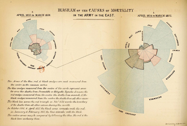
The whole point of a diagram is to express something visually, both more efficiently and more effectively, than can be done by words alone: a picture, as they say, is worth a thousand words. Sometimes the purpose is descriptive, the idea being to convey information in a more easily grasped way than if it were presented as a table, or in the text, and sometimes it is prescriptive, a call to action. Nightingale’s Diagram of the Causes of Mortality in the Army in the East was both descriptive and prescriptive. It described mortality before (on the right) and after (on the left) the introduction of sanitary measures in the Army in the East, and then prescribed, or urged, the government to adopt the same measures at home.
It did this by plotting two years mortality data as two rings, with each ring being one year, divided into twelve months. Time flowed clockwise round each ring,, and in each of the twelve wedges the area, not the radius, of the wedge, as taken from the centre, was scaled to represent the mortality from various causes for that month. Notice that there is no radial scale; instead, we are meant to grasp the information visually from the areas. The small pink/red wedges are deaths from wounds and injuries, the small grey/black wedges are deaths from other causes, and the pale blue wedges, which dominate the images, are deaths from zymotic (contagious) diseases. The case is clearly made that mortality fell after the Army introduced sanitary measures, with far less pale blue zymotic deaths on the left diagram, after the measures had been introduced. Note that the convention that time flows from left to right appeared later; in the diagram above, the events shown on the left happened after those shown on the right.
This version is correct: the area of the wedge is scaled to the month’s mortality. But it only appeared as a correction after Nightingale had previously published her hideous bat’s wing chart (Figure 1) of the overall mortality data, as rates per 1,000 men, in which the radius of each of the twelve sector wedges is scaled to that month’s mortality. The effect, as we can see is to exaggerate greatly the apparent mortality. This happens because in a polar area diagram, the plot, like the universe, constantly expands as it moves ever outwards, with each concentric circle larger than the one before it. It is non-linear: the 100 increment from 0 to 100 covers a far smaller area than the 100 increment from 900 to 1,000. It happens because in a polar area chart, making a linear adjustment to the radius, alters the area of the plot.
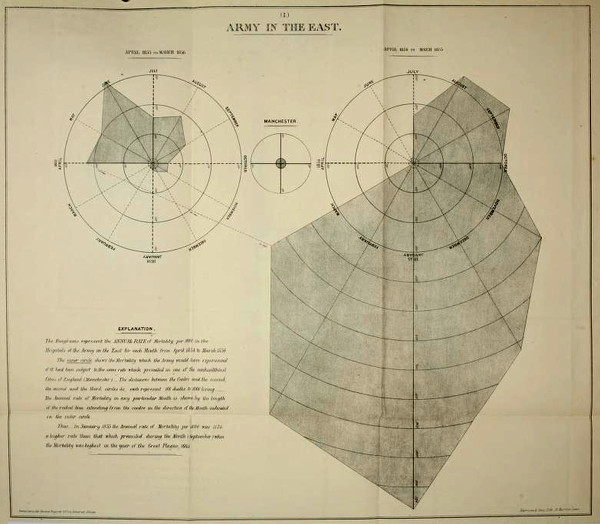
Figure 1: the misleading original bat’s wing chart. Compare the exaggerated lower part of the right hand diagram with the correct version shown at the top of this post.
To see what is happening, consider Figures 2 and 3, and how plotting by height and area affects visual appearance. To keep things simple (and Dr No sane), only two months are shown, December and January. Throughout the plots, there are four events in December, and nine events in January. In both figures, the leftmost two bars are simple bars, with linear height proportional to the measurement, four and nine. In both figures, the middle two squares plot the data by area: a two by two square to get four, and a three by three square to get nine. Do we get the same sense of proportional difference between December and January with the squares as we do with the bars? Probably, give or take a bit. They are after all the same areas: one by four equals four for the December bar, two by two equals four for the December square, and the same for January, one by nine and three by three both equal nine.
But look what happens when we use rightmost two wedges! In Figure 2, the plot is by linear radius, or height. The December plot looks pretty much the same (this is a quirk of the numbers Dr No used, four and nine), but the January plot now dominates the chart, because although the linear height is the same (nine), the area has increased dramatically. To correct this eye-watering visual distortion, we have to, as Nightingale did in her corrections, plot the wedges by area, such that the areas, rather than the linear height, are proportional to the values, as shown in Figure 3. Here January appears a bit over twice the size of December, as it should.
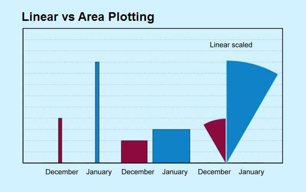
Figure 2: January’s wedge is far too big! See text for details
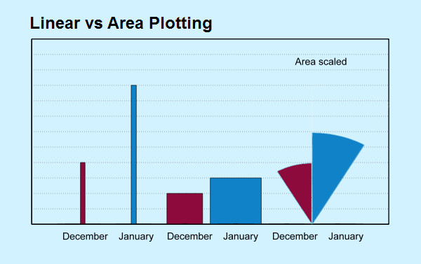
Figure 3: January’s wedge as it should be. See text for details
Technical note: the reason for using four and nine is that their square roots are readily known, and so the so-called square root transformation, which is what this is, is easily done, without any need for complicated maths. Furthermore, the wedge areas are easily determined: if we think of them as a triangle, then a triangle twice as high but the same width of the matching month square will have the same area as the square. You can do all the sums for these diagrams in your head. We can also use a square root transformation to confirm Nightingale did plot using areas, rather than linear radial length, in the corrected version by overlaying a polar area plot of the square root of the monthly mortality on Nightingale corrected diagram, as seen here.
All sorts of confusions arise by mixing up linear, radial distance based plots and area plots. Florence Nightingale spotted the error of her bat’s wing chart, and corrected it to produce a valid, even if somewhat confusing, and visually spidery, chart that has gone down in history as one of the great innovations in the early use of statistics. But the mayhem caused by these charts continues unabated. One bright spark, after misunderstanding an ‘otherwise superb article’ in The Economist, even went so far as to correct Nightingale’s corrected chart, and in so doing didn’t just clip the bat’s wings, he amputated them entirely, leaving the chart dead on the page. Even Nightingale’s original error, plotting by linear distance, or radius, instead of area, remains alive and well today. One of its better known incarnations is the CEBM’s regularly updated Nightingale chart of weekly mortality (Figure 4).
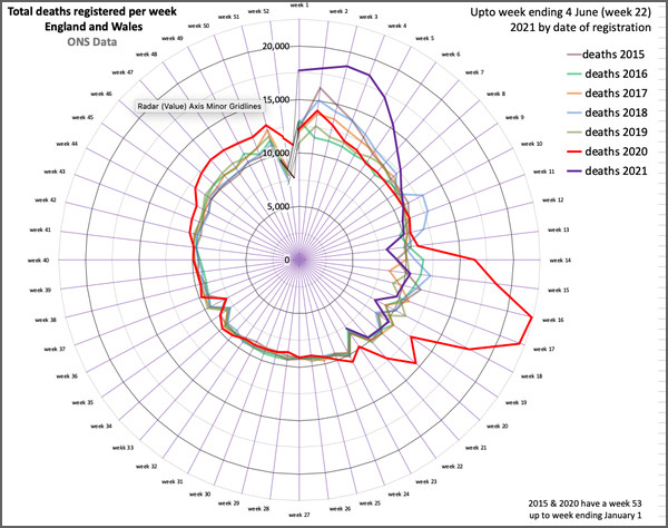
Figure 4: Florence Nightingale Diagrams of Deaths in England & Wales, reproduced from https://www.cebm.net/covid-19/covid-19-florence-nightingales-daigrams-for-deaths/
Just look at that monstrous red inflamed prolapse at 4 o’clock! Holy bat-shit, it’s a bat’s wing chart! That bulge is Spring 2020, grossly exaggerated, because of the way a polar chart works when plotted using linear radial distance rather than area. It is the haemorrhoid from hell — and that is why Dr No calls these charts ring piece charts, because all too often they are full of, well, you know what. The same data for 2020, plotted as a scaled overlay after a square root transformation, to approximate plotting by area, can be seen in Figure 5. It isn’t a true wedge diagram, merely an indication of where the wedges on a true wedge diagram would lie; and furthermore, true wedge diagrams do not have radial scales (they are meaningless, because it is area that is being plotted), so Dr No is not suggesting there were 16,000 deaths when there were 22,000 deaths. The bulge is still present of course, but visually it is far less striking, and what we perceive is more proportionate to what actually happened.
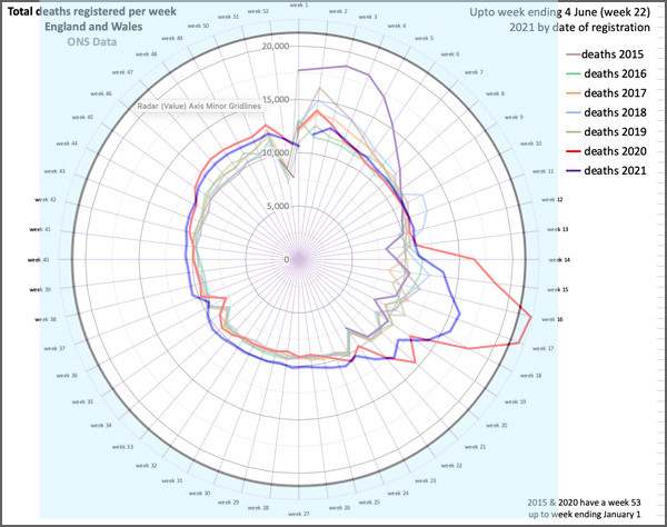
Figure 5: CEBM Nightingale diagram of weekly deaths, with 2020 overlaid in bright blue after a square root transformation to approximate the shape of a corresponding wedge diagram
Footnote: For the avoidance of doubt, Dr No has the greatest respect for Professor Carl Heneghan, the CEBM, and the work they do. This post is merely a comment on the method of presentation of one particular chart, nothing more, and nothing less.
Edit 0735 19 Jun 2021: Post title changed from “Nightingale and the Ring Piece Chart” to “Flo Nightingale and the Ring Piece Chart” – thanks to Annie for the inspiration!
I like the Nightingale charts on CEBM, but I couldn’t figure out what made them look so much worse than linear graphs depicting the same information. Now it seems so obvious. Thanks!
It’s an optical distortion – like standing at the edge of a shaft, looking down into the abyss. The first 10000 deaths of the month look really far away, whereas the second 10000 deaths of the month are nearer the surface and visually much more immediate. Quite apt really.
I love this post. It is excellent & should be discussed by anyone teaching maths, science or statistics in school. Years ago I thoroughly enjoyed a visit to the Florence Nightingale museum in St Thomas’ hospital. They had some great artefacts & personal possessions. Does it still exist?
There is one thing, however, with which I must take issue. You said; “The whole point of a diagram is to express something visually, both more efficiently and more effectively, than can be done by words alone”.
You, I & many readers of this blog might think so but I fear that, in the world at large, diagrams are used to mislead, misrepresent & misdirect. It works well because few people are now able to question anything.
I recently saw a yoohoo survey that suggested over 60% of people believe teenagers & children should be ‘vaccinated’ because “they need protection”. What evil kind of diagram have they been shown?
Helen – thanks. Perhaps another way of looking at them is as a balloon that is being constantly inflated. The further you get from the centre, the bigger things get. You just don’t want to be standing too close when the inevitable happens!
Devonshire – thanks too, and a good point. Could have been clearer in saying that ‘more efficiently and more effectively’ can apply just as much to malign messages as benign messages. This hideous German eugenics propaganda poster uses the same linear / area trick. As the height increases/decreases, so too does the area, exaggerating the effect:
And here’s an example from Darrell Huff’s classic How to Lie with Statistics. The bag on the right is only twice as high as the one on the left, but perceptually we see things very differently:
A great article! Thanks.
Typo alert: between Figures 4 and 5 you have introduced the intriguing idea of a “square roof transformation”.
Tom – thanks, and thanks for the typo alert. Almost a plausible thing, so almost left it as it is, but have nonetheless corrected it.
Unfortunately, graphic designers are guilty of increasingly turning ‘infographics’ into graphical porn — hence the distortions you highlight, ever more present in relatively recent publications, like the much lauded (but flawed) ‘Information is Beautiful’ by David McCandless.
That with the motives and meddling of politicians and scientists, distortions are inevitable. Whilst studying at the LCC (previously known as the London School of Printing) a well respected tutor and practicing designer, with strong views on infographics, could only recommend to students just one text from 1974, ‘Graphis Diagrams’, which has examples of good practice — this stand alone resource speaks for itself, the lack of credibility and heavy criticism this particular ‘discipline’ of graphic design deservedly receives.
A great article, thanks. I trust Dr No’s parishioners are also viewing the parish notices on John Dee’s Almanac. Instructive and informative data both here and there.
Some of us don’t do farcebick.
@ DD – in that case review the archived Parish Notices
Surely the standard text on graphics to display or reveal information is Edward R. Tufte’s work “The Visual Display of Quantitative Information “ first published in 1983. If anyone in statistics or data presentation has not read this then do yourself a favour and get a copy right away. 40 years old and even more relevant today.