
Winter Waves
Competent enough when reading out Google finance reports, Radio 4’s Simon Jack falls apart when loaded with a ministerial interview. Even with the bar set as low as it is these days on the Today programme, and the minister for jabs having all the appeal of a lump of blu tack stuck on the seat of your pants, Jack approached the interview like a teenager rugby tackling a brick wall, only to crumple through lack of preparation. Attempting to ask why individuals with learning disabilities weren’t being prioritised for vaccination, given their high covid mortality rate, it soon became apparent that the interview was to be as illuminating as mountain of Welsh coal slag. Click. The sound of silence filled Dr No’s kitchen.
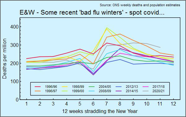
On to other news. Tuesday is ONS weekly deaths day — isn’t it charming how covid distorts priorities — and Dr No has added the latest weekly deaths, for the week ending 5th February, to a chart showing winter weekly deaths for recent bad flu years. The idea for the chart isn’t a Dr No original, something very similar appeared on twitter, but with little in the way of attribution, except to say the data came from ONS. This was a useful tip off that weekly data was available somewhere that covers a far longer period than that reported in the normal routine data series of data, which only goes back ten years. We know that by and large the last ten years had low mortality, guaranteeing that any comparisons would make covid look bad, so having a longer time series is a potent and useful way of getting a proper perspective on covid. After a lot of googling and digging ever deeper into the ONS website, with its tortuous web-page addresses, Dr No came across this ad hoc page, with some very useful links, including weekly registrations data going back to the mid 1990s. What do we find?
The chart shows all cause weekly mortality for England and Wales, as deaths per million to account for the not inconsiderable change in population over the last twenty five years, over the twelve weeks straddling the New Year for winters that had visually notable winter spikes in charts from previous posts. To manage the occasional week 53, Dr No selected week 1, and counted back six weeks, and then copied the deaths from that week and the subsequent 11 weeks into the new chart, so the numbers on the X axis are not ISO week numbers, but rather just the sequential numbering of the weeks. We now have a much more finely detailed picture of mortality patterns over those bad flu winters, without the smoothing effect caused by using longer intervals.
The chart shows that this winter has not been exceptional, when compared to recent bad flu winters. Three winters had notably higher peaks, and in four years a crude estimate of the ‘area under the curve’, representing total deaths assuming the same population size for each winter, was higher than over this winter. Yet again, looking at the data in a different way, we can only conclude that this winter of 2020/2021 has been a bad year, but not exceptionally bad. It appears in the chart ‘somewhere in the middle’, and the only reasonable conclusion is that it is just another bad flu winter. Only it isn’t. It’s the winter when we shut down the entire country, to manage just another bad flu winter.
Edit 17:18 23 Feb 2021: updated chart to Week 06-2021 added here.
These are very interesting figures, and effectively give the lie to claims that the NHS is being overwhelmed. Well at least any more overwhelmed than it is in other winters.
However what the figures don’t, and cannot do is counter the argument that lockdown restrictions have been required to achieve this semblance of normality. Lockdown may have been OTT, but it can easily be presented as successful. Without a properly conducted control trial (impossible on the required scale) you cannot prove it was unnecessary. Comparisons with countries that took a different approach do go some way to making the case, but the huge variations in demographics, treatment capabilities and capacity and compliance of populations make it difficult to present a convincing case.
Point well made Dr No, and supported by this rather sarcastic but relevant tale from Bob Moran…
@bobscartoons
Cartoonist
@Telegraph
http://bobmoran.co.uk
4th Feb 2021
“Mr Blair, thank you for joining us.
I would like to ask you about the greatest crisis you faced as Prime Minister.
Indeed, the greatest crisis we have faced as a nation since the Second World War.
In the winter of 1999/2000 a huge number of people were tragically killed.
They died from a totally out of control influenza virus, letting rip across the country. The end result was a level of all-cause mortality which absolutely towers over what we saw during 2020’s ‘deadly pandemic’.
I can only imagine how stressful it must have been for you.
Obviously, it goes without saying that you considered a national lockdown – I mean, it’s so obvious that they hashtag save lives. And obviously, you considered mandatory face masks. I mean, the science is clear. They just work.
Obviously, you considered investing billions in vaccine development.
Obviously, you had NHS managers and staff on the telephone in floods of tears every day, screaming that they were “AT BREAKING POINT!”.
How you must have agonised over what to do.
How would we grieve as a nation? How would our children come to terms with the fact that they had murdered their grandparents by hugging them? Would we ever let them forget it?
I can see this is difficult for you to revisit.
But please, if you could Mr Blair, talk us through your decision making process. How precisely did you reach the eventual conclusion that the right course of action was to do absolutely bugger-all? To totally ignore the whole thing and have a giant party instead?”
[Pic of Blair / Queen and others, awkwardly doing the Auld Lang Syne in the Millennium Dome]
Sorry Denis, but that does not work. One word: Sweden. (Although there are dozens of other nations, states and cities that avoided lockdowns and had better outcomes than the UK).
Denis and Tom – Dr No agrees with both of you. Denis is right – nothing can, by the normally accepted standards of proof, be proved (and crucially either way, so that means lockdown supporters can not prove they work, just as lockdown sceptics can’t prove they don’t work). Proof would need a randomised cluster trial on an international scale, and that, unsurprisingly didn’t happen.
Should we just give up and say we don’t know? Dr No thinks not, because we do have observational data, and we would be foolish to ignore what it might suggest, so long as we don’t become too dogmatic.
Sweden’s data is interesting. One of the charts Dr No did last year compared the shape rather than the amplitude of the UK and Sweden’s mortality curves for the first wave (the latest Our World in Data charts show some very odd wobbles, but the story is much the same) simply by scaling the peak of the Swedish curve to the same height as the UK curve:
Not the prettiest chart, but what is striking is how closely the two curves track each other, from the start of the pandemic, all the way up to the peak, and for the first part of the fall in cases. If hard lockdowns compared to soft lockdowns have an effect, it isn’t apparent in this chart. Or to ask the question another way, why are the curves so similar???
“as mountain of Welsh coal slag”: slag is a by-product of iron-making and other metallurgical processes. Did you perhaps mean a coal spoil tip (such as that at Aberfan)?
The National Coal Board was to spoil tips as the National Health Service is to hospital infections.
Can someone tell me when did the NHS start promoting influenza vaccines for the over 65s? I think this may have a bearing on the graph at the top of the page, is as much as all the noticeably bad flu years were pre-vaccines.
dearieme – Dr No first wrote coal waste, then something made him change it to sludge, and then slag, without checking the meaning. Perhaps something Freudian. The image he was after was of a huge dull grey ugly shapeless mass incapable of illuminating anything; and that was a rushed replacement for an earlier completely different phrasing that didn’t work. Dr No will try harder in future.
Bill – good point, the move from clinically vulnerable to all over 65 year olds may well have been around 2000 (this is not however the sort of thing Dr No commits to memory…). The OECD website (you have to poke around about to get the settings right) has data going back to 2000 and a quick plot shows the rates haven’t varied that much.
Dr No will see if he can find some pre-2000 data (anyone is very welcome to point him in the right direction).
A fairly thorough search has revealed remarkably little data on pre-2000 flu vaccine uptake rates. 2000 was the year when vaccination was promoted for all 65 year olds and over, and maybe that triggered more rigorous routine data collection.
There is one paper (abstract only) from 2002 that looked (via postal questionnaires, so possible bias+++) at rates in one health authority area (Bolton) for the three winters from 1997/98 to 1999/2000 which found:
“Self-reported vaccine uptake had increased in people with diabetes from 53.9% in 1997-98 to 67.6% in 1999-2000, and in people aged 75 years and over from 63.5% in 1997-98 to 70.2% in 1999-2000.”
Rather flimsy evidence, but it may suggest that in the years building up to the universal promotion of flu vaccine (in 2000), that rates in high risk groups and the elderly were already on their way to matching post 2000 rates.
We should also not lose sight of the fact the winters with higher deaths rates did have higher death rates, whatever the reason. It could be said that in the late 1990s we stood in relation to flu as we stood in relation to covid in late December/early January this winter: a seasonal wave of a respiratory viral infection, with partial population immunisation. And yet, no one even thought of shutting down the country. As James points out, rather the opposite. One of those bad flu winters saw in the new millennium, and rather a lot of non-socially distanced partying went on. It is sobering to realise that what was normal in New Year 2000 would in New year 2021 have led to £millions in fines, civil unrest, and God knows what. How we have changed.
” It could be said that in the late 1990s we stood in relation to flu as we stood in relation to covid in late December/early January this winter: a seasonal wave of a respiratory viral infection, with partial population immunisation. And yet, no one even thought of shutting down the country”
This is a key bit of thinking, Dr, and it’s a shame it’s been missed. It struck me the other day too, when I was reading that slightly clumsy Andrew Lillico piece in the telegraph about the financial cost of lockdowns relative to different years. In terms of health, presumably if lockdowns work now, they would have worked back in 2000, and possibly saved similar numbers of lives. Yet if you had tried to tell people that they must lockdown for half a year to save 100000s of people in 1999 they’d have laughed at you. It’d have (rightly) been considered morally reprehensible and not worth the cost.
But then China moved the overton window for our deeply illiberal public health sector, and 2020/21 happened.
Thomas – agree, the ‘China Effect’ is Dr No believes one of the keys to understanding our response to covid. It’s already in a post written, but not yet published.
Don’t you think that the Covid 19 nonsense is mixed up in the collapse of industrialized society, simply because we are running out of the resources that brought it into being?
Updated chart, to week 06-2021: