
Putting Covid–19 in Perspective
There has been much fuss over the question of whether covid–19 is a truly exceptional event that justifies the draconian restrictive measures imposed by decree that our governments have freely, even wantonly, applied, or whether it is just another seasonal flu like illness. Dr No, readers of this blog will know, is inclined to the latter view. One way of attempting to get closer to a definitive answer to this question is to compare the Spring 2020 covid spike in deaths with previous spikes, and see how it measures up. There are problems, though, in doing this: not only has the population grown in size (so pro rata, all other things being equal, we expect more deaths), but it has also changed in age structure (more older people, so again we expect more deaths). And if that wasn’t enough, underlying health and medicine’s capabilities have also changed — hopefully for the better — over time, so we might expect less deaths.
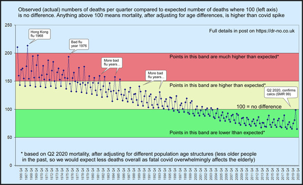
Dr No’s last post was an attempt to present the data, making allowance for the change in population size. This is simple enough: we just use deaths per million, rather than the raw death counts, and look at the seasonal pattern year by year. The seasonal pattern — that is, we plot by quarter by quarter, not year by year — matters: if we just look a annual rates, the seasonal peaks tend to get lost, though some years will appear worse, and others better, than average. The need for seasonal data for each year was one of the main stumbling blocks, but after some digging around, Dr No found data going back to 1966, and that data is presented in the post. It shows why ONS’s limited time perspective studies have been somewhat misleading, by accident, of course, rather than by design. If we only go back twenty years, which is the limit of the readily obtainable ONS data, then covid–19 does look exceptional. But if we go back fifty years, to get the bigger picture, then covid–19 shrinks in significance, and becomes just another seasonal flu like illness.
Note that we are only looking at all cause deaths: no attempt has been made to identify causes of death within the spikes, though if there is an epidemic, we can reasonably assume the epidemic has made a contribution. Limiting the data to all cause deaths is by design: the great advantage of all cause mortality is that it is the most robust by a long shot set of data that we have — hard to mix up counting deaths. The flip side is we lose detail, but that is tolerable, given what we are aiming to do, which is to look for rises and falls in the total number of deaths: the grim reaper’s toll for each epidemic. This number is a very real number: 10,000 deaths are ten thousand real people who really have lived, and died.
The other two influences on death numbers, the ageing population, and changes in health and health service capability are harder to adjust for. The latter is almost impossible, and is frankly not of much consequence: each age is where it is, so to speak. Allowing for changes in age structure of the population is possible, by a method known as standardisation, but it requires a lot more data. Depending on the method used, we need, at the very least, the age structures, or distributions — how many people in each age band — for each the populations. Put another way, we can’t adjust for age unless we know the age distribution for each of the differing populations. The same principles apply to other variables — sex, social class, ethnicity, whatever — so long as we have the data, we can standardise for the variable, but today we will stay with just age.
There are two ways of doing standardisation. The first, and all other things being equal, preferred method is direct standardisation. For each population of interest — they can be different countries, years, hospitals, or anything else of interest — we work out age band specific mortality rates. We might find that there had been 20 deaths in the 60-64 year old age band (five year grouping is common) which contained 20,000 people, and so the mortality rate is 10 per 10,000. We then apply these rates to each of the numbers in each age band in a standard population — there are a number of these available — to determine how many deaths there would be in the standard population, if it had the same mortality rate as the population of interest. Let us say the standard population in use has 15,000 people in the 60-64 year age band: it will then contribute 15 deaths to the total. Once we have applied each age band specific mortality rate to its matching age band number in the standard population, we add all the resulting numbers, together, and that is our standardised mortality rate. Once this has been done for two or more differing populations — different countries, years, hospitals, whatever — we can directly compare the mortalities, knowing that any effect due to different age structures has been removed.
Direct standardisation may be the preferred method, but it needs detailed data, in this case, quarterly mortality data for each age band going back over the last fifty years. This data is simply not available: we only have quarterly mortality data for all deaths in all age groups, so we can’t apply the age band specific rates to a standard population. But there is a way round this, as long as we have, as we do, the numbers in each age band for our populations of interest. Instead of applying the age specific mortality rates from all our populations of interest to one standard population — a sort of many to one relationship — we can apply the age specific mortality rates from a chosen population to each the age bands in each of our populations of interest — a sort of one to many relationship, making it a sort of right to left rather than left to right mirror direct standardisation, known in the trade as indirect standardisation.
Another way of comparing direct and indirect standardisation is to say that direct standardisation applies the population of interest rates to a standard population’s numbers, whereas indirect standardisation apples a reference population’s rates to our population of interest’s numbers. Both have advantages and disadvantages. Direct standardisation, because each different population of interest is adjusted to the same standard population, allows direst comparison between the results from different populations, but it is more demanding of detailed data. Indirect standardisation demands less detailed data, but the cost is direct comparisons between differing populations is less robust, as the true comparison is between each population and the reference population, not each population with each other. For this reason, indirect standardisation results are often presented as standardised mortality ratios, or SMRs. An SMR is the observed number of deaths in a population divided by the expected number calculated using indirect standardisation, that is the expected number had the population of interest experienced the same age specific mortality rates as the reference population. This number is them conventionally multiplied by 100, such that an SMR over 100 means there were more deaths observed than expected — that is, mortality was worse than expectations based on the reference population — and an SMR below 100 means the opposite — mortality was better than expectations based on the reference population.
Now for crunch time! As it happens, we do indirect standardisation on our quarterly data going back to 1966 if we can accept age bands in each quarter, which we don’t have directly, are near enough to the age bands in the mid year population for each year, which we do have. This is a bit of an approximation, but not a huge one, and, in the spirit of Dr No’s favourite epidemiological axiom, better a good enough answer to the right question than an exact answer to the wrong question, one that is well worth tolerating. If we then use the age band specific mortality rates from Q2 2020, that is, the spring spike, as our reference population rates, then we can very usefully compare SMRs for each of the past quarters all the way back to 1966 with Q2 2020, with the effects of differing ages structures removed.
Given today’s population has more older people, compared to earlier younger populations, and that, importantly, covid mortality affects mainly the old and very old, we might, even before doing the calculations, predict that the expected mortality in earlier years derived by applying Q2 2020 spring spike rates to earlier year age bands is less (relatively more younger people who have lower mortality, so less overall deaths), and that therefore any large observed spike is even more striking than at first it might appear. So Dr No expected the indirect standardisation to make historical spikes more striking. What he did not expect was the sheer scale of the effect, as seen in the chart at the top of this post, with a larger version available here. Truly, covid–19 really is just another seasonal flu like illness, perhaps marginally worse than flu in recent years, but over a longer, and so better, perspective — think woods and trees — it really is just another seasonal flu like illness, and not even a very striking one.
Methodological note: Dr No is all too conscious he is straining at methodology here. He believes this novel analysis for the now not so novel coronavirus is valid, but he is also human, and can make mistakes. He is therefore more than happy to make available the spreadsheet (xls format) he used to do the calculations and generate the chart (contact Dr No via Contact Form to request a copy). The sources (all ONS, though some have now been moved to the National Archive) for the data are given in the various sheets, and the workings should be familiar to those with a nodding acquaintance with standardisation methods.
PS Added 1920h: this is a long post, but needs to be, to cover all the methodology using words rather than fancy equations. If you don’t get it first time round, don’t worry, Dr No didn’t either!
Edit 11:20 28th Nov 2020: I have changed the image for this post (with a link to a larger version here) to a revised version that I posted recently on twitter, which hopefully makes it a little bit easier to see the point being made: that, seen in a historical context, and after adjusting for the ageing population, covid is nothing exceptional.
“This number is a very real number: 10,000 deaths are ten thousand real people who really have lived, and died”.
True, and important.
Although, in a given year, many of those 10,000 might have been expected to die the previous year, and would thus be living on borrowed time.
In his video interview and his recently published book (with Dr Katrina Reiss), Dr Sucharit Bhakdi points out that Covid-19 deaths are primarily and strongly correlated with illness – and only indirectly with age. Thus a healthy 90-year-old would be at less risk than a 45-year-old with diabetes and heart trouble.
And this, with its astonishing Figure 1:
“Excess deaths from Black, Asian, and Minority Ethnic Doctors during the Covid-19 Pandemic”
http://www.drdavidgrimes.com/2020/11/covid-19-vitamin-d-deaths-of-doctors.html?m=1
@Tom: when I was a lad every child seemed to be given cod liver oil in winter. Presumably that kept our VitD level up.
Dr No started taking daily cod liver oil/vit D earlier in the year, and there is even a standard pre covid recommendation from our dear friends at PHE that people should consider taking vitamin D supplements in winter. Grimes’ findings (and he acknowledges the less than ideal data collection) are striking but I remember very early on noticing that photos of healthcare workers who had died (you will recall they all but published roll calls) were often (a) BAME and (b) overweight (and enough to be evident in the photo, so not just a little bit over-weight). But will have to have another look at Bhakdi and Reiss over relative contributions of age itself and of co-morbidity independently of age, unless you have large cohorts, always tricky teasing these thing out.
At the risk of repeating myself, isn’t the problem that even if you had all the population data you wanted, and the most sophisticated statistical techniques known to man, it’s impossible to compare like with like ?
I’m 67, and I don’t recall any flu outbreak where the government has seen fit to intervene to change people’s behaviour on a huge scale. There have been school closures on occasion, I seem to recall, but nothing to compare with the stream of edicts/guidelines/ ordinances/regulations/laws of the last 9 months.
What we’d really like to know is what would have happened under ‘normal’ circumstances, in the absence of all the restrictions, but I suggest that can only be estimated at the moment using some kind of highly speculative modelling. a la Ferguson.
Finally, a link which may be of interest
https://twitter.com/MaxCRoser/status/1330898992629157888
Tony – I think we are on the same hymn sheet. You could say that the whole urge and impulse of epidemiology is an attempt, always imperfect, but nonetheless the best we have, to compare like with like. It’s Dr No’s favourite epidemiological axiom again, better a good enough answer to the right question than an exact answer to the wrong question. Indirect age standardisation is far from perfect, but it does move closer to comparing like with like.
Too right there has never been anything like the huge scale of the interventions we have seen in the UK in response to covid. Some of the US states applied some pretty draconian restrictions during the 1918-19 pandemic, and these are sometimes used to justify lockdowns. The reality is lockdowns probably do reduce spread, but that is only one part of the whole. It’s the whole leg amputation to fix an ingrowing toe nail thing: for sure, it absolutely fixes the ingrowing toenail, permanently and forever, but is the cost worth it?
Sometimes we just have to accept we can never do the necessary experiment, in this case a clustered randomised controlled trial of lockdown with comprehensive data collection of all the variables that matter. Using modelling is an option, but as Fergie has proved beyond all reasonable doubt, and on many occasions, modelling gets it wrong. It could be argued that taking note of a method that we know fails is perhaps not the most sensible thing to do.
The twitter link is to a study that looks at IFRs and as the comments rapidly point out, early estimates vary widely, and inevitably are almost always wrong, almost always over-estimates. The basic problem is that early on, you really have no true idea of what the true infection rate is. Malcolm Kendrick has a useful post with links on this here.
@dearieme: Indeed – we also got horrible Robolene at school (for B vitamins I think). As for Vitamin D, we Scots used to chomp on kippers, herring and haddock routinely. You can’t do much better for breakfast than some of that oily fish followed by a nice big bowl of porridge and cream.
I was very lucky indeed to be born in Rosario, Argentina (also the birthplace of Ernesto “Che” Guevara and Lionel Messi) where there is plenty of sunshine. Nowadays, as a wrinkly, as soon as the sun comes out between April and September I race outside clad only in shorts (sorry!) and toast myself for 30 minutes a side – longer as my tan improves.
But we also take 8,000 iu daily year round, to be on the safe side. As you get older absorption decreases, I am told, both from sun and supplements.