
Tis the Season To Be Jolly Careful
Bad mental picture of the week so far is an image of Boris Johnson in a Santa Claus outfit stuck upside down in a fireplace chimney chortling ’tis the season to be jolly careful. In the recurring nightmare Dr No endured last night, all attempts to light a fire under the bastard ended in failure, and Dr No drifted off into fitful sleep only to wake again with a fresh box of Bryant and May’s in his hand, for the whole ghastly cycle to repeat itself. If the nightmare comes back tonight, Dr No will be up on the roof with a vat of boiling oil. Simple, but effective.
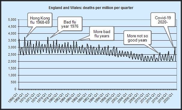
Meanwhile, Dr No has been digging around in the statistical archives for some mortality data. Inspired by an annotated Swedish chart that shows monthly deaths per million population going back to 1851 — yes, 1851, the Swedes certainly know how to keep records — he wanted to find similar UK/home nation data that contains seasonal information. Earlier trawls through dusty ONS digital corridors revealed some weekly and monthly mortality data, but only for relatively recent time periods, and rather unsurprisingly 2020, the year of covid–19, does stick out like a tent pole. What we need is a longer time series, to put things properly into perspective.
Finally, with the recurring image of BoJo stuck chortling in the chimney looming nearer and nearer, Dr No came across some ancient digital files stashed away in the online National Archive that contain annual mortality data by quarter, going back to 1966. There is even older data, but this has been grouped into five year periods, making it useless for our purposes, given that we want to tease out what is happening on a seasonal basis, year on year. Nonetheless, quarterly data going back over half a century is quite a find.
Taking this historic data, and adding more recent monthly data grouped into quarters gives us a complete time series of quarterly deaths for England and Wales from 1966 right up to Quarter 3 2020. Plotting this raw data — just the counts of deaths — strongly suggests 2020, viewed in a historical context, is something of an outlier, but not uniquely so. More importantly the raw data does not take account of the increase in population size over the last half century (more people, more deaths). To get round this, we can plot deaths per million population. More digging around, more data collection and sorting, and in short order we have deaths per million (mid -year population) per quarter from 1966 to date. When plotted — see the image at the top of this post, data sources below, and click here for a larger but less pretty version of the chart where you can see 2020 detail better — it strongly suggests that, while 2020 is slightly worse than recent years, and even that isn’t very striking, viewed over a wider time span, covid–19 — seen as the last spike on the right, for Q2 2020) really is no worse than a bad flu season. Well over a dozen flu seasons in the last fifty years have been notably worse, and even when the final quarter for 2020 is added, this situation is likely to remain unchanged.
So perhaps it really is the season to be jolly careful — jolly careful, that is, not to inflate what is no more than a bad flu season into an over-blown monster of a pandemic myth that once jolted into hideous life does far more widespread and long-lasting damage than ever covid–19 on its own could achieve.
Data Sources (very long urls shortened as necessary)
Deaths 1966 to 1988 (zip file)
Death 1989 to 2005 (zip file)
Deaths 2006 to date (xlsx file plus ad hoc extractions from this xlsx file)
Mid-year populations (xlsx file plus ad hoc extraction for 2019 and estimate for 2020)
Please feel free to add a comment below if any of the links fail/fail to make sense.
Extracted data as used by Dr No for the above plot uploaded as a csv file.
Notes
1. Sometimes the ONS datasets overlap, and the figures don’t always agree between the different datasets. These things are sent to try us… After eyeballing the differences, Dr No decided the differences — typically around 0.5% between datasets — were small enough to be ignored.
2. Adjusting for changes in population size is important, which is why we look at deaths per million, so we are comparing like with like. Ideally we would also adjust for age distribution (more or less old people), because even with the same size population, two populations with different age structures will gave different death rates per million (the one with the older population will have more deaths). The data might be there to allow such adjustment but extracting it and applying age adjustment would take a very long time and given the data already shows enough to say ‘just another (bad) flu like illness’, Dr No is not inclined to do the necessary work. It is nonetheless worth noting that such an adjustment would almost certainly increase the historical spikes and/or (depending on the reference population used) reduce the more recent spikes.
As many have said, the virus is real but the pandemic is not.
A perfect storm of plastic politicians, propagating a myth to a population of risk adverse peoples, seemingly uninformed and unable to make pragmatic, autonomous decisions about their day to day lives.
Lost in the whole jamboree is perspective — which is thankfully offered here by Dr No.
The trouble is, until this kind of insight goes mainstream, with people perhaps regaining their ability to critically evaluate and make decisions for themselves, the pandemic myth perpetuates.
It is shift in behaviors that will save us, not any magic wand vaccine!
The graph is perfectly fascinating, for many other purposes than putting Covid into context.
It’s a pity the data set does not go back to the foundation of the NHS, but one can extrapolate (although of course without any certainty).
The first thing I noticed was that the size of the excursions between winter and summer is very much greater at the left side of the graph, in the 1960s. These excursions have got very much smaller by the 2000s, but we have had three bad winters since 2015. Each of those spikes is higher than the last, which doesn’t seem reassuring.
The underlying trend, too, seems to be falling from the late 1970s until about 2014, when it appears to start going very slightly upward again.
It is of course pure speculation what – if anything – this has to do with the NHS. One might think that, after being in existence for a generation, the NHS may have very gradually begun to increase life expectancy, as was hoped by its creators.
But in the past few years something has happened to stop that trend and, perhaps, to reverse it.
Tom – there’s probably a PhD or three to be had on the back of that chart…
The data does go back further, to 1841, but 1966 is the first year when the data was per single year. 1841 to 1965 is grouped, in five year groups, meaning we lose the year on year seasonal effect. For example, the 1957 epidemic is completely lost in the aggregated data (note that this is a 1998 data set, but it is the key one with the historical by quarter data; ONS quarters are Jan-Mar, Apr-Jun etc):
Epidemiologists wrangle forever about the determinants of health/ill-health but one thing that crops up time and time again in some shape of form is wealth – wealth => health. Then we get into into association/causation: maybe its the other way round: a healthy population works and gets wealthy! The question of why improvements have tailed off somewhat in recent years is intriguing. One possibility we haven’t ruled out is that, pending some truly radical development, the human body really does have a natural life span, something a bit more than the biblical three score years and ten, but still very real nonetheless.
Dr No as you well know is an ardent supporter of the NHS – free at the point of delivery, based on need, and paid for out of general taxation is the only sensible and civilised way to do health care. The NHS does of course have many faults both systemic and local but to give it its due it was set up, as has often been said, as a NIS ie National Illness Service, to deal with illness as it arrives, and the whole prevention/health promotion jamboree which has largely been added later. It may not even be the NHS’s responsibility to improve health above neutral, if that makes sense (instead it deals with health when it is below neutral); instead, the responsibility for ‘positive health’ may rest with governments, through things like wealth generation, environment etc.
Might the decrease in the last 20 years be due to the changing demographic? Many incomers are very young, so the average age will have been reduced. UK population has increased significantly in this period, so this should be reflected as a decreases mortality when plotting in ppm.
Ed P – “Might the decrease in the last 20 years be due to the changing demographic?” – certainly, see Note (2) in the post. But if you think about it, the population has aged, ie higher proportion of older people (as well as increased in size, but that is taken care of by using deaths per million) and so if we were to age standardise (the routine way of comparing populations with different age structures) we would almost certainly find the 2020 spike is even less impressive, or rather some of the earlier ones are even more impressive. The logic goes like this: most 2020 excess mortality is in the (very) elderly in an elderly population: if we applied (this is in effect an indirect age standardisation, see below) the 2020 age specific rates to say the 1976 population, we will almost certainly find we ‘expect’ fewer deaths (because relatively more younger people in 1976 have lower mortality, so less overall deaths) than we observe (the actual spike in the chart), ergo spike is even more significant/impressive than it first appears. Yes, the logic makes Dr No’s head hurt as well…
Despite Herculean attempts, I have not yet managed to find enough data to do direct (which is the preferred method, where we apply age specific rates from different years to a standard population) age standardisation. The data needed is deaths by age band by quarter (or month, which we can sum to get quarters, or week, which we can semi-bodge to quarters), and while we can (probably) derive it from current stats for 2020, going back anything more than a few years looks like it is impossible: the data simply isn’t there. It may be possible to do something called indirect standardisation (along the lines described above), but that comes with its own set of problems. Rest assured, Dr No is on the case…
THERE IS NO EPIDEMIC IN THE UK AND THEREFORE THERE IS NO PANDEMIC
An ONS survey said 86.1% of people tested between April and June 2020 had none of the main symptoms of coronavirus.
“In the UK Officials announce an epidemic when flu symptoms reported in GP consultations breach an amount per 100,000 patients, with each country having its own level.”
Before the convid19 plandemic the flu criteria for GP consultation per 100,000 appointments ranged from 75.4 in Wales, 108.9 in England, 142.4 in Ireland and 418.9 in Scotland.
See near the end of the article below for consultation stats: https://www.dailymail.co.uk/health/article-5440785/Killer-flu-outbreak-blame-42-spike-deaths.html
See the gov uk original version of the article covered by the Daily Mail above at: https://www.gov.uk/government/news/uk-flu-levels-according-to-phe-statistics-2019-to-2020
So in England 108.9 people with fully symptomatic flu per 100,000 total appointments would designate epidemic status.
Current European Centre for Disease Prevention and Control suggest the case rate for the UK as a whole is currently 500 per 100,000 people as of 15/11/2020.
“A study, reported in Clinical Epidemiology, analysed the symptoms described by more than 36,000 people who were tested between April and June. Only 115 tests came back positive and of those only 27 people, or 23.5%, had symptoms of any description. When the scientists narrowed the symptoms down to the main three for coronavirus infections, namely a cough, or a fever, or a loss of taste or smell, the number reporting the ailments fell to 16 people or 13.9%.”
See: https://www.google.com/amp/s/amp.theguardian.com/world/2020/oct/08/more-than-80-positive-cases-incovid-study-had-no-core-symptoms Original Clinical Epidemiology article: http://doi.org/10.2147/CLEP.S276825
So to bring the CE test sample into similar statistical data to the GP consultation per 100,000 appointments we can increase the test data and actual symptomatic cases by a factor of 2.8 to achieve approx 100k for simplicity:
2.8 x 36,000 people = 100,800 2.8 × 115 positive tests = 322 2.8 x 16 people = 44.8
So 44.8 people per 108,000 tested would have three or less of the main symptoms during the period when the majority of tests were only being performed on people who thought they might have symptoms between April and June 2020.
This gives comparable data to the GP consultation method of symptomatic flu cases per 100,000 appointments to establish epidemic status.
Now consider there were 30.8 million GP appointments made in October 2019 in England. See: https://www.pulsetoday.co.uk/news/uncategorised/highest-number-of-appointments-ever-as-gp-numberscontinue-to-fall/ And see Gov UK Flu and covid report week 43 link at end of article.
That equates to approx 1 million appointments per day in October 2019.
108.9 people with flu per 100,000 GP appointments. That would be 1,090 people per day with the actual symptomatic flu per 1 million all reason GP appointments in Oct 2019 to be classified as an epidemic.
Now with mass testing of non symptomatic people a positive test means absolutely nothing unless there are definite symptoms of fully symptomatic flu (see symptoms below). It makes the ability to determine and classify an epidemic impossible without the use of classic diagnosis with main symptoms present.
Current European Centre for Disease Prevention and Control suggest the case rate for the UK as a whole is currently 500 per 100,000 people tested (over 14 day cumulative period).
https://www.ecdc.europa.eu/en/cases-2019-ncov-eueea
These cases are meaningless without symptom confirmation within the 500 positives. The RT PCR test is fully unreliable producing all positives above 60 cycle thresholds (Ct), all negatives at 10 Ct and an unknown mixture of both at 30 Ct.
For reasons of comparison let us assume that these 500 positives were accurate then using the Clinical Epidemiology figure of 13.9% actually having some of the main symptoms would give us 69.5 symptomatic cases per 100,000 tested when the tests are compared to all reason GP appointments.
This would mean using the same sensible diagnostic processes such as were used for common flu whereby a GP would expect to find most of the classic flu symptoms to justify flu classification, that the convid status in England is only just over half way to epidemic status. (Common flu is now nonexistent worldwide since June 2020 so quite clearly common flu is entirely being diagnosed as the convirus which clearly does not actually exist.)
Flu has disappeared worldwide: https://www.rt.com/op-ed/504625-covid19-flu-disappeared-replaced/
Common flu symptoms “Most people who contract the flu virus will experience several symptoms. These include:
Fever, aches and pains throughout the body, headaches, chills, a sore throat, an extreme feeling of fatigue, a persistent and worsening cough, a stuffy or runny nose.
Not everyone with the flu has every symptom, and the seriousness of the symptoms varies by individual.” (Other less concerning symptoms such as loss of taste and smell obviously occur with most upper respiratory illness)
Flu versus the common cold
“If you have flu-like symptoms BUT NO FEVER, you might suspect that you have a cold. It is not always easy to tell the difference, and even a cold can cause you to have a mild fever. In general, all symptoms are WORSE when you have the flu. You are also more likely to have congestion, a runny nose, a cough, a sore throat, or sneezing with the flu. EXHAUSTION is also common with the flu.
This tiredness is NOT nearly as extreme when you have a cold.” See: https://www.healthline.com/health/flu-without-fever#other-causes-of-fever
Note: (With convirus-19 the propaganda gov at msm have caused such paranoia that people who even have a minor symptom such as loss of smell or taste are consulting GPs which would likely only happen rarely with Influenza Like Illness)
GP in Hours Syndromic Surveillance
An approx average of 20 people a day per 100,000 have visited a GP for potential covid like consultations since mid March until October 25th in England.
An approx average 1.5 people a day per 100,000 visit a GP for potential flu like illness since May10th until October 25th . (average of 0.5 people per day from June until October)
See page 2 chart 1 for convid consultations and See page 4 chart 3 for ILI (Influenza Like Illness) consultations. GPinHoursEngBulletin2020Wk45.pdf
See pages 37 and 38 of pdf article below for charts:
Weekly_Flu_and_COVID-19_report_w43_FINAL.pdf
So combining flu and convid averages 21.5 consultations a day per 100,000 people. 1,090 GP visits for Flu like illness of the 1 million Oct 2019 visits per day would be an epidemic.
21.5 GP visits for Flu and convid combined per day of the same 1 million GP visits per day of 2019 would give 215 GP Flu symptom visits per day. That is 875 GP visits per day less than epidemic status requires.
Simply stated there are 21.5 symptomatic people per 100,000 all reason GP consultations which is far lower than the 108.9 symptomatic people per 100,000 all reason GP consultations required to cause an Epidemic. Appointments in General Practice Statistics
Seeing as we are supposed to be in a pandemic then we should be having more GP consultations than previous years but instead the number has been practically the same as 2019 other than April and May where GP face to face consultations dropped by nearly half during the peak of the plandemic and telephone diagnosis accounted for the missing face to face consultations.
See below and download December 2019 and September 2020 Appointments in General Practice and look in table 1 for statitics: https://digital.nhs.uk/data-and-information/publications/statistical/appointments-in-general-practice
On average there are approx 24 million GP appointments every month equating to 800,000 per day. With 21.5 GP Flu like illness consultations per 100,000 we can determine a possible 172 GP Flu like illness consultations per 800,000 all reason GP consultations per day.
See link below and scroll down to National flu report data: 5 March 2020 (week 10) to download report then click on RCGP tab at bottom of excel spreadsheet: https://www.gov.uk/government/statistics/weekly-national-flu-reports-2019-to-2020-season
It can be seen that up to week 10 of 2020 GP consultations for ILI (Influenza Like Illness) was highest in week 1 of January with 16.6 ILI consultations. Week 6 of 2019 had 23.1 ILI consultations. It is worth noting that an Epidemic must have happened in Week 51 of 2010 where there were 124.4 ILI consultations. In week 1 of 2011 there were 108.4 ILI consultations this being just below the 108.9 ILI epidemic threshold.
Referencing back to the Syndromic Surveillance charts it can be seen during the peak month of the plandemic in April that there was a peak of just above 50 convid GP consultations per 100,000 people on the week between 5th to the 12th of April. On this same week there were approx 1.5 ILI per 100,000 GP consultations. This is a combined ILI (counting convid as an ILI which it is in all reality) of approx 50 to 55 GP consultations per 100,000 people where GP face to face appointments dropped to just under 16 million in the month of April from the usual 24 million per month (Due to Saving the NHS mantra of course). This was NOT an Epidemic but clearly a deceptive illusion using a new non isolated virus (so called) to create fear and panic.
15/11/20 We now have the ridiculous scenario whereby asymptomatic positive cases are being counted as justification for plandemic status and resultant emergency powers to be enforced ad infinitum.
384,000 tests per day have an average 23,000 PCR positives. The number of proper symptomatic people as per common flu diagnosis is unknown but going by the current GP data discussed above it is extremely low.
Recapping on the Clinical Epidemiology statistics for actual symptomatic cases at present reveals a startling figure using this calculation method:
For 115 out of 36,000 we establish that only 0.31% were actual positive cases in the peak period of the pandemic.
This would mean using these test standards from the peak infectivity period when mainly only symptomatic people were being tested only 1,229 people of the current 384,000 daily tests would actually be positive cases.
Furthermore when using the same Clinical Epidemiology percentage of 13.9% for the classic flu type symptoms in the positive group of 1,229 we have only 171 symptomatic cases of the 384,000 tested or 0.054%.
384,000 ÷ 100,000 is 3.84 171 ÷ 3.84 is 44.54 or 26.05% of 384,000.
This concludes that only 45 people out of 100,000 are symptomatic backing up previous calculation methods.
Whichever of the above calculation methods is used to establish a real perspective of the so called current pandemic we can see it does not come close to being Epidemic status in England and therefore the UK is NOT a Country within the Plandemic Zone.
Info and data used in this article can be found at the links below:
https://www.pulsetoday.co.uk/news/uncategorised/highest-number-of-appointments-ever-as-gp-numberscontinue-to-fall/ https://www.gov.uk/government/news/uk-flu-levels-according-to-phe-statistics-2019-to-2020
https://www.google.com/amp/s/amp.theguardian.com/world/2020/oct/08/more-than-80-positive-cases-incovid-study-had-no-core-symptoms https://www.dailymail.co.uk/health/article-5440785/Killer-flu-outbreak-blame-42-spike-deaths.html
https://www.newscientist.com/article/2237475-covid-19-news-uk-government-under-pressure-to-imposeengland-lockdown/ https://www.ecdc.europa.eu/en/cases-2019-ncov-eueea
Clinical Epidemiology article: http://doi.org/10.2147/CLEP.S276825
Flu disappeared see 10 minutes into video at link below: https://www.ukcolumn.org/ukcolumn-news/uk-column-news-28th-october-2020
Flu and covid report week 43: Weekly_Flu_and_COVID-19_report_w43_FINAL.pdf
Maybe the decrease is from something as ‘simple’ (clearly not) as the last 20 years having a far greater incidence of a more sedentary working day and lifestyle – cars, active work making way for computers, and exercise being yet another thing to achieve, rather than just daily movement – and far more damaging things in our food supply, from chemical fertilisers and glyphosphate, poorer air quality (give me smog vs cyanide any day) and general ‘hustle stress’ (two jobs or more, juggling family and work), which is different to working with life as I remember it in the late 1900’s (!).
Thanks for your helpful reply to my comment, Dr No.
A propos the effects of wealth on health, are you familiar with Michael Marmot’s classic “The Status Syndrome: How Social Standing Affects Our Health and Longevity”?
As I recall, he did an impeccable large-scale study of British civil servants and found a definite effect: the more senior the post, the longer the life and better the health. I think he controlled for a number of confounding factors, but it’s years since I read the book so I may be mistaken.
I have a (perhaps harebrained) theory that when the agricultural revolution forced most people to get most of their food from grains, royalty and nobility went on – as far as possible – eating a hunter-gatherer diet of meat, fish, wild birds and vegetables, with some fruit (and perhaps cheese) as dessert.
Hence the traditions of huntin’ and fishin’, shootin’… well, you get my drift.
Tom – yes, I recall the Whitehall study, and Marmot is certainly one of the grandfathers of modern epidemiology. Traditional epidemiologists have been rather snooty about psycho-social factors in disease causation (can’t include them because you can’t measure them) but I remember being influenced a long time ago by a 1976 Israeli study (unfortunately behind a paywall) that included psych-social factors and showed they were a strong predictor for subsequent angina.
Diet, especially ‘impoverished’ diets are interesting. This time I can’t put my finger on it, but I seem to recall there was a study that showed the British wartime diet improved subsequent health. Perhaps one to bear in mind when countering ‘its intuitive’ arguments (like the one about lockdowns work, obviously).