The Flea Is Airborne
The Covid Inquisition has had a rather hard time of it lately. As UK test positives, hospitalisations and deaths have plummeted, they have had in recent weeks to rely on scariants and foreign outbreaks in Brazil and India to maintain fear levels, but over the last few days a game changer has emerged: the virus is airborne. WHO have marginally up-rated their assessment of risk from aerosol transmission, triggering a raft of tweets from the Inquisition saying we told you so, but the real bombshell is a pre-print that puts some E notation numbers and extra computer generated colours on the Milk Curdler’s earlier three colour crayon box model #CovidRiskChart. The Inquisition now know that H, or your airborne infection risk parameter, for a brief, silent masked outdoor encounter is 2.33E-05. Prolonged shouting without masks in a poorly ventilated crowded room, on the other hand, pushes your H up to 1.00E+02. If shout turns to shove, your H jumps even higher, to 2.33E+02. Cripes.
There is a lot wrong with this pre-print, starting of course with the fact that it is a pre-print, and so has not been peer-reviewed. Of the twenty authors, most, perhaps as many as eighteen, are non-medics, and none appear to be epidemiologists. They are instead a crew of engineers, ventilation experts and environmental technologists, and Dr No takes it that they are indeed experts in their fields, but notes nonetheless that they are not medical experts. The methods used rely heavily on numerology, by which Dr No means all but impenetrable maths, and modelling, and as we have seen more than once, using such methods doesn’t always end well. This obfuscation — the bane of so much modern science — is even extended to the presentation. There really is no need to use E notation in the chart, given that the vast majority of readers will not be familiar with its use. The E notation n.nnE[+/-]xx means n.nn time 10 to the power [+/-]xx, so for example, the 1.00E+02 given above is an obfuscation of a rather more familiar real number: 100.
The idea behind the obfuscation is to deter the casual reader from asking too many questions, and so accept the findings by academic osmosis. It can even act as a sort of obfuscation fallacy: if the eggheads can handle maths of such complexity, then they must be right. Nothing could be further than the truth, of course: obfuscation blocks verification, as we have no ready way to assess whether the numerology and models make sense. But there are other things we can look at without popping too many little grey cells. First and foremost of these is where the data comes from. For normal studies this means looking at the population studied, along with the data that was (and wasn’t) recorded; for meta-analyses — and this pre-print includes a form of meta-analysis — it means looking at the studies that provide the data used in the meta-analysis.
The pre-print’s chief exhibit is Figure 1(b). This plots the attack rate (in this pre-print, percentage of exposed who got infected) against log Hr (Hr is the relative infection risk parameter) for 12 covid outbreaks (and a few other diseases), along with a covid predicted attack rate based trend line based on somewhat arbitrary assumptions. In a model of academic clarity, the authors state “An Ep0 of 18.6 quanta h-1 was obtained by fitting (with B0 = 0.288 m3 h-1 assumed for all occupants for simplicity). This value is higher than that suggested by Buonanno et al. (2 quanta h-1 ) (33, 37), but within the uncertainties provided by those authors”. The Ep0 is the “SARS-CoV-2 exhalation rate by an infector resting and only orally breathing” and is all but an order of magnitude larger than estimates from other studies, but it is “within the uncertainties” given in those studies, so that’s all right then, all the more so as it makes for a good fit with the observed data. It’s sort of possibly convincing, but only if the magic Ep0 is used. If other Ep0 values are used, the model moves away from the observed data, as can be seen in this reproduction of Figure 1(b) from the preprint.
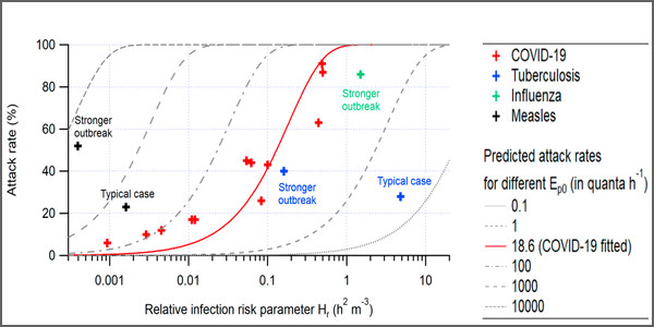
Figure 1: attack rate vs. the relative risk parameter Hr for outbreaks of COVID-19, tuberculosis, and measles reported in the literature (source)
The data behind those covid points in Figure 1 come from a variety of sources, several of which are pre-prints, so we have pre-prints using data from pre-prints. For at least four of the points, the data come from a pre-print which notes that the data are ‘not yet scientifically published’. We have a pre-print using data from pre-prints that use data that hasn’t even been pre-printed. Perhaps they heard it on the grapevine. Different studies used different case definitions, sometimes only test positives counted as cases, in others, clinical suspicion was sufficient to define a case. In some studies, persons at risk appear to have been chosen on a whim: one study uses the entire floor of an office building, for example, while another used only passengers seated in business class on a long haul flight. These thing matter, because they have a big effect on attack rate, the variable plotted on the Y axis on Figure 1 (b). In at least two cases, the listed source either fails to provide the attack rate, or gives a different estimate.
Repeating the plot in Figure 1 using just the covid outbreak data given in the pre-print, and adding labels showing the setting for each outbreak, we get a plot that looks like Figure 2. A trend seems apparent, even without the eye leading red trend line.
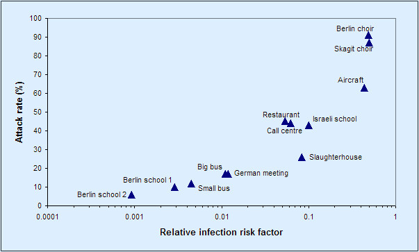
Figure 2: the data behind Figure 1 above, covid data points only, with setting labels added
What happens if we remove the ‘heard it on the grapevine’ and missing data points, correct one apparent error (the big bus rate), and make some not unreasonable adjustments to numerators and denominators (Skagit choir: only include PCR +ves, as most of the other studies do; include all passengers on the aircraft as persons at risk and include all diners in the same room in the restaurant as persons at risk)? Even with just these adjustments — Dr No lost the will to do any more, because the point is already made — the apparent trend effectively disappears, as seen in Figure 3.
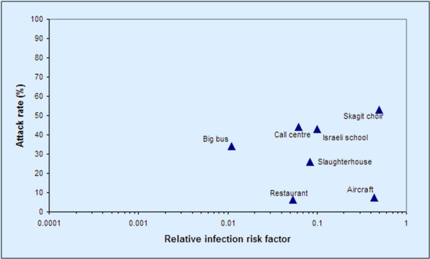
Figure 3: Figure 2 adjusted by (a) removing/correcting questionable data and (b) changing some underlying assumptions (see text for details)
The sources are the same: all Dr No has done is removed unverifiable data, corrected an error, and made some different but not unreasonable assumptions. And yet we get a very different result. And this is the point: studies such as these are extremely sensitive to (a) data selection and (b) initial assumptions. Once this is established, the robustness of the authors’ subsequent modelling collapses, and with that, the E notation numbers presented in the revised quantitative #CovidRiskChart disolve into a haze of airborne fleas.
Basically a load of pre-print ballocks then?
I hadn’t even heard this. It’s all way beyond any sense now. India are starving – lockdown is leaving their crops in harvest time rotting in the fields, and without 50,000 rupees, no ambulance will come to attend a heart-attack, and hospital beds have anyway been withdrawn – and suffering from their vax reactions. Brazil, too, is just another control fear-weapon, patronising used by the UK gov, whose intent re the whole damned 15 month facade is now as visible as rocks on a low spring tide.
The two words on my lips this last year – 9 months certainly – are now being frequently spoken boldly: what pandemic? People have to start asking different questions, or a North Korean life will be ours.
I love what you have done here. Rational, methodical & not at all hard to follow.
The depressing thing is that I’m surrounded by neighbours who would all mark you down as a heretic, fake news merchant, anti-vaxxer etc.. Unless and until the MSM (led by the BBC) start raising some of these questions, nothing will change.
DevonshireDozer, your comment brings us face to face with what I consider out biggest problem.
While many human beings seem to be quite intelligent, and theory tells us that half possess IQs of over 100, the species as a whole behaves as if it had the brains of a sloth.
There is the “cleverer than your average bear” syndrome, explained thus by George Orwell:
“One has to belong to the intelligentsia to believe things like that: no ordinary man could be such a fool”.
– George Orwell, “Notes on Nationalism” (first published: Polemic. — GB, London. — May 1945).
By advancing or supporting ideas that seem ridiculous, some people may be implying that they are wiser and therefore see further than the ordinary folk.
As I see it, our only lifeline in this perilous situation is science – properly so called. In other words the use of the experimental method, together with complete openness and transparency, and an absolute rejection of all arguments from authority.
Unfortunately, science is being quietly throttled by scientism – the blind acceptance of authority in the guise of religion, stealing only the superficial trappings of science. White coats, clipboards and computers by all means; but no fair, open, unbiased debates.
We have never properly faced and dealt with the undeniable fact that proper science is the deadly enemy of dogma, and hence of authoritarianism. And although our glorious leaders never tire of denouncing authoritarianism elsewhere and in others, there is nothing they secretly lust after more greedily.
But… isn’t the insistance that masks are needed and effective predicated on ONLY droplet transmission and aerosol transmission strictly denied. If transmission is by aerosols, the particles would be too small for masks to be of any real use, and social distancing, etc similarly of little benefit.. Most masks aren’t much use stopping droplets anyway, and all masks get sodden within a short period to become next best thing to useless.
Of course it could explain why lockdowns and masks have flattened no curves… apart from the futility of partial isolation, like carrying water in a colander.
Great work Dr No.
The fomite story will be the next to be resurrected. And the variants are the gift that keeps on giving.
At least the Milk Curdler and her aerosol buddies haven’t latched onto the threat posed by fartosols, and the even more alarming sewage blowback (‘aerosolised diarrhoea’, as one report dubbed it) that is believed to have caused the Amoy Gardens SARS outbreak in 2003.
Good debunking of the suspect efficacy of masks against aerosols here, in particular the video of cigarette smoke being exhaled through a mask.
It is also interesting to see that aerosols of comparable size can remain suspended in indoor spaces for several hours, meaning that one might enter a “contaminated room”, empty of people, completely unaware that aerosol particles are present.
https://www.theblaze.com/op-ed/horowitz-why-masks-dont-work-in-the-real-world?utm_source=theblaze-breaking&utm_medium=email&utm_campaign=20210420Trending-HorowitzMasks&utm_term=ACTIVE%20LIST%20-%20TheBlaze%20Breaking%20News
Denis – good link. For those who had yet to come across Dr No in August last year, here is the original post on the MC’s three colour crayon box model paper:
Multiphase Turbulent Gas Clouds