Another Day, Another Perspective
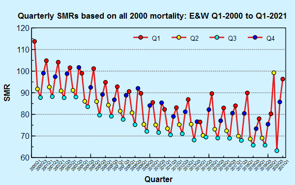
What’s in a baseline? We now have all cause mortality data for the first quarter of 2021 for England and Wales, and so it is time to add this data to one of the many charts Dr No has squirreled away in his covid dossiers. This chart shows quarterly standardised mortality ratios (SMRs) from Q1 2000 to Q1 2021, the last two decades. They are calculated using the indirect method, using all 2000 mortality data as the standard. Each point represents that quarter’s SMR compared to all 2000 all cause mortality, adjusted for population size and age distribution, with values above 100 meaning observed mortality was higher than expected using the 2000 baseline, and values below 100 meaning it was less than expected. Quarters 1 to 4 are identified by the colours shown in the key. What do we see?
As expected, the winter quarters (Q1 red and Q4 blue) generally have higher mortalities, and the summer quarters (Q2 yellow and Q3 cyan) have lower mortalities. The four year 2000 quarters are scattered around 100, as we would expect, since all year 2000 mortality is the baseline. Not a lot happens in the early Noughties, but by the late Noughties mortality has started to decline. As we move into the Teenies, the decline continues, but at a slower pace. We also see greater volatility, with notable peaks in the winters of 2014/15 and 2017/18, coinciding with recent ‘bad flu winters’.
And then we come to 2020 and 2021. Q2 2020 (the right-most yellow point) was bad. That was last spring’s covid wave. In the summer (Q3, July to September), the SMR fell sharply, and then rose again over the winter quarters, during the second covid wave. Strictly speaking, because these are indirect SMRs — indirect because of the limitations of the available data — they are all ‘relative to 2000 mortality’, and so very strictly speaking we should not make comparisons between other years, but given we are looking at the same nations (England and Wales) over a short time frame (20 years) it is not entirely unreasonable to do so. What we see is that winter 2020/21 was ‘about as bad’ as the mid to late Noughties, a period when social distancing was something Penelope Keith last practised in The Good Life, bubbles were something babies blew in the bath, and lockdowns were something that rarely happened outside rioting prisons.
What’s in a baseline? The chart yet again shows the myopic fallacy, that of using too short a time frame. ONS, PHE and the dreaded EuroGAGA charts all usually, and sometimes exclusively, use a recent five to ten year time period as the baseline. As the chart above shows, this is a period of relatively low mortality, that cannot but make 2020/21 look bad. But if we pull back just a few more years, we see 2020/21 in a rather different light: about where we were fifteen or so years ago. Disappointing, perhaps, but a trigger for the biggest ever self-inflicted social medical and economic wound in peacetime? What have we done?
But proponents of lockdowns and masks will undoubtedly argue that is has been these very things that reduced deaths to lower than they would have been if no action had been taken. It doesn’t matter how much true information is presented to the convinced – they’ll dismiss it or find some wriggle-room (cognitive dissonance) to support their entrenched positions.
Dr Malcolm Kendrick brilliantly described this phenomenon the other day.
“A randomised controlled study from Denmark showing that masks don’t really work was dismissed as useless and stripped apart by the Fact Checkers…. Studies from the US demonstrated that states that locked down tightly did no better than those that didn’t…. Oh, it was population density, atmospheric pressure, ethnic make-up, temperature. Throw whatever made-up evidence free explanation you like into the air.
“This is the scientific equivalent of a fighter plane releasing chaff into the air to confuse and misdirect an incoming missile. You no longer have one target, you have thousands.
“It is something I have been battled against in my cardiovascular research. Attack the ‘cholesterol hypothesis’ and it disintegrates into hundreds of different pieces in front your eyes. HDL, LDL, particle number, small dense LDL, light fluffy LDL, dyslipidaemia…. On and on it goes. A lifetime can be fully wasted examining each piece of chaff in minute detail. My advice, don’t bother, just learn to recognise chaff when you see it”.
– Dr Malcolm Kendrick https://drmalcolmkendrick.org/2021/04/24/covid19-taking-stock/
I suppose your rightmost cyan dot is low because the previous months had burnt through a lot of “dry tinder”. Presumably the 2021 cyan dot will turn out also to be low, perhaps aided not only by that effect but also by any gain from vaccination.
Anyway, masks, lockdown, etc: they seem likely to have all been balls. God knows what their cost in human suffering and death will have been. Those with religious beliefs should probably be praying that the vaccines don’t also induce long term damage.
It’s been a remarkably shabby episode in our history.
Ed P – “would’ve been worse if X not done” is pure post hoc ergo propter hoc to the nth power. It’s meaningless, and we just have to remind those folk who use it that is all it is – meaningless. Dr No happens to believe that swallowing six whole bulbs of raw garlic at midnight on the 6th day of the 6th month last year cut the number of deaths in the second wave by half. Things would have been so much worse if he hadn’t swallowed all that garlic…
The default position has to be the null hypothesis: there is no difference between X/not X where X is lockdown, masks, mass testing, moonshots, vaccination whatever. Yet curiously the only one in that list that got a sort of null hypothesis test was vaccination (clinical trials are based on the null hypothesis). The others got through on obvs, innit. But that isn’t good enough: proponents need to show something works, or face justified accusations of authoritarian racketeering. This is all the more the case when the measures are both intrusive and harmful: there is an even greater onus to show the measures work.
Dearieme – Q3 2021 is likely to be low, possibly because of the dry tinder effect, or just because Q3 tends to be low anyway. Follow the trend over time for the cyan dots and see where you mind’s eye puts the next one. Whether the vaccine has had/will have any real effect is a moot point (it falls under the “would’ve been worse if X not done” category of interventions discussed above, but does have some support from the clinical trials). But equally the decline in cases/deaths could just be the natural course of events (waves by definition go up and down).
“Dr No happens to believe that swallowing six whole bulbs of raw garlic at midnight on the 6th day of the 6th month last year cut the number of deaths in the second wave by half. Things would have been so much worse if he hadn’t swallowed all that garlic…”
Is there a control group ? :)
Of course not! As one of Dr No’s parish councillor’s once said about committee formalities, ‘no need to bother with that sort of nonsense round here!’.
The garlic was almost certainly effective because it is a natural aid to social distancing ?