Situation Normal
We are told that Lockdown v3, now renamed Kier 4, in honour of the leader of Her Majesty’s Loyal Opposition and his staunch support for any lunatic measures Her Majesty’s Government may want to implement from time to time, is now in place across large parts of England as winter pressures mount to save lives and protect the NHS. The situation has been further aggravated in recent weeks by the arrival of a new variant of the coronavirus, with a screw loose in its spike protein. A week ago today, a bodged press conference by BlowJob predictably spooked the rest of the world, and with hours the rattle of chains could be heard across the globe as countries drew up their collective drawbridges against la merde anglaise. La solution française turned out to be to use dodgy paperwork based on dud test, the now discredited lateral flow test, but at least it got the truckers trucking. But how fares the outbreak back home?
Sometime last week, a briefing paper used by NERVTAG to sex up the transmissibility of the new virus strain was published online. It turns out that BlowJob’s 70% increase in transmissibility estimate was a classic let’s push the envelop as far as we can exercise: the actual estimate is 56%, with a 95% credible interval across three regions 50-74%. Perhaps, if he had stuck with the actual estimate, rather than its upper bound, less drawbridges would have rattled shut. Be that as it may, UK test positive numbers have, quite literally, been all over the place recently, but do appear overall to show a rise during December, with the current 7 day moving average being around 31.5k, compared to 24.5k during the November peak, a 29% increase. But this is at least in part, but not entirely, a testdemic fuelled rise, given that tests rose sharply in the second part of December, from around 333k daily tests to over 500k tests on the 23rd December, a 50% rise in testing. Frankly, these numbers are about as useful as a sequence of numbers generated using a lottery machine.
What about covid admissions and deaths? We’ll review deaths first, as they are more straightforward. These have pretty much flat-lined since mid November, with the 7 day moving average for deaths within 28 days of positive test by date of death hovering around 430, less than half the April peak. Covid admissions have shown a rise during December, but these figures alone do not reveal how well the NHS is managing, or not. A better indicator is bed occupancy.
The NHS, to its credit, has started releasing weekly reports of total and occupied general and critical bed numbers, with daily figures for each trust. This means we can compare occupancy over the most recent reported week, 14th to 20th December, and compare the figures to the nearest in dates week in recent years (week 3 in this file). It turns out that current occupancies, both for general acute and critical care beds are actually marginally lower than in recent years. Current general and acute bed occupancy is 89%, compared to 94% in 2019 and 91% in 2018, and this despite the facts that this year compared to last, we have several thousand less beds available. The pattern is repeated for critical care beds: 77% occupancy, compared to 84% in 2019 and 81% in 2018.
These are national figures for England, and they show that overall the NHS is well within its capacity. But what about regional variations? Rather than do a long waffling region by region account of general and acute occupancy, Dr No has borrowed a leaf out of the Milk Curdler’s book, and adopted a traffic light colour scheme to indicate occupancy levels. Cells coloured red have occupancies of 95% or more, cells coloured amber have occupancies between 90 and 95%, and cells coloured green have occupancies under 90%. The red cells indicate a little overheating, the amber cells indicate levels similar to recent years, and the green cells indicate levels better than recent years. Though not the prettiest graphic in the book, Figure 1 tells a story: that by the end of last week — Dr No accepts there may be a slight Christmas discharge effect, so also consider the week as a whole — most trusts were in ‘Situation Normal’ (amber), or better (green), with only a handful of trusts, mostly in London, showing signs of over-heating (red). Nil desprandum.
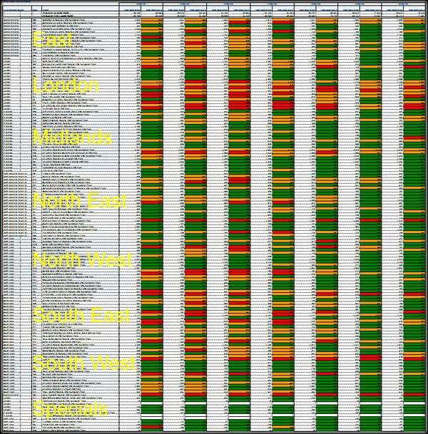
Figure 1: overview of daily occupancy by trust/region (yellow text). Specials are the oddball mostly ultra-specialist hospitals eg Papworth. See text above for meaning of the colours. Larger version available here.
COG-UK showcase event 16 Dec, a 10 minute presentation barely covering the current ‘panic’ (NOT) variant and an earlier one as given by Erik Volz of Imperial (at 2: 36: 40)
https://youtu.be/G3CT9N89L-c?t=9403
Seasons greetings, Dr. No, and thank you for another sanity boosting dose.
“Situation Normal”: an allusion, I assume, to snafu?
Tish – thanks, and Season Greetings to you and all other Bad Medicine readers.
dearieme – it wasn’t, was trying to point out occupancy was normal in the latest data, but your supposition is very apposite. SN(occupacy)-AFU(just about everything else).
Thank you Dr.
Merry Christmas everyone, and a happy new year!