
The Sensibilities of Sensitivity and Specificity

The recent odious twitter spat between the self-appointed witchfinder Dr Dominic Pimenta and the aggressive broadcaster Julia Hartley-Brewer about covid false positive rates triggered by Hatt Mancock’s assertion that the rate was ‘less than 1%’ has yet again highlighted the rampant confusion that continues to plague the meaning and interpretation of screening and diagnostic tests. Dr No understands this confusion only too well, since he has struggled for many a long hour to get his head round what the test results and their derivatives — the sensitivity and specificity, positive and negative predictive value etc — really mean. So, in the interests of clearing his own head, and, he hopes, helping a few readers to clear their heads, Dr No is going to do a run through on tests, and explain what matters, and why it matters. Inevitably it is a long post, but at the end we do at least have something of a possible, but baffling, answer to the Pimenta Hartley-Brewer spat.
Before we start, we need to be clear about some concepts used. We are going to avoid that nasty Bayes’ theorem, which does to testing what silt does to spring water, and stick as far as possible with verbally rather than mathematically defined concepts, though the latter are inescapable at certain points. First and foremost comes prevalence, which is the proportion of people in a population that have the condition of interest, usually at a point in time — the point in time when the test is done, and so point prevalence — though sometimes it is over a period of time, say a week, in which case it is a period prevalence. Unqualified, and as commonly used, prevalence means point prevalence. It can be expressed as a percentage, say 10%, meaning ten out of a hundred people have the condition, or, if the condition is rare, as a number in so many format, say five in ten thousand, which means exactly what it says. There is a special case of this format, the one in so many format, often encountered because it is easy to grasp, and to compare. ONS, for example, use it to present the findings from their covid infection survey: for example, ‘around 1 in 900 people‘. Since prevalence is always a rate (it has a numerator over a denominator), the various ways of expressing it can be freely converted between each other. One in nine hundred for example is the same as 0.11% (1/900 = 0.0011, then multiply by 100 to get percent), which is the same as 11 in 10,000 (again, multiply the percentage by 100 to get X in 10,000).
Prevalence is absolutely crucial to understanding testing, which is why Dr No has gone into it in such depth. Prevalence is the key to understanding the difference between screening tests (tests done on people without symptoms of the condition of interest) and diagnostic tests (tests done on people who have symptoms of the condition of interest), because, for any given condition, the prevalence is almost always lower in asymptomatic people than it is in symptomatic people, and, as we shall come to see, underlying prevalence is crucial to the interpretation of tests.
With the meaning of prevalence, and the differences between screening and diagnostic tests out of the way, we can now move on to that grim little two by two table that is forever both the bane of and the key to understanding testing. The two columns are for those with and without the condition, and the two rows are for those who test positive and negative. Once you have run the tests that test the test — that is, run your test on people who you know for certain do or don’t have the disease — then you fill in the numbers for each cell in the table. Those who have the condition and test positive go in the top left cell, and so on. So far, so good. Figure 1 shows the table as normally laid out.
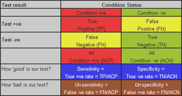
Figure 1: the standard ‘testing the test’ table, with various derivatives, explanations below.
We then come to the derivatives, which tell us how good or bad the test is, and this is where the fun and confusion starts. It is not helped by the fact the most often quoted measures of test capability — as used in the title of this post — are in reality geek measures, of little practical importance of themselves, even if they are nonetheless a bar to be crossed. So, what the geek wants to know is how good his test is, and for this he uses two measures. The first has to do with how good is the test at picking up people who have the condition — how sensitive it is — which is the proportion of people with the condition who test positive. If the test picks up all the people who have the disease, it is very sensitive, if it only picks up half of them, it is less sensitive. If you test 100 people who have the disease, and all the tests come back positive, it has a sensitivity of 100% (100/100), but if only half come back positive, it has a sensitivity of only 50% (50/100).
Now, we might have a very sensitive test, one that comes back positive for all those with the condition, but maybe it is also a feeble test, in that it almost always comes back positive, even when the person doesn’t have the condition. So the geek wants secondly to know how specific to the condition the test is, that is, how good is it at returning a negative result when the person doesn’t have the disease? Or to put it numerically, what proportion of people without the disease get a negative result? If you test 100 people without the disease, and the tests all come back negative, then the test has a specificity of 100% (100/100); if, on the other hand, 20 of those without the disease nonetheless get a positive result, then the test is rather vague, or unspecific, and so its specificity falls, to 80% (only 80 of the 100 people without the condition actually get a negative result, 80/100, and so 80%).
Sensitivity and specificity are about true results: the true positives and the true negatives, the occasions when the test result is the true. Unfortunately, but inevitably given that no test is perfect, each true result has a bastard sibling: the false positive, a positive result for a person without the disease, and the false negative, a negative result when the person does in fact have the disease. It is these two bastard siblings that cause all the trouble and mayhem.
At this point, we should note that the sums we have done so far, sensitivity and specificity, have been done vertically on the table, on the columns. Sensitivity is done on the Condition positive column, specificity on the Condition negative column. We continue to do the sums vertically, on the columns, when we determine the measures of unsensitivity, the false negative rate, and unspecificity, the false positive rate. This is the key point at which we need to apply a bit of sensibility if we are not to get confused, because it is all too easy to see false positives, for example, as being to do with all positives, and so imagine that the false positive rate is false positives divided by all positives, but it is not: that tells us nothing about how unspecific the test is (it does have a meaning, and a useful one, as we shall see, but it has nothing to do with specificity). To determine how unspecific the test is, the false positive rate, we need to stay in our columns, and divide the number of false positives by the number of people who are in fact condition negative, to get the false positive rate, that is, the percentage of people who are condition negative, who have a false positive result.
We can clarify this by defining the term false positive more comprehensively as the false positive test rate ie it is a measure of how often the test is positive when it should be negative, so the denominator is all condition negatives, not all test positives. Likewise, the false negative rate is the percentage of those who test negative among all those who are in fact condition positive. Figure 1 shows these various measures, aligned in their correct columns.
In the real world, at the bedside and in the consulting room, and indeed the offices of epidemiologists, sensitivity and specificity tell us more about the test — its inherent characteristics — than they do about the patient if front of us, or what is happening in the community. To be of practical use, we need to know, for example, what percentage of people with a positive test actually do have the condition, and this is where we now do our calculations horizontally, on the rows, because the focus is now not on the presence of absence of disease, and how the test fares, but on given a positive or negative result, how likely is it the person has the disease. This is called the positive predictive value, or PPV, and is the percentage of people who do in fact have the disease among all positive tests. A quick look at our two by two table makes it clear that the PPV is very dependent on the false positive rate. If there are a lot of false positives, then the PPV will quickly become feeble, and then useless, whether the setting be clinical or epidemiological.
And so finally, we come full circle to the importance of prevalence, and how it affects the PPV, or how useful the test is in the real world. The crux of the matter is that when prevalence is low, even a very specific low false positive rate test will pick up a lot of false positives, because even a small percentage of a large number is still a large number, such that very soon the numbers of false positives dwarf the numbers of true positives. Let us take a real world example, the ONS one in 900 prevalence rate, and apply it to an unreal world example, Operation Moonshite. The table below shows this in action (we enter the data in the lower table and press Compute under that table to get the figures in the upper table; note the website uses decimals rather than percentages for entry, so 99.2% is entered at 0.992 etc, one in 900 (0.11%) as 0.0011 etc):

Figure 2: applied numbers: ONS prevalence of one in 900, test sensitivity of 80% and specificity of 99.2%, and 100,000 tests done (using this Diagnostic Test Calculator, don’t be tempted to use the BMJ one because despite the prettier pictures (a) it rounds prevalence to one decimal place and (b) it has a fixed sample size of 1000 so no Moonshots)
We can immediately see that in such a scenario the number of false positives dwarf the number of true positives, by almost an order of magnitude, which is the chief reason why Operation Moonshite is indeed a shite idea, though the number of false negatives (fifth column spreaders) is also a concern. But what if we apply the same calculator to current testing, using yesterday’s tests done and test positive numbers?
Here we answer a slightly different question: given we know the number of tests done (232,268), the tests characteristics (as before), and the number of positives (6,634), what do we need to set the prevalence at to get the number of positives we found? This will also reveal the numbers of true and false positives, because, given prevalence and test characteristics, we can ‘reverse engineer’ these numbers. What we find is both intriguing and baffling:
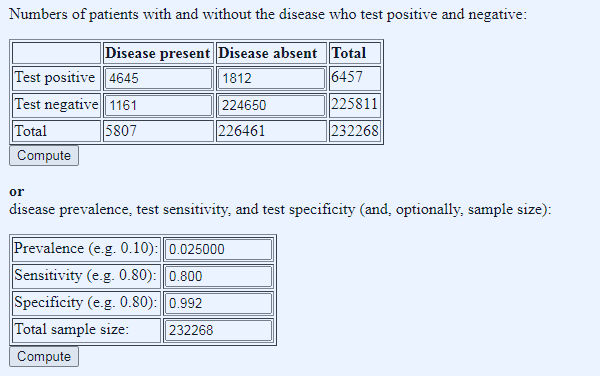
Figure 3: what does the prevalence need to be to get yesterday’s number of test positives? Prevalence manually adjusted in stages to get total positive number close to 6,634
Given the fixed parameters of test characteristics, tests done, and positives returned, we have to set the prevalence at 0.025 decimal, so 2.5%, to get 5807 true ‘cases’ (quotes because this is the dodgy PCT test that in reality tests not for cases, but for likelihood of having a positive PCR test – see posts passim). Of the 5807 true ‘cases’, 1161 come back as false negatives (fifth column spreaders) and of the 6457 positive tests, only 4645 were true ‘cases’, a PPV of 72%, leaving 1812 false positives (quarantine hell despite being disease free).
These findings — the false negatives and positives — are worrying enough but what really baffles Dr No is the remarkably low total prevalence of 2.5%. The tests are both Pillar 1 (1/3 of the tests) and Pillar 2 (2/3 of the tests) combined, and both, should, in theory, have high prevalences, Pillar 1 because these are in hospital tests, and Pillar 2 because these are (mostly) symptomatic people in the community. A prevalence of 2.5% is much higher than the ONS figure (0.11%, so roughly twenty times higher), but even so, for (mostly) sick patients, either with covid symptoms and/or sick enough to be in hospital, it seems remarkably, and inexplicably, low.
It becomes even more baffling when we try to run the Mancock Hartley-Brewer Pimenta numbers (which came from 1st Aug plus Mancocks guesstimate of the FPR): 147,002 tests, 494 total positives, a false positive rate of 0.8% (and so a specificity of 99.2% – the FPR and specificity are complements of each other), and lets say sensitivity of 80%: it’s impossible. Using these numbers, the false positive rate of 0.8% always pushes the total number of positives into four figures. To get down to around 494 total positives, we have to cut the prevalence back very hard, to one in 2000 and increase the specificity to 99.7% (and so a false positive rate of 0.3%), both of which seem barely credible (other minor variations on the numbers also work, but the message is the same, very low prevalence, and very high specificity). But most intriguingly of all, perhaps the substance of what Hartley-Brewer had to say was right after all. Look at the ratio of true positives to false positives, 59 to 441, between seven and eight false positives for every true positive…
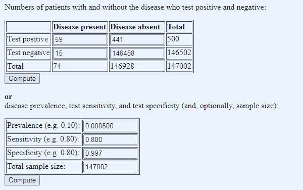
Figure 4: shoe-horning the numbers to get something that fits the 1st August Pillar 1 and 2 testing data.
Dr No has no interest in re-igniting a twitter spat. Instead, he finds himself baffled by the numbers thrown up by the calculator, which is why he presents them, in the hope that a brighter spark can illuminate the matter. In the meantime, pending a better explanation, he inclines strongly to the view that so long as national Pillar 1 and Pillar 2 PCR testing continues to throw up such bizarre and quirky results, it is tantamount to useless, and should not be used to guide local let alone national policy decisions.
I am baffled by just about everything these days.
What I’m interested in is the prevalence of people with a mild vaguely coryzal illness that suddenly develop a critical illness at around day 10 and the rate at which this prevalence is changing.
JT – You might be able to use hospitalisations as a proxy but as noted the other day on twitter the https://coronavirus.data.gov.uk/healthcare page pretty much writes itself off as being not up to much.
Going critical around day 10 – are you wondering about some sort of immune over-reaction?
What is also beyond me is why, when they were being published separately, the proportion of positive test results for Pillar 2 (wider community) were so much higher than for Pillar 1 (high risk hositals and care homes).
It would be interesting to see the proportion of positives by each testing laboratory, but I don’t suppose that will happen either.