2020 Tin Foil Hats
Is wearing a facemask against covid-19 a curious, curious in that the intent is to keep the danger in rather than out, variant of the tin foil hat? Both are designed to keep an invisible peril at bay, and although neither has one jot of direct evidence that they work, wearers of both can point to studies done in physics labs that support their use, at least indirectly, though not without blowback. Advocates of both are fanatic in their zeal, brook no counter-argument, and fervently deny they patently look silly. The more Dr No considers it, the harder he finds it to distinguish between what now increasingly looks like two variations on a common theme, with the possible exception that by and large tin foil hat wearers don’t beat up non-wearers. Perhaps there are other novel tin foil hats that have emerged for the novel coronavirus? Well yes, there are. But we are only going to consider one, because it is a tin foil hat large enough to be a flying saucer. It is of course the lockdown. Unlike normal tin foil hats, this one isn’t just useless, it’s downright dangerous.
Dr No accepts that back in the early spring, when covid–19 first appeared outside China, a case could be made for taking urgent draconian action. He also accepts that just as strong a case could be made, in the face of a new unknown threat, for caution, as a precaution against adopting a fix that in the event does more damage than the threat. But that was then, and now is now, and we have a much better understanding of the natural history of a SARS-CoV-2 pandemic. We are now, Dr No believes, at a point in time where we can get a good enough answer to the question: do hard lockdowns work?
The evidence is temporal: the pattern, or shape, of the epidemic curve over time. Let’s start by comparing the curves for two countries, one with a soft lockdown, the other with hard lockdown, say Sweden (soft lockdown, if that, remember those photos of Swedes enjoying cafe life in the spring, such a joyful sight) and the UK (hard lockdown, no such joy here, just the stay home Stasi shopping their neighbours). Given that case counts are notoriously wobbly, and subject to wild typically inflationary pressures, we will instead count covid–19 deaths. These too are also subject to a raft of inflationary pressures — until recently, the UK had a once a covid case, always a covid death policy, and even the revised 28 day policy is almost certainly far too inclusive — but at least a deaths is a death, and it gets counted. Let’s compare so-called covid–19 deaths, that is, deaths with, and possibly from, covid–19. Remember, we are not interested in absolute numbers, or deaths per million population (as it happens, Sweden actually did slightly better than the UK), but in the shape of the curve: when it rises, when it peaks, and when it falls. Figure 1 shows the two curves.
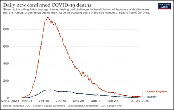
Figure 1: 7 day moving average of daily covid–19 deaths in the UK and Sweden for the period 1st March to 31st July 2020. Source: Our World in Data.
Caveats about count accuracy aside (which is OK, as long as by and large each country stayed reasonably constant in how it defined a covid-19 death, because we are interested in the shape of the curve, not numbers per se), the striking thing about Figure 1 is that the shape is almost identical for both curves. The amplitude of the UK is much larger (bigger population, more deaths per million population), but the shape of the two curves is all but the same: both rise at the same time, peak at the same time and fall at the same time. What this tells us is that the shape, or progression, of the epidemic follows the same pattern, with or without hard lockdown. This is somewhat compelling evidence that hard lockdown makes no difference to the natural history, or progression, of a covid–19 epidemic.
Ah, but, some will ask, what if the UK had not applied a hard lockdown? The short answer, of course, is we will never know. It is entirely possible, but completely unprovable, that the UK might have had more deaths, and might even have had a more prolonged peak, but such a focus on amplitude is to miss the point that the shape is by and large the same. Even more to the point is that the moment we utter the words what if we are removed from the real world of data and science into the realm of numerology. This is the realm where anything goes. Just dial in the numbers and get your result, without any handle on reality. Far better, Dr No suggests, to stick with the real world data we have, acknowledge imperfections where they exist — which is why the focus in Figure 1 is on shape rather than numbers per se — and make such observations as we can.
Can we do more to assess whether hard lockdowns work? As it happens, we can. Again, the focus is temporal, on timing, on the shape of the curve over time, rather than the numbers themselves. We are now far enough away from the peak of the epidemic to have a good enough idea of the shape and timing of the epidemic curve of deaths. We also have a better idea of the incubation period, and, for fatal cases, the time from illness onset to death. Give or take a few days — estimates do vary, and some quote a mean, others a median — the incubation period is around four to five days, and the onset to death period is around (this frequently quoted study is based on small numbers from China early on in the pandemic) eighteen days. Let us say then that a reasonable estimate of the time from infection to death in fatal cases is around twenty one days, or three weeks. Of course there will considerable variation for individual cases, but that’s OK, we just need a good enough estimate of usual illness onset to death interval.
This means that we can re-plot deaths shifted back three weeks in time to get a reasonable idea of the date of infection curve for those who died. This is not perfect: as already noted, there will be individual variation, and furthermore there is a marked selection bias, in that we have selected only those who died. Nonetheless, it is not unreasonable to assume that infection in those who subsequently died paralleled all infections; and we could even go further and say that these data are both the most robust available (because they are death based) and furthermore these patients, the ones with serious and ultimately fatal disease, are the ones in which we are most interested. We can then add a line to the chart, marking the day lockdown was introduced. Figure 2 shows this, using NHS England data for hospital deaths.
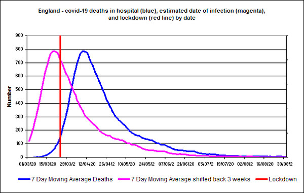
Figure 2: seven day moving average daily hospital covid–19 deaths in England, shifted three weeks to the left, so the curve estimates date of infection, rather than death, for the period 1st March to the end of August, with lockdown day added in red. Source: NHS England.
The peak of deaths happened on or around the 8th April, meaning the peak in infections happened on or about 18th March, which predates the lockdown by almost a week. By the time the lockdown was imposed, numbers were already in steep decline, and furthermore, the gradient of the curve shows no visible change after the lockdown was imposed. This finding is in keeping with another study that used a different methodology, which concluded, ‘The most notable feature of the [England/England and Wales] results is that fatal infections are inferred to be in substantial decline before full lockdown’. This study also includes Swedish data, and, using a slightly different perspective, comes to the same conclusions as Dr No does from Figure 1 above, that, with minor variations, the shape of epidemic curve is the same, with or without lockdown.
Though not by any means infallible, the finding that the peak and subsequent fall in fatal infections predates the hard lockdown, along with findings from Figure 1, are nonetheless the best evidence we have that, whatever caused the number of infections to peak and then fall, it cannot have been the lockdown. If it wasn’t in place, it can’t be the explanation for the peak and subsequent fall. It is possible that soft lockdown measures already in place in the UK before the hard lockdown may have had some effect, or there may be other explanations, or even a combination of explanations, but the one thing we can be reasonably sure about is that whatever it was, it was not the hard lockdown. That makes the hard lockdown the mother of all tin foil hats, one so large it can even be seen from space. Even worse, the harms caused by hard lockdown are so vast they too can be seen from space.
I fashioned myself a tin (aluminium) foil hat to read this post, in case it contained some dangerous data which might leak from my PC screen and infect me. (Well, it’s as rational as the government’s nonsense.)
How do we mount a prosecution of the idiots who caused the destruction of society, based on mad modelling and panic?
What about a tin foil mask? It might even prevent the dreaded non-existent 5G signals carrying in the Most Deadly Virus Every Known to Man (TM)
Thank you, Dr. No for providing another sanity refuge (as per Dr Kendrick’s blog). I am by no means doubting that people have been very ill with Covid 19, and that many have died of/with the virus, but it occurred to me today that the panic propaganda has succeeded in making every human on the planet a potential health hazard to every other human, the fear ramped up with notions of the unknowingly asymptomatic infecting the air we breathe, leaving viral residue on anything they touch. It is absolutely stark staring bonkers. On top of this we were asked, as in socially and morally blackmailed, into ‘saving the NHS’. But for whom did we save it? So 60 plus million people no longer had/have access to appropriate health care! I asked my MP this question the other day. I await his response.
Ed and Ken – as he types this, Dr No is wearing not only a tin foil hat, but also, obviously, a tin foil mask, as well as tin foil gloves (keyboards are such dangerous things) not to mention a tin foil jockstrap (gonads need protecting too), all in the interests of ‘staying safe’ in these ‘unprecedented times’.
Tish – There is a very telling quote rather buried Dr No’s recent post “Surveillance Capitalism”, from a high tech company CEO keen capitalise on the waves of interpersonal fear sweeping over the planet (link to source in the post): ” “Humans are biohazards, machines are not.” She thrills to a a ‘friction-less world’, where everything is done by an app, and you can see where she is headed ($$$^2). Dr No is of the view that the disruption of normal social interaction by all the ‘covid secure’ measures so many have adopted will in time be seen as one of the greater evils of the measures wantonly and indeed recklessly imposed upon us. They erode that most fragile of things, trust, and when we stop starting from a position of trust with our fellow human beings, then hell is not far round the corner.
And not a flattened curve in sight.
The shape of the curves over the period are the same for most European Countries.