
Trumpdemics
That Trump gets it but Halfcock Hancock doesn’t is a long way south of bizarre, but there it is. A trumpdemic is an artefactual spike in covid-19 cases caused simply by doing more tests. You do more tests, you get more cases, or, as the eponymous president would have it, you do no tests, you have no outbreak. ‘That’s great, you know. I’ll have my people stop testing. No tests, no covid. No tests, no way. Yes, sir, that’s my baby. Mahmood Indigo. Sheik Rattle’n’Roll. Celine Dion.’ Or, to get an outbreak, take a city with a constant prevalence of covid–19, say 5%, from one week to the next. In the first week do 2,000 tests, and you have 100 cases. In the next week do 10,000 tests, and you have 500 cases. Cripes! Houston, we have an outbreak! Only we don’t: the underlying prevalence remains the same. We just did more tests.
The problem is exacerbated by spuriously quoting the numbers of positive diagnostic tests as if they were as if they were part of a random survey of the city’s population, as 100 and then 500 per 100,000 population. This error, which appears to have started with PHE in its weekly covid–19 surveillance reports, and lapped up by the likes of the FT, is a classic example of selection bias. As a result the per 100,000 rates are meaningless. This is because the tests were done on a highly selected (had symptoms or contact with covid–19 case) sample, rather than a random, and so representative, sample. Not only do we not have an outbreak, we don’t even know the true prevalence.
So far with have only considered trends over time in one place. Exactly the same thing applies to comparing two or more areas at the same time. If two similar cities have the same true prevalence, but you do twice as many tests in the second city, the second city will appear to be in the grip of an outbreak, but it is an artefact caused by the increased testing, a trumpdemic.
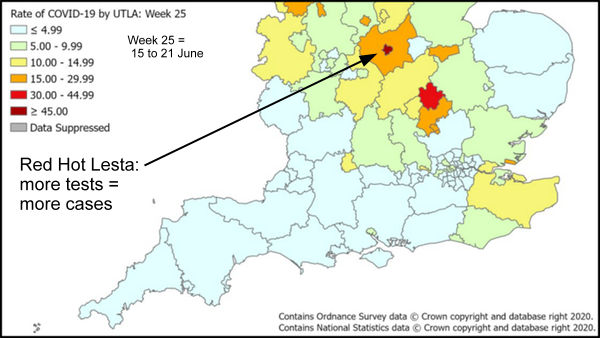
At the time Dr No wrote his last post, he was unable to find any reports of the crucial number of Pillar 2 (community) tests carried out, and so was stumped to put the flesh on the bones of his proposal that the Leicester spike was an artefact caused by doing more tests than normal. One official website even went as far as to say that reporting the number of tests carried out had been ‘temporarily paused’ (with no mention of reinstatement), at which point Dr No stopped looking for the data. Since then, some crucial data has come to light, indicating that the Leicester outbreak is almost certainly an artefact, a non-outbreak, a trumpdemic.
Late on 2nd July, the same day that Dr No published his last post, the DHSC published it’s Weekly NHS Test and Trace Bulletin, England: 18 – 24 June 2020. This report is timely — Halfcock Hancock’s 80, I mean 944, cases covered the two weeks from 13th to 26th June — and, despite the counts of tests done being ‘temporarily paused’, it does in fact give the numbers of tests carried out, both for Pillar 1 and Pillar 2. For the period 18 – 24 June, there were (Table 1, page 8) 177,332 Pillar 2 tests carried out in England.
Meanwhile, on 27th June, that stalwart of the regional press, the Leicester Mercury, reported that ‘More than 37,000 coronavirus tests have been carried out at testing centres across the city and county, a report has revealed. The majority – 28,946 tests – were carried out at the Birstall Park and Ride site between April 30 and June 21. Another 8,775 tests were performed at [nine] mobile testing units during the same period.’
We already know the mobile units were ordered in on or soon after 18th June, so (most of) the 8,775 mobile unit tests would have been done in the 18th-21/24th June period. Although the Leicester Mercury reports numbers ‘across the city and county’, it seems most tests were city or city boundary based (Birstall Park and Ride appears to be just to the north of the city area, within a mile of less of the UTLA boundary) and so it seems more than likely that most of the 29,000 or so Birstall tests count as city rather than county tests. Lets assume a slight weighting towards mid/late June, and say 10,000 Birstall tests for 18 – 24 June, and add those to half (assume half done in city, half in county) of the mobile tests, giving us an estimated 14,388 tests for Leicester City (UTLA area) for the week 18 – 24 June.
Now we already know that there were 177,332 Pillar 2 tests done across England for the period 18 – 24 June. There are 149 UTLA areas in the government covid reports, so assuming (for now) the 177,332 Pillar tests were evenly spread out across UTLA areas, that is 1190 Pillar 2 tests per UTLA area for the period 18 – 24 June. Leicester city had around 14,000 tests over the same period – over ten times as many as the average for England. The case for a trumpdemic looks stronger.
Now, clearly UTLA areas vary widely in their population sizes. By a bit of reverse engineering, we can work out (cases/rate x 100,000) what population counts are used for the 149 government’s UTLA areas, and so the average population, which comes out at 375,264 per UTLA. Leicester UTLA area, using the above calculation, has a population of around 355,000, while Leicester’s DPH estimated a few years back that the 2021 city population will be around 345,000; other give figures nearer 410,000 (that’s demographics for you…). So let’s take a middle figure, say 380,000. Leicester UTLA area is an almost perfectly average sized UTLA (380,000 vs 375,264), and so could be expected to have an average number of Pillar 2 tests, 1190 for the period 18 – 24 June. In fact, it had well over ten times as many tests, around 14,000.
If you think Dr No is making this up, or doing some weird numerology, he isn’t. Even PHE agree, though it isn’t shouting it from the roof tops (doesn’t fit with Halfcock Hancock’s narrative, dear boy). In a report dated 29th June, but published late on 1st July, snappily titled ‘Preliminary investigation into COVID-19 exceedances in Leicester’ (exceedances?), PHE says (conclusion two of three, page 25) ‘Evidence for the scale of the outbreak is limited and may, in part, be artefactually related to growth in availability of testing.’
Or in plain English: you do more tests, you get more cases, You do ten times more tests than average, you get ten times more cases. Cripes! Epidemic! Lesta Lockdown Now! Only thing is, it’s not an epidemic, it’s a trumpdemic. Whoops.
But doesn’t figure 1.3 in the report show in increase in the number of positive cases per 100 tests ?
Yes, it does, but Fig 1.3 also includes a lot of numerology (eg the ‘ exceedance algorithms regression model’) which is at best somewhat impenetrable. It also implies they know the daily number of tests carried out in Leicester (the green line), which is needed to calculate positives per 100 tests (the grey/black lines) but the numbers are at odds with the locally reported (Leicester Mercury) test numbers. The latter reported 37,000+ tests between April 30 and June 21 (say 2/3 of which were in the city and 1/3 in the county so say 25,000 for the city), Fig 1.3 suggests (eyeball stats) around 225 tests/day, so for 21 days, 4,725 tests, a five fold disparity. It (the green line) also also lacks an overall upward gradient (which is to be expected as they ramped up testing over June). If the number of tests per day are wrong, as it appears they are, then the positives per 100 tests cannot be relied upon.
Also worth noting if Fig 1.3 was ‘conclusive’, it (or it’s implications) would surely get a mention in the conclusions. Neither gets mentioned, though Para 1 immediately above the Conclusions (page 25) does contain a reference, though the following two paras say no obvious cause for the apparent rise (2) and ‘no supportive death reporting data suggestive of an epidemic dynamic’ (3). Putting aside the fact this is a modern example of an epidemic dynamic situation, what they mean is the higher number of cases does not appear to have followed by a higher number of deaths, which suggests there wasn’t an epidemic.
PS Thanks for the succinct question and Dr No apologises for such a long winded reply.
Thanks for your swift response.
On the issue of an increase in positive tests not being followed by an increase in deaths, are you aware of any data on changes over time in the age distribution of those testing positive ? If the positive cases are now on average much younger than in April or May, then you’d expect many fewer subsequent deaths proportionally.
A good question. The Rapid Investigation Team report did note (Conclusion 1) ‘The strongest evidence of an outbreak is given by the numbers of new infections identified in children and working age people, and rising proportion of positive tests also seen in these age groups, from late May onwards.’ This is of itself distinctly unusual, and potentially complex, both for why it should the the case, and also for implications, which include the data being somehow flawed, so Dr No didn’t add it to an already longish post.
That said, you are of course right. If the extra cases – ‘exceedances’ (sounds like Mr Kipling has been in town) – were significantly younger, then we would expect lower mortality. But then again that might be offset by high BAME population, high deprivation, associated co-morbidities etc. It is a complex matter.