
Not Caring and Not Sharing
The last 24 hours has been a wake up call for Dr No. A natural sceptic when it comes to government statistics, he has nonetheless been lulled into a false sense of confidence over the availability of covid–19 data, by the widespread online publication of data. Crucially, he made the naive assumption that, if data was existed, then it would be published. This assumption — and we should recall that assumption is none other than the mother of all f*ck ups — was it seems badly wrong. Allegations are rife in the press that the government has wilfully held back crucial local authority level data on Pillar 2 covid–19 testing, hampering local attempts to manage spikes. This discovery has led to an orgy of data mining and sharing, led by the FT, and tarted up using deeper red data gloss by the Guardian. The inevitable caring and sharing so much it hurts explosion on twitter is now in full swing.
All this suits the mainstream media/twitter government doesn’t care/won’t share agenda. Why, even Donald Trump knows the best way to shut down an epidemic is to stop testing. The next best thing, if you have accidentally got some data, is to bury it. Clearly, in the run up to Independence Day this coming Saturday, the last thing the government wants is to frighten the horses. So, the reasoning goes, the government decides, best not to care too much, best not to share too much. If that doesn’t work, then hold back for as long as possible. In the case of the Leicester outbreak, that meant waiting until last Monday evening, when Hancock finally provided some numbers to back up the Leicester lockdown announcement.
And that would be that, were it not for that wonderful thing, the internet Wayback Machine, which archives web pages as they were on a particular day. Dr No decided to see when Pillar 2 data, the crucial ‘community’ data, first became available. The answer isn’t perfect, because there is a gap in the Wayback Machine’s snapshots, between the 29th May and 19th June, but the indications are that Pillar 2 data was certainly publicly available by 19th June, and was probably available as early as the 4th June, a full four weeks earlier than the FT’s recent ‘discovery’ of the data.
The government publishes weekly national COVID-19 surveillance reports here. The current page has a series of such reports that go back to late April, but because a report is there today, it doesn’t mean it was there in the past. This is where the Wayback Machine comes in, with its records of what was available in the past.
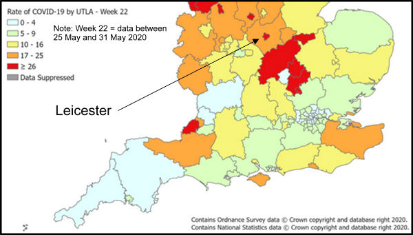
The two snapshots of interest are those for the 29th May and 19th June. We have already noted the unfortunate gap of nearly three weeks between these two consecutive snapshots, but luckily there is a work around. On the 29th May, the most recent weekly report was for week 22, published on 28th May (this is confirmed by the pdf’s own ‘Created’ date), and in it, on page 6, Figures 8 and 9 show the cumulative and weekly ‘rate of COVID-19 cases per 100,000 tested under Pillar 1, by upper-tier local authority, England’. There is no mention of local authority level Pillar 2 data. Note these are rates, not numbers, which we will need to come back to. The weekly rate Leicester appears warm, but not hot; in other words, unremarkable.
By the next main webpage snapshot, on 19th June, we have three more weekly reports, for weeks 23, 24 and 25. If we look at the report for week 23, as it was on 19th June, we can see that, on page 6, Figures 8 and 9 show the cumulative and weekly ‘rate of COVID-19 cases per 100,000 tested under Pillar 1 and 2, by upper-tier local authority, England’. Now, as it happens the report is a pdf, and when we open it in the Wayback Machine, we can see that, while the main webpage listing the reports did not have earlier snapshots for June, this particular pdf does. The earliest was taken, meaning it must have been publicly available then, on 7th June. It clearly shows, in both the cumulative and weekly maps, that Leicester was hot. The Wayback Machine snapshot is here: note the date in the bar at the top, and in the url: 7th Jun 2020. The actual ‘Created’ date of the pdf is 4th June, and there is no reason to suppose that it was not made publicly available then. Local authority level Pillar 2 data was definitely publicly available in early June, certainly by the 7th, and possibly even earlier, on 4th June.
Which raises an interesting question: if local authority level Pillar 2 data was available in early June, why has their been so much recent hand wringing and bed wetting about the government withholding the data? On Tuesday, the FT claimed in an article reporting more than its fair share of hand wringing and bed wetting, that ‘Leicester’s new outbreak is visible only in Pillar 2 data, which the government does not make public’. This is simply not true. The data was available, not necessarily as numbers (spreadsheets), but certainly, as shown by the Wayback Machine, as maps of rates per 100,000 tested, in early June, and it was clear even then that Leicester was already getting hot (see image at top of post).
Now: before you start concluding Dr No has become an apologist for the government, consider this (and be warned: things are going to get a whole lot worse). Dr No mentioned that the data is presented as rates. He mentions this because there is a trap for the unwary here, which the government has aggravated. If you look at the FT and Guardian maps, you will see the rates are per 100,000 population, whereas the government maps are per 100,000 (population) tested. The difference may appear minor, but it is crucial, since the former ignores numbers of tests, while the latter takes them into account. If the rate is per population, then simply doing more tests will elevate the rate (and doing fewer will reduce the rate, something we noted earlier even Donald Trump gets), whereas if the rate is per number tested, then rates more comparable (though still subject to numerous assumptions, most importantly that the sampling is broadly similar) over time and place.
This frankly inexcusable confusion (is the rate per 100,000 population, or per 100,000 tested) arises because the government doesn’t seem to know which it is. The weekly pdf reports clearly and consistently label the maps as ‘per 100,000 population tested’ (earlier reports omitted ‘population’, and read ‘per 100,000 tested), but the now released numbers (spreadsheet) label the data, including that on which the maps are produced, as ‘per 100,000 population’.
Elsewhere, however, government guidance on testing data published on 2nd June, and not updated since, notes that ‘reporting on the number of people tested has been temporarily paused’, and that almost certainly provides an answer to the confusion: since early June, the government has had no idea of the number of tests done, especially in the crucial Pillar 2, and so has no way of calculating rates per 100,000 tests. Instead, it has casually resorted to using rates per 100,000 population.
Which means the rates are all but meaningless. If two similar cities of 100,000 people both have the same prevalence rate of say 5%, then if the first city does 100 tests, it will find 5 cases, and have a rate of 5 per 100,000 population, and the second city does 200 tests, it will find 10 cases, and so have a rate of 10 per 100,000 population, even though the underlying true prevalence is identical. If the cities differ in population numbers, it gets even worse. Lets say city two has half the population, 50,000, then it will still find 10 cases if it tests 200 people, but the rate will go up to 20 per 100,000 people.
So it seems after all that the government don’t care, and haven’t shared, in particular the crucial number of tests done. Instead they have mendaciously pumped out shoddy misleading data. Leicester’s spike may simply be a reflection of more tests: we just don’t know, because we don’t know — though in all likelihood the number has gone up, because of the army of testers sent in — how many tests have been done. The mainstream media, especially the FT, should know better than to swallow up this sort of fanciful numerology. But the true villains are in government and amongst its cronies, who now it appears have the means, whether by accident or intention, to make up epidemics, just like that. Just send in more testers, and report the rates per 100,000 population. Job done. It seems Dr No’s natural scepticism is well founded after all.
Yep. Plandemic, par (tragic) excellence.