Covid PCR Testing — Trick or Treat?
At the risk of banging on like a Duracell bunny, Dr No returns once more to covid–19 testing. He does so because BloJo’s goons have told him that test–track–trace, or whatever the current iteration of the tricolon is, is the only way out of lockdown. WHO have a similar, but even less imaginative, version, test–test–test. So high are the hopes for testing that it has become the new TOWIE for covid–19, TOWIT. Hancock regularly uses his half hour to plug TOWIT and from time to time spin the government’s meteoric rise in the number of tests carried out. And yet, the testing dance is also the dance of Damocles beneath the sword. If the test fails, the thread breaks, and the sword plunges down to impale the dancing minister below.
So, the crucial question is: how good is the test? This post will only consider the RT-PCR/antigen/swab based test, the has this patient currently got covid-19 test, as it is the test being used in the TOWIT rollout. To get a grip on this, we need to review some of the terms used in medical tests. Do not be alarmed: Dr No aims to be comprehensible to the interested lay reader, and also perhaps medical readers who fancy a refresher on these matters. The terms we need to understand are sensitivity, specificity, positive and negative predictive values, and prevalence.
Sensitivity and specificity — the most quoted characteristics of a test — are the true positive and true negative rates for the test. The former describes how many people with a disease get a correct (true) positive test result, while the latter describes how many people without the disease get a correct (true) negative test result. They are easily calculated: if we have 100 people with the disease, and 90 get a positive result, the sensitivity is 90%; if we have 100 people without the disease, and 90 get a negative result, then the specificity is also 90%.
Both sensitivity and specificity are an essential characteristic of a test, but they only tell you about the test itself. They are in effect of no clinical use themselves. One way to understand this is to see sensitivity and specificity as being like the strength of a material. One can know the strength of a material, say steel or paper, but until we know the intended use for the material, the strength is just a number, a characteristic. Context is everything. It’s why we don’t make shopping bags out of steel, or ocean going ships out of paper.
The other important thing about sensitivity and specificity is what they don’t explicitly tell you: the false positive rate (a positive test result in the absence of disease) and false negative rate (a negative test result in the presence of disease). These, as we shall shortly see, are the dark horses that can severe the thread that suspends the Damoclean sword above the dancing minister.
In the real world, we are interested not so much in sensitivity and specificity as the positive (PPV) and negative (NPV) predictive values of a test. These, respectively, are the percentage of people with a positive test who do actually have the disease, and the percentage of people with a negative result who don’t have the disease. A test with a PPV of 50% means only half the people who test positive will actually have the disease. All too often PPVs are lower than we might expect; and often that matters very much, for example in cancer diagnosis, where the consequences of a false positive test can be devastating.
Lastly, we need to know the meaning of prevalence. This is the percentage of people with the disease in the population of interest, usually at a point in time. If five people in a population of 100 have the condition, the prevalence is 5%.
At this point it may help to review the traditional two by two table setting out the test results and its characteristics. Let us consider — these figures are chosen for good reasons, as we shall see — a test with a sensitivity of 70%, and specificity of 95% for a disease with a prevalence of 5%, and run them for a sample population of 1000:
| Disease Present | Disease Absent | Total | PPV/NPV/Prevalence | |
| Test Positive | 35 (true +ve) | 48 (false +ve) | 83 | PPV = 42% (35/83) |
| Test Negative | 15 (false -ve) | 902 (true -ve) | 917 | NPV = 98% (902/917) |
| Total | 50 | 950 | 1000 | |
| Sens/Spec | Sens = 70% (35/50) | Spec = 95% (902/950) | Prev = 5% (50/1000) |
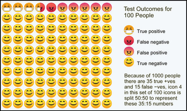
The PPV (number of people who test positive who actually have the disease) is only 42% – less than half of the positives have the disease. Note too the false positives (48) and false negatives (15). If the disease is covid–19, in our sample of 1000, that means 48 people told they do have covid–19 when in fact they don’t, and 15 people told they don’t have covid-19 when in fact they do. If we transform these results for 1000 people into those for 100, then we get the infographic at the top of this post, repeated here for ease of reference. Note the false positives (test +ve, but no disease), and false negatives (test -ve, but has disease). Under the government’s TOWIT plans, the former will be quarantined quite unnecessarily, while the latter will be released as covid-19 free when in fact they are infected.
Now, as it happens, the sensitivity, specificity and prevalence used above are not unreasonable best guesses for covid–19 RT-PCR testing (strictly speaking it is the virus, SARS CoV-2, that is tested for, but for convenience we will stick with covid-19, the disease name) and prevalence.
None of these are known for certain. However, a BMJ review of the evidence (which incidentally uses a wildly unlikely prevalence, which it calls pre-test probability, of 80% for its infographic) for sensitivity and specificity suggested best guesses of 70% for sensitivity and 95% for specificity, though we should note the 70% for sensitivity is optimistic: DIY pharyngeal swabs are not for the faint-hearted. Done in a car, using the rear view mirror as an accessory, may result in significantly lower test sensitivity, perhaps as low as around 32% according to a widely quoted but based on small numbers study. In such a scenario, the number of false negatives exceeds the true positives: more sick people will be given a clean bill of health than correctly identified as true covid-19 patients. An online calculator here provides a convenient way to run various test characteristics and see the results. A similar more visual but less comprehensive calculator can be found here.
Current covid–19 prevalence in the population of interest, that is people with symptoms, is harder to estimate, but a reasonable starting place is the government’s own published total test/test positive numbers. As of the 5th June, 5,438,712 tests had been carried out, with 284,868 positive results, giving a prevalence of 5.24%, which is not a million miles away from the peak Vò all population prevalence (2.6%) in Italy, though it should be noted that in the highly unusual setting of the Diamond Princess outbreak, the prevalence was around 17%.
There are a couple of other important points to consider. The first is the lack of a true gold standard, or “gold standard” as the BMJ article mostly calls it, for testing the RT-PCR test. The test is in effect validating itself, as amended by “clinical adjudication”, itself a fancy name for “it seems there’s a lot of it about” — hardly a true gold standard. But it is the best we have got for now. The second is that the prevalence estimates using the RT-PCR test are themselves subject to the errors caused by inadequate test characteristics, and so will themselves contains false positives and false negatives. Nonetheless, again, these are the best figures we have.
All of which suggests that the covid-19 test on which the whole government TOWIT plan hangs is indeed more trick that treat, more threadbare than ministerial bluff might suggest. As the weight on the Damoclean sword increases, perhaps we should not be too surprised if we wake up one day soon to find that Hancock’s half hour is over.