Muppetry

Muppetry, n. the fanatical desire to promote and implement minimum unit pricing for alcohol as the solution to the world’s alcohol problems.
There has been a rise in muppetry in the UK in recent years. Two of our nations have introduced minimum unit pricing (MUP) for alcohol, first Scotland, in 2018, and then Wales, in 2020. All eyes are on the data, to see whether muppetry works. The muppets of course want to show that it does, while the more sceptical, including Dr No, are inclined to be, well, more sceptical. Almost a decade ago, when muppetry was all the rage, but had yet to be introduced, Dr No published a number of posts pointing out that the underlying dogma and predictions — chiefly a dodgy marriage between Geoffrey Rose’s sick individuals and sick populations theory and some elastic economics, all veiled in a dense web of creative numerology — were about as robust as a wet paper bag. And so it seems: alcohol related deaths have been on an upward trend over the last few years in Scotland, with 2020 having the highest age standardised morality since 2011. Yet in the face of this hard evidence of a worsening position, we have muppets publishing a paper telling us that muppetry works.
The paper is a good example of how modern public health uses opacity and obfuscation to massage the message. Figure 1 in the paper looks impressive: on the day MUP was introduced, the price of alcohol appears to take off like a rocket, and consumption appears to drop like a stone:
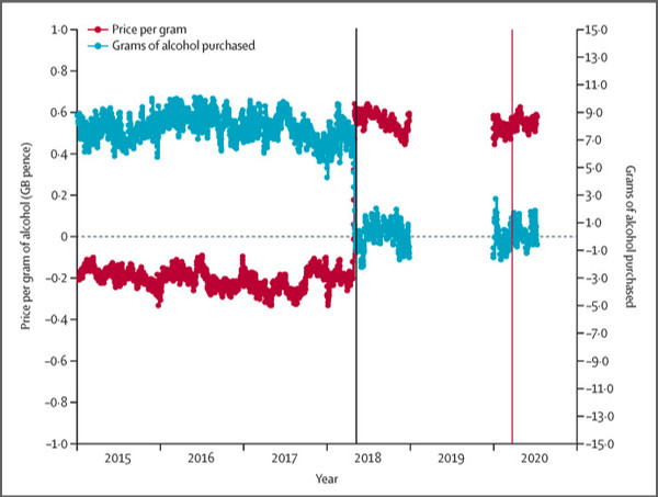
Figure 1 Price paid per gram and grams purchased for Scotland minus northern England. The solid black vertical line represents introduction of minimum unit price on May 1, 2018, and the coloured vertical line represents introduction of COVID-19 lockdown on March 26, 2020. Plots are of daily datapoints.
But, immediately after first glance, there are two points of concern. The first is that the data is based on purchasing behaviour, and so is a surrogate for consumption, which is itself, in turn, a surrogate for harm. This wheeze, of using a surrogate, or marker, for the real outcome of interest (harms, illnesses, admissions, deaths etc) is extremely common in public health research, simply because it is invariably makes the research much easier to do, but to be valid, the surrogate must be very closely tied to the real outcome of interest. Such strong ties are often very difficult to establish, and the more tenuous the link, the more misleading the surrogate based research is may be. The general rule is always be sceptical of surrogate research unless and until you know surrogate is a valid marker for the real outcome of interest.
The second point of concern is all but hidden, being only barely visible in the last three words — ‘minus northern England” — of the main caption, and to a lesser extent in the axis values, but not the axis titles, which are misleading: how, for instance, can a gram of alcohol cost minus 0.2 pence (-0.2p), as it appears to do in 2015? What looks like a chart of actual price paid and actual grams purchased (and so we presume consumed) is in fact not a before and after price paid/grams purchased plot, but a difference plot. These plots can very quickly become too clever by half. Their rationale is they compress a lot of information into a single plot, but therein lies their downfall: they have so compressed the data that we lose some key information. The blue plot, which at first glance appears to show absolute values, in this case of alcohol purchased, in fact shows a relative plot, the difference between the amount purchased in Scotland, and that purchased in northern England. What we see is, on the left, before the introduction of MUP, the Scots purchased around 7 or 8 grams (over what interval appears to be somewhat confusing, and is something like per adult on the days that some alcohol was purchased) more than the northern English, while on the right, after the introduction of MUP, both purchased pretty much the same number of grams. The plot hovers around the zero, or no difference, line, meaning no difference in the amount purchased.
The problem is, we have no way of knowing from Figure 1 what the underlying absolute values are. An identical plot would appear if the Scots made no change to their alcohol purchases, while the northern English upped their purchases from 7 or 8 grams below the Scots to the same level as the Scots; or, for that matter, any of the infinite variations in between. An identical plot could even appear if both groups roughly doubled their purchases, with the northern English also adding a bit more. In fact, there is an infinite variety of underlying values that can give rise to this plot. It is the old enemy, a relative ploy hiding an absolute truth.
These plots appear in studies that use a controlled interrupted time series, or CITS methodology. Sounding more like a questionable form of birth control than a study method, it combines an interrupted — the interruption is the sudden introduction of the measure, in this case MUP, not the gap in the plot, which is simply missing data — time series, that is data over time, with a control set of data, in this case from a different location, that didn’t experience the introduction of the measure. Rather than plot the two data sets separately, the difference plot combines the two, by plotting differences between the two series. But without the absolute values, the plot is meaningless.
This — the absence of the absolute data in the paper — is sufficient alone to say the paper is bunkum, and belongs in the waste paper bin. The authors are not telling readers the truth, the whole truth and nothing but the truth; instead, they have fed readers a very selected part of the truth that suits their message. Even worse, the paper has a coy ‘we’re not telling‘ message tucked in at the bottom of the paper on data sharing: ” Kantar Worldpanel [Kantar are the commercial company that collected the data] data cannot be shared due to licensing restrictions”. It would border on scientific fraud were it not for their one get out of jail escape hatch, the Supplementary Appendix hidden in a link at the end of the paper. In all likelihood, most readers of the paper, including all those MSM hacks who report the study in glowing terms, never read the supplementary material. Why should they – it’s only a supplement, after all? But Dr No did read it, and low and behold, buried within it is the authors’ escape card: a sort of representation of the absolute data, contained in Appendix Figure 8:
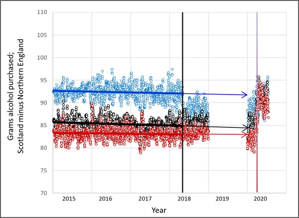
Figure 2: Appendix Figure 8 Grams of alcohol purchased for Scotland (blue), Northern England (black) and England (red). Solid black vertical line: introduction of MUP, 1st May 2018; coloured vertical line: introduction of COVID-19 lockdown, 26th March 2020. Plots are of daily data points, seasonally adjusted. Horizontal arrows added, see text.
Putting aside the y-axis label which is incorrectly labelled Scotland minus northern England — both the text, and the values on the axis, make it clear these are plots of absolute values — what we see is interesting. Firstly, it looks like there was an early effect from MUP in Scotland: the blue points (Scotland) fall sharply from around 92 to 87 grams, while not a lot happens to the black points (northern England) or the red points (all England). We then have 2019, for which the authors had no data, and so there is no plot, and then finally we have 2020, which is perhaps best described as all over the place, for all three regions. What, if anything, can we deduce from this chaos of points?
The two most obvious things about the 2020 data are firstly, the range (top to bottom values) for each region have increased greatly, and secondly, there appears to be a lockdown effect: compare the patterns before and after the vertical line marking the lockdowns. By following the horizontal arrows added by Dr No, we can see that in early 2020, before the lockdowns, all England matched its long term trend, northern England had risen a small amount above its long term trend, and Scotland was clearly below its long term trend. That Scots effect quite possibly is a MUP effect, even if it is muddied in the difference plot by the slight rise in northern England values. Then look at what happens after lockdown: all jump onto values centred on Scotland’s long term trend. Given that the data is based exclusively on off-sales purchases, there can be little doubt that this is due at least in part to an increase on off-sales, as pubs restaurants and bars closed. But, whatever the cause, the effect is clear: by mid 2020, all regions were purchasing much the same amount of alcohol, at a level centred on Scotland’s long term trend.
What can we conclude, when we combine Figure 1 and Figure 2/Appendix Figure 8? First, the pre-lockdown 2020 figures don’t add up: Figure 2 shows a difference which disappears in Figure 1. Dr No can only assume some numerology — hidden in the many varied and astonishing adjustments in the analysis — have caused this anomaly. But the important conclusion is that post-lockdown, in Figure 1, the apparent difference in the purchasing rates disappears — the blue blobs centre on zero — not because the Scots reduced their purchases, but because the northern English increased their purchases. Post-lockdown, for whatever reason, there is no discernable MUP effect.
The ‘for whatever reason’ is important: these natural experiments, as they are called, which are to be found lurking around many of the pandemic’s mysteries, including the grand daddy of them all, do lockdowns work, are always boiling cauldrons of known, suspected and unrecognised biases and confounders. Was the 2018 dip in Scots off-sale purchases compensated for by a rise in on-sale purchases? Did the southern Scots compensate by going on booze cruises to northern England? Given the data comes from bar code scanning of off-sales, and people who volunteer to scan their shopping are believed to be more price sensitive than those who don’t, might that create a bias, in that Scots are traditionally even more canny than the English when it comes to money? Are there age biases at work, given the Scots and the northern English groups have different age profiles?
And what about the introduction of MUP in Wales, on which the paper has some data? Dr No put that on one side, partly because there is less data for Wales, and, more to the point, MUP was introduced in Wales in the same month as lock-down, which compromises the natural experiment, because more than one intervention has been applied at pretty much the same time. Lastly, what about the all important question of who, if anyone, alters their behaviour in response to minimum pricing? The authors claim the paper has evidence the policy targets those who purchase more alcohol, but the evidence is flaky, and buried in the Supplementary Appendix, in Appendix Figure 19. Those who purchase more do appear to reduce their amount purchased by a greater absolute amount, but it looks like the proportionate reduction (on this occasion, relativity is useful) is much the same across all levels of consumption, at around twenty percent.
Muppetry is deeply embedded in public health dogma, and the muppets will continue to raise their heads above the parapet for the foreseeable future, plugging evidence that they claim shows muppetry works. As with all policy dogma based on unholy alliances between questionable theory, elastic economics and creative numerology — of which there are many — we have to remain ever vigilant and even more sceptical, unless and until real evidence emerges. Only then will Dr No put the cork back in his bottle of champagne.
Puritans take joy from denying other people their pleasures. Once you accept that, the rest follows – lying, cheating, bullying are all justified because the Puritans are doing God’s work.
Declaration of interest: I drank 250 ml of beer today. Tomorrow I’ll probably drink 125 ml of wine. I would, however, happily increase my intake temporarily to celebrate a mass de-bagging of Puritans.
About a century ago, H.L. Mencken summed it up beautifully.
“Puritanism: The haunting fear that someone, somewhere, may be happy”.
It is almost certain enterprising people in Northern England have started a trade in shipping booze North, just as plain labelling of cigarettes has increased counterfeiting and sale of cheap cigarettes, just as a fat tax on butter and cheese in Denmark resulted in supermarkets just over the border in Germany doing a roaring trade.
The fools in charge just cannot understand Humans have independent agency and we just will not, do not do what our masters tell us or predict. Their cunning plan never goes to plan – they never learn. The official statistics always show the plan worked, but as we say in the North, they’re just working themselves, and reality is quite different.
‘Alcohol related’ – weasel word phrase. Why not ‘caused’. I read that ‘alcohol related’ A&E cases are determined by type of injury which are typical of the sort of injury associated with drinking too much. Thus, scalding, falling down the stairs, injuries from fighting, are ‘alcohol related’ injuries whether or not alcohol was involved, and the injuries awarded points on a scale linked to type, severity of injury. It is therefore possible to be tea-total and still have an ‘alcohol related’ injury.
At the end of the week/month all the points are added up in order to show there are more ‘alcohol related’ injuries, therefore an increasing alcohol abuse problem, compared with previous periods, therefore ‘something must be done’.
Using points assigned to treatments, diagnostic procedures, etc is not new in the NHS. Aggregation of points can show that a department is really over-worked, struggling to cope, more staff/more budget please so supervisory/managerial types can go up a grade = more money, higher status.
It is of course wide open to abuse and impossible to audit even if anyone wanted to.
“Alcohol related” is strongly reminiscent of the logic by which anyone who “tests positive” for “Covid” is then considered to have been killed by “Covid” if they die.
All together now: post hoc, propter hoc.
Unless we don’t like the conclusion. Thus if someone who was “vaccinated” yesterday suddenly has a heart attack and dies, that is NOT “vaccination related”. Apparently.
“The fools in charge just cannot understand Humans have independent agency and we just will not, do not do what our masters tell us or predict”.
I interpret that rather differently, John. As I see it, some (at least) of them dislike and resent the idea that we pond life have agency just like them. Or that we should have freedom of choice, or human rights.
Their ideal world would be one in which they alone have freedom and respect. The rest of us would be wholly controlled in everything we do and (if feasible) think.
Essentially, those people hanker for a return of slavery – although it would be politically incorrect to admit it.