
Murder By Decree
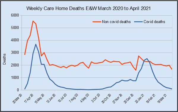
For a while, Dr No has bumbled on about having to wait a while to get data on non-covid–19 deaths caused by the panicdemic, that is, the collateral damage done not by the virus, but by our response to the virus. It now turns out that the data has been hiding in plain sight all along, in one of ONS’s cryptically named data files. The trail starts with referencetable10052021114704.xlsx, which was recently uncovered and dissected by the excellent John Dee, and which can still be downloaded from ONS’s own website here. But referencetable10052021114704.xlsx only covers part of the picture, specifically deaths in care homes, and furthermore, it has, as John Dee points out, been deliberately obfuckstrated by ONS, who have chosen to report cumulative totals rather than weekly numbers of deaths, which has the effect of disguising what John Dee rightly calls a “shocker of a hump” for non-covid deaths in the spring of 2020. Dr No’s chart for the de-obfuckstrated version of the data is shown above. The “shocker of a hump” is clearly visible in the red line representing non-covid care home deaths in April and May 2020.
But this is only part of the picture. We might suppose that the “shocker of a hump” represents all those unfortunate individuals who were unceremoniously dumped from hospital into care homes at the start of the panicdemic, only to die from neglect, or worse. But what if the hump is just a displacement effect, that is, patients who would have died in hospital were displaced to care homes, and so just died in a different place? To consider this possibility, we need more data, specifically how many non-covid deaths there were in hospital over the same time frame. If in a given week there were 3,000 less non-covid deaths in hospital, and 3,000 more non-covid deaths in care homes, then we might just as well call it quits. Nothing to see here, dear boy.
And so to the data hiding in plain sight. ONS’s most recent Deaths registered weekly in England and Wales report does include, in Figure 3, a breakdown of deaths by place of occurrence, but the chart only shows overall excess deaths — so no use for teasing out absolute numbers of non-covid deaths. But by good fortune the associated data file does include columns for all deaths and covid–19 deaths by place of occurrence, meaning by simple subtraction we can calculate the weekly numbers of non-covid deaths by place of occurrence, for home deaths, hospital deaths and care home deaths. What do we find? Note added 2nd Sep 2021: the above two links have now been edited to link to the report and data that were current, and so most recent, at the time this post was written.
Starting with care home deaths, we find much the same pattern as revealed by referencetable10052021114704.xlsx, over a slightly longer time period. The April-May 2020 non-covid deaths hump is again clearly visible.
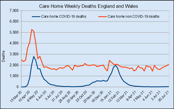
Figure 1: Weekly care home deaths in England and Wales. Source: ONS (see text for link to data)
Next we have the crucial hospital deaths. What we see is interesting: there is a marked decline in hospital non-covid deaths during spring 2020, which is consistent with a displacement effect: patients who would have died in hospital were discharged into care homes, only to die in the care home instead of in hospital, but the numbers don’t match. If we iron out the Bank Holiday oscillations, weekly hospital non-covid deaths declined by around 2,000, from about 5,000 per week to 3,000 per week, but the care home non-covid deaths rose by almost 3,000 deaths per week. The care home hump is bigger than the hospital trough, suggesting that there was a displacement effect, but it wasn’t the only effect.
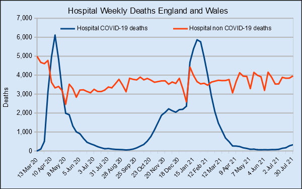
Figure 2: Weekly hospital deaths in England and Wales. Source: ONS (see text for link to data)
The ONS data also includes numbers for weekly home deaths, and again these are interesting. During the first wave, in April-May 2020, we see another “shocker of a hump” in non-covid–19 deaths; maybe not as pronounced as the care home hump, but still clearly visible, rising from just under 3,000 deaths per week to over 4,000 deaths per week. Something caused that hump.
Figure 3: Weekly home deaths in England and Wales. Source: ONS (see text for link to data)
We must be careful not to jump to over hasty or extreme conclusions on such crude data. Nonetheless, what we have here is picture that suggests that during the first wave, in Spring 2020, non-covid–19 deaths rose sharply in both care homes and private homes. If we remove the hospital to care home displacement effect, we are still left with humps that peaked at around 1,000 unexpected non-covid–19 weekly deaths for both settings. In the absence of alternative explanations, the most likely cause of these unexpected deaths is direct harm resulting not from the virus — they are after all non-covid deaths — but from the various measures decreed by government in response to the pandemic; and, to the extent that this is a correct assessment of what happened, the government has blood on its hands.
Thank you very much, Dr No, for this pioneering effort. I think all of us who believe in facts, figures, logic and sanity have been hoping that at some point the dust would settle and the truth begin to appear. Your article makes a substantial contribution to that truth.
Without in any way detracting from the importance of your work, we also have to bear in mind that all the statistics issued by governments and other official institutions rest on the precarious – indeed, probably indefensible – concept of a “Covid death”.
As we probably all know by now, a “Covid death” is defined as the death of anyone who has recently – during some period that has occasionally been slightly adjusted – “tested positive” for Covid.
However it is also gradually coming to light that, around the world, those figures have been grossly and systematically (and probably deliberately) distorted by rules, such as those issued by WHO, insisting that anyone who dies after a “positive test” died of Covid. No autopsies, no clinical judgment… “if it might be Covid, it is Covid”. Almost as if someone, for some reason, wanted to inflate the number of “Covid deaths” as much as possibly.
Which brings us to the “positive test”, which is also fictitious. Not only was PCR never intended for diagnosis; the Corman-Drosten protocol has been completed exploded. Those who were awarded “positive test” results were most likely the victims of a game of Russian roulette.
So we have an imposing marble building, with foundations of clay, standing on a deep layer of sand.
I salute your data unravelling, Dr. No, though what these findings point to is beyond tragic. Also the link to John Dee is v. useful, though I do struggle with all the numerical analysis. But to follow on from what Tom Welsh says, it doesn’t seem to matter how well documented/evidenced are the actual events, fakery rules the dominant narrative. The purveyors of same (i.e. from whichever branch of the unholy affiliation of disinformation conduits) have desperate need to keep it that way. Which leaves the righteous pretty much defenceless, doesn’t it.
“What a wicked web we weave when first we practice to deceive.”
If this was the second coming of the Black Death then the preemptive triage of throwing the old and very ill out of hospitals in order to make room for those with a better chance of survival might have been justified. Likewise, if highly contagious, the caution of declaring it a ‘notifiable disease’ and treating suspected case as if. But it was clear enough by April 2020, if not earlier, that Covid was not that big a deal. Why the world should continue to be gripped by this mass hysteria I do not know.
Thank you all. The question of the extent of diagnostic creep (Hot Stiff Bias) is indeed important. All the data for charts come from ONS death registration data, and the covid deaths are ‘deaths involving covid,’ which can as we know get on the MCCD through a whole raft of possible routes ranging from clinical suspicion and/or ‘there’s a lot of it about’, to had a positive PCR test 27 days ago, never mind the cause of death was being run over by a bus. This means that for each chart, the numbers behind the blue covid death lines will be too high, and the numbers behind the red non-covid lines will be too low. In other words, the true non-covid death humps will almost certainly be larger than the ONS data suggest.
“Why the world should continue to be gripped by this mass hysteria I do not know” and “The purveyors of same (i.e. from whichever branch of the unholy affiliation of disinformation conduits) have desperate need to keep it that way”: Dr No came across this quote but was unable to confirm the source, so he will just quote it anyway. It’s a rather good summary of what’s going on:
“To effectively brainwash and mind control a population you first need fear. You then need a ritual or ceremony, which relieves the fear. That ritual must be simple so anyone can do it. You must make average people feel like heroes for doing exactly as they’re told. The tyrant is best served by being in full control of the fear plus manufacturing the ritual that removes the fear. That pre-manufactured ritual will in turn trick the public into participating in their own enslavement and brings them willingly in the iron grip of the tyrant.”
“What a wicked web we weave when first we practice to deceive” indeed.
Tangled not wicked.
Alex – correct, of course, and thanks, but one hopes Scott wouldn’t object to the change, as the alliteration works better.
Scott referred to more or less ordinary decent people who make the mistake of deceiving others. In their case the web is tangled, to their detriment.
Dr No’s version applies to the current world, in which the hugely rich and powerful deliberately deceive millions in order to increase their wealth and power.
That is wicked.