A Reckoning for the Coffin Counters
Happy is the epidemiologist who works on deaths. This observation arises because death is the ultimate hard end point (the patient is either dead or alive), and usually there is a more or less certain cause of death. These normal certainties however come under threat in times of crisis. In the face of the double barrelled assault of a combined pandemic and panicdemic, and the ensuing rush to ‘get something done’ it is all too easy to gloss over details, and start getting things wrong, perhaps seriously wrong.
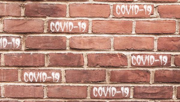
This is worrying enough even in single deaths, as in the case of the misguided Berkshire coroner who, on hearing the deceased might have had a cough, said ‘righty-ho, another brick in the covid-19 wall’, when in fact it wasn’t. Much more worrying is when such sloppy counting happens on a national scale.
For some time now, the DHSC has given us on Twitter official daily counts of tests, positive results and deaths. These deaths, it may be remembered, form a large and significant part of the data the government relies on when it says it is ‘guided by the science’. They also contribute in no small part to the launch pad from which the what-if missiles of epidemiological misfortune get launched.
These daily tweets of counts are presented in such a way as to suggest linkage — test, positive result, death — and the day on day counts, especially the deaths, paint a grim picture, the inexorable rise of the exponential curve. It all seems pretty black and white (the patient is either dead or alive) — but is it? Could these apparent covid-19 death counts be misleading, perhaps even be wildly inflated?
Before we look more closely at the figures, we may wish to remind ourselves that the DHSC, while chiefly interested in the running (or not, as some may say) of health and social care services, is also, like all government departments, a Ministry for Information. History tells us that such ministries are not, and never can be, totally impartial. This is not to say he who feeds the chick always calls the tweet. Instead, it is to remind ourselves that there is a real and significant risk of systemic bias towards the party line, and this may — or indeed may not — affect the way data is collected and presented.
With that important background in mind, let us now look at the counts, or more specifically, the coffin counting. The first thing that struck Dr No was how fast the counts appear — within hours of the deaths taking place — when the normal process of certifying, registering and collating deaths, which still relies partly on pen, paper and human couriers, takes days and weeks. The only plausible explanation is that the normal system has been ditched in favour of a more streamlined, almost certainly electronic, system.
If so, and it seems very likely it is so, we need to know how that system operates. The normal way of certifying and registering deaths, evolved over time, has the means to distinguish between the true underlying cause of death, and contributory causes, conditions that aggravate the death but do not cause it. It also, crucially, has an implicit way of excluding those also present conditions that do not either cause or contribute to the death, simply by not entering the condition on the death certificate. If it is not on the certificate, it won’t appear as a cause of, or contributor to, death.
Does the novel rapid reporting system for covid-19 patient deaths include such mechanism for distinguishing between deaths from and deaths with? We don’t know. Dr No tweeted a number of request for details of the reporting system used by the DHSC, but the tweets went unheeded. Opacity is never helpful. Nonetheless, we do know some things, so let us take a look at what we do know.
The first thing in plain sight, alluded to above, is the modus prestentii of the tweets: an implied temporal association. Some get tested, of them, some test positive, and of them, some die. This presentation implies connection, the age old fallacy of if B follows A then A caused B, when in reality there may be no such connection. The tweets are, whether by accident or design, blurring the line between association and causation.
But when we look closer still at the wording in the tweets, it gets more interesting. Until the end of last week, the wording read ‘[xxx] patients who tested positive for coronavirus have sadly died’, then it became ‘of those hospitalised in the UK, [xxx] have sadly died’. The changing of the wording is probably trivial (so far, by and large, you don’t get tested unless you are in hospital); what is not trivial is the wording does not mean causation. Crucially, they are deaths with, not necessarily deaths from, covid-19. The at first glance apparent connection is not borne out by the detail. All you need to get counted as an apparent covid-19 death is that you get tested and either (a) you test positive (and by implication are in hospital) or (b) you are hospitalised (and by implication are also positive). This is association, not causation.
Can we get an idea of how many of the deaths with covid-19 and also deaths from covid-19? Unfortunately, not directly: while the DHSC rapid reporting system remains opaque, we have no way of knowing. What we do know is that the vast majority of those that die are elderly, and that the vast majority of those that die also have ‘underlying conditions’. Given that old people, especially old people with ‘underlying conditions’ are more likely to die, we can surmise — it’s the best we can do while the reporting process and data remain opaque — that at least some of those patients died from their not so underlying after all conditions, with covid-19 perhaps a contributing condition, perhaps an innocent passenger.
We also know from other countries that death from covid-19 inflation can occur at an eye-popping rate. In Italy, for example, a closer look at the apparent from covid-19 deaths revealed that almost nine out of ten (88%) of the apparent from covid-19 deaths were in fact with covid-19 deaths. That is not to say that an all but ten fold from covid-19 death inflation has also happened here — Italy has a more ‘generous‘ reporting system — but it is a reminder that rapid early data reporting can be misleading, sometimes wildly so.
Politicians and their paid experts – and here again we should not forget he who pays the piper – are curious beasts at the best of times. Faced with what appears to be a national emergency, the voltage spike of urgency can easily blow the circuits of their collective mind. On the one hand, they may want to err, if err they must, on the side of playing down the counts of covid-19 labelled coffins – the ‘don’t panic, it’ll be over soon‘ option; on the other, it may suit them to err, if err they must, towards inflating the counts, the better to wind up for a ‘something must be done‘ scenario.
We urgently need further and better particulars from the DHSC on the true cause of death for the implied covid-19 deaths, to get a better and truer understanding of covid-19 mortality, and so what our response should be. Until that reckoning comes, Dr No leaves it to his readers to form their own best estimate of any inflationary or deflationary pressures that may or may not be at work on the DHSC’s daily coffin counts.
Footnote: Dr No is aware of the ONS weekly death figures released yesterday, but notes that these are always historical (and perhaps even beneficially so, in that they provide more data and context, unlike the DHSC daily tweets) because of the time taken to register deaths, and further notes that in due course they will throw light on whether covid-19 was on the death certificate (“From 31 March 2020 these figures also show the number of deaths involving [which is not the same as caused by] coronavirus (COVID-19), based on any mention of COVID-19 on the death certificate” [insert and emphasis added]) but even that will still not distinguish deaths from covid-19 and deaths aggravated (to a greater or lesser extent) by covid-19, nor guard against Berkshire coroner type errors.