
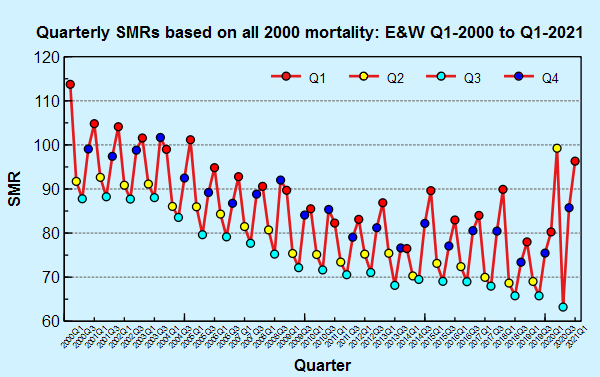
What’s in a baseline? We now have all cause mortality data for the first quarter of 2021 for England and Wales, and so it is time to add this data to one of the many charts Dr No has squirreled away in his covid dossiers. This chart shows quarterly standardised mortality ratios (SMRs) from Q1 2000 to Q1 2021, the last two decades. They are calculated using the indirect method, using all 2000 mortality data as the standard. Each point represents that quarter’s SMR compared to all 2000 all cause mortality, adjusted for population size and age distribution, with values above 100 meaning observed mortality was higher than expected using the 2000 baseline, and values below 100 meaning it was less than expected. Quarters 1 to 4 are identified by the colours shown in the key. What do we see?


